
Another High Street Rebrand
-
AgainWTheNorth

- Posts: 22
- Joined: Thu 28 Jan, 2016 03.12
Maybe the Waterstones logo isn't going to change? Maybe only the wordmark will change; the serif W's been in use for all but 3 years of Waterstones (and previously Waterstone's) existence.
Then again, I'm an American - what do I know?

Looks like what's left of Little Chef are trying to do a Co-op, with their fourth rebrand in 10 years:
http://m.wiltshiretimes.co.uk/news/1452 ... velopment/
http://m.wiltshiretimes.co.uk/news/1452 ... velopment/
-
bilky asko
- Posts: 1463
- Joined: Sat 08 Nov, 2008 19.48
Here's my local branch of Waterstone[']s complete with Wet Paint signs.

I also saw my local mobile phone shop. It was good I tell

I also saw my local mobile phone shop. It was good I tell
I quite liked the last look they rolled out to some locations, with the red cladding on the outside of buildings.WillPS wrote:Looks like what's left of Little Chef are trying to do a Co-op, with their fourth rebrand in 10 years:
http://m.wiltshiretimes.co.uk/news/1452 ... velopment/
Can't remember the last time I went to a Little Chef mind.

It'll be interesting to see how quickly they roll out the new Co-op look and where the first new stores will pop up - they were quite quick with a lot of the stores when they did the 2007 rebrand. It'll also be interesting to see what changes are made to the interior of existing stores since a lot (but not all) are still looking pretty smart.
I noticed last night they've already put the new logo on their distribution depot in the East Midlands, just by the M1.
I noticed last night they've already put the new logo on their distribution depot in the East Midlands, just by the M1.
I was speaking to someone who works for the EoE Co-op the other day who seemed to think they'd be getting the new old logo too. I would assume this is not the case but couldn't be sure, as they've not had their square logo for long, and have probably only just got to the end of changing the fascias of all their stores (although not the interiors, quite a few of which could do with an update to bring them out of the 90s). Then again, the promotion posters the EoE Co-op have been putting in their window recently have contained the Co-operative (and now Co-op) logo, whereas before whilst they used the design of the Co-operative posters, I'm sure they never actually had the logo on them.
It'll be nice to see this store here in Sheffield restored with the Co-op logo - they refurbed it in early 2008 but the logo's always looked a bit odd squashed at the bottom of the square shaped sign space, obviously designed with the older logo in mind!
https://goo.gl/maps/PXfKDExiMnM2
https://goo.gl/maps/PXfKDExiMnM2
All the stores down here have already got the uniforms changed over and most internal (non-fixed) POS updated. Co-Op branded stock is starting to filter through (mainly on the perishable items for obvious reasons) but obviously this will take some time to complete. No refits yet though.woah wrote:It'll be interesting to see how quickly they roll out the new Co-op look and where the first new stores will pop up - they were quite quick with a lot of the stores when they did the 2007 rebrand. It'll also be interesting to see what changes are made to the interior of existing stores since a lot (but not all) are still looking pretty smart.
I noticed last night they've already put the new logo on their distribution depot in the East Midlands, just by the M1.
-
thecorrector
- Posts: 8
- Joined: Tue 31 May, 2016 19.57
First post here, so hello. My local Co-op had a full internal refit just under a month ago, and they've been back to amend the frontage. Sadly, it's a hideous halfway house.
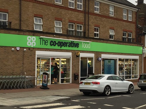
One-off or more to come like this?
EDIT: now with image, apologies
One-off or more to come like this?
EDIT: now with image, apologies