
Yet more work

Well - perhaps not all old German phrases. Don't mention the war, and all that.Nini wrote:A little better each day, eh? No nice doily I'll grant you but good on its own merit, old German phrases are like that.

-
Lorns
- Posts: 3149
- Joined: Thu 24 Mar, 2005 22.48
- Location: A room with a view. 15 Hookey street, the Edge.
- Contact:
I quite like the grey footer. Reminds me of the wallpaper my mum and dad had in the living room. Only theirs was reddish not blackish.
Mental anxiety, Mental breakdowns, Menstrual cramps, Menopause... Did you ever notice how all our problems begin with Men?
-
Nick Harvey

- God
- Posts: 4170
- Joined: Fri 15 Aug, 2003 22.26
- Location: Deepest Wiltshire
- Contact:
Oh, where was their Indian Restaurant?Lorns wrote:Only theirs was reddish not blackish.

OK so I'm not finished, but I'll post these now anyhow
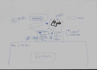
So first of all, we have the sketch of the planned header. I think the original idea here was to have more clutter, on the thinking there'd be random objects down the side too. The link to the help pages was prominent and was going to be on the back of an envelope, TV Centre style. The link to the "user control panel" would be on a walkman with the headphones littering the table.
The rest was pretty similar, although the TVF links were on a post it note at this point.,

Here we have the plans for the footer. For some reason I wanted to have those squiggly lines BBC News had before their whitewash going up to the edge of the paper, thankfully Lee talked me out of that idea.
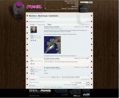
And so, progressing, we have an early version of the current theme. The paper had blue and white stripes so it was more retro and we were considering keeping the default phpBB colours to match this. I also notice I was trying to keep the )) alive in a few more places.

And so finally, about a week before the relaunch I had trusty old moo testing it on safari. I do wish shaun visited more often, we had many a chat about being stuck on dialup back in the chatroom days.
Anyhow, this was pretty much it done, my very basic photoshopping skills are on show here (they have since improved, a longtime fireworks user i had a bit of trouble getting the hang of it). For some reason I was still insistent on the logout text overlapping the icon, not sure why. And about two hours later the final (well, the pastry version) of the header landed in my inbox and we were ready to launch.
So first of all, we have the sketch of the planned header. I think the original idea here was to have more clutter, on the thinking there'd be random objects down the side too. The link to the help pages was prominent and was going to be on the back of an envelope, TV Centre style. The link to the "user control panel" would be on a walkman with the headphones littering the table.
The rest was pretty similar, although the TVF links were on a post it note at this point.,

Here we have the plans for the footer. For some reason I wanted to have those squiggly lines BBC News had before their whitewash going up to the edge of the paper, thankfully Lee talked me out of that idea.
And so, progressing, we have an early version of the current theme. The paper had blue and white stripes so it was more retro and we were considering keeping the default phpBB colours to match this. I also notice I was trying to keep the )) alive in a few more places.

And so finally, about a week before the relaunch I had trusty old moo testing it on safari. I do wish shaun visited more often, we had many a chat about being stuck on dialup back in the chatroom days.
Anyhow, this was pretty much it done, my very basic photoshopping skills are on show here (they have since improved, a longtime fireworks user i had a bit of trouble getting the hang of it). For some reason I was still insistent on the logout text overlapping the icon, not sure why. And about two hours later the final (well, the pastry version) of the header landed in my inbox and we were ready to launch.
"He has to be larger than bacon"
I love the current Metropol look and think there's "just enough" clutter - my only gripe is a minor one - that the bottle isn't 1024x768 safe and as such I see what looks like half a condom on the left hand side of my page.
Other than that, Lee, Pete and Gav, it's the best website on the web.
Other than that, Lee, Pete and Gav, it's the best website on the web.
-
Nick Harvey
- God
- Posts: 4170
- Joined: Fri 15 Aug, 2003 22.26
- Location: Deepest Wiltshire
- Contact:
Brings a whole new meaning to the phrase "1024x768 safe sex".
Make a nice homepage, then sit back, make money from the ads and relax.StuartPlymouth wrote:What are the future plans?
Nothing big or interesting will happen until they release phpbb 3.2 which has some nice new features like report a PM
Like I said earlier, the reason for all the work over the last two weeks was to bring the templates up to date and finish bits and pieces. The original "integrate with wordpress" thing was a disaster and there was loads of junk from that lying around, plus it was built on an outdated template that lacked some buttons so it was more getting it working like it should have originally.
Having said that, 3.0.3 supposedly has "template dependency" which if I understand it correctly means it should be easy to introduce a choice of having the avatars on the right or left, although I now love them on the right having originally been against it..
"He has to be larger than bacon"