

If it still has Co-operative branding then it'll be part of one of the non-Group societies - those stores were not included in the sale to Best One.woah wrote:You're unlikely to see the new Co-op branding at your local pharmacy, it's overdue a rebrand to Well.
Another High Street Rebrand
Judging by your location tag would that be the one at North Point shopping centre? I was there a few days ago and I noticed that oddly the pharmacy has the generic 2008 "The co-operative pharmacy" sign but the promotions in the window carried the Lincolnshire Co-op branding, despite not having the usual Lincolnshire Co-op pharmacy fascia found at their other pharmacies. That would explain the lack of a re-brand.JAS84 wrote:No changes yet at the Funeralcare and Pharmacy at my local shopping centre.
Ah, I didn't know that - thanks for letting me know. They'd been a bit slow to update the branding round here so I had thought they'd been even slower in Hull!WillPS wrote:If it still has Co-operative branding then it'll be part of one of the non-Group societies - those stores were not included in the sale to Best One.woah wrote:You're unlikely to see the new Co-op branding at your local pharmacy, it's overdue a rebrand to Well.
-
Martin Phillp
- Posts: 1602
- Joined: Wed 11 May, 2011 01.28
The white cloverleaf sign has been added to my local Co-Operative Food today.
TVF's London Lite.
-
thecorrector
- Posts: 8
- Joined: Tue 31 May, 2016 19.57
All Tiger stores internationally are about to be rebranded as Flying Tiger Copenhagen, which the company says is 'more fun'.

Unless they've got a territorial naming rights issue, why?
Unless they've got a territorial naming rights issue, why?
Sorry to drag the Co-op back up but what a transformation (admittedly with a major refurb) from this:

Into the picture in this tweet: https://twitter.com/CP_Whitf/status/739819168443322368
Obviously not all the stores will get such a refurb but it provides hope that a lot of the grottier looking stores can look much more classy.
Into the picture in this tweet: https://twitter.com/CP_Whitf/status/739819168443322368
Obviously not all the stores will get such a refurb but it provides hope that a lot of the grottier looking stores can look much more classy.
Already taken effect, looking at their website. Can't say I'm a fan of that new logo.thecorrector wrote:All Tiger stores internationally are about to be rebranded as Flying Tiger Copenhagen, which the company says is 'more fun'.
Unless they've got a territorial naming rights issue, why?
-
aquadextrous
- Posts: 2
- Joined: Tue 07 Jun, 2016 19.27
- Location: Bristol, UK
Hello, long time reader, first time poster!
I felt compelled to post as it's not been picked up on here...
The B&Q in Cribbs Causeway in Bristol has recently had a refurb and a new fascia across the whole building - as part of this work new signage has been put up all over. All of the new signage is still orange but has a slightly changed B&Q logo where the font is narrower and less squashed down and the biggest change being the line on the Q - it's no longer flat and horizontal and is now diagonal like a traditional Q.
I can't find this new logo anywhere online so it must be quite new and I didn't manage to take a picture sorry!
Anyone else spotted the change of logo?

-
AgainWTheNorth

- Posts: 22
- Joined: Thu 28 Jan, 2016 03.12
Does this technically count as High Street?
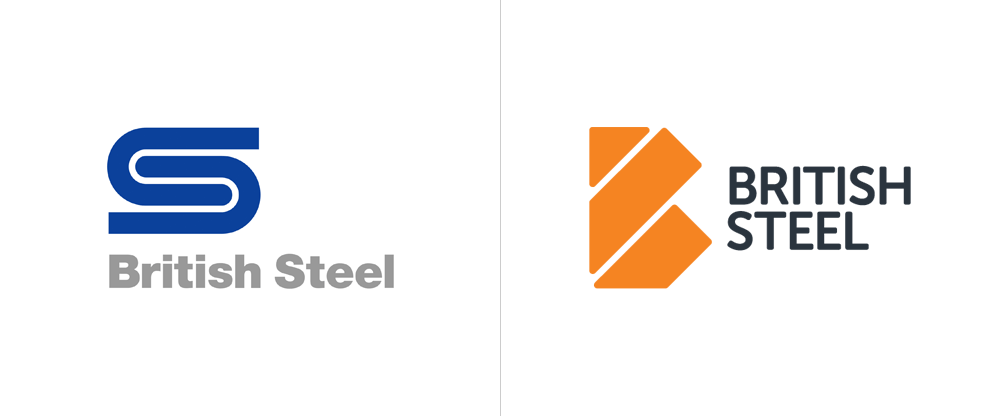
The new British Steel drops Gentleman's logo, forges new one
Here's what Armin has to say about it.
http://www.itsnicethat.com/news/british ... lff-030616
Letter from M.W.
And finally, DesignWeek's take on it.
http://www.designweek.co.uk/issues/30-m ... -branding/
(I would write my own opinion, but I feel as though I've wasted enough space. I'll just wait for you guys.)
The new British Steel drops Gentleman's logo, forges new one
The main icon which is set in “molten orange” and combines the B and S letterforms also appears to look like three strips of steel.
- Press Release
This banal replacement to David Gentleman’s classic British Steel symbol plunges contemporary British graphics to an abysmally low place.
- Micheal Wolff, founder of Wolff Olins
http://www.underconsideration.com/brand ... 1c0GNUrLIUIt could be argued that if they already chose the old name they might as well use the old logo too but I think that using a new logo yields them the best of both worlds: building on an established name but signaling this is a new company.
- Armin Vit, writer of Brand New
Here's what Armin has to say about it.
http://www.itsnicethat.com/news/british ... lff-030616
Letter from M.W.
And finally, DesignWeek's take on it.
http://www.designweek.co.uk/issues/30-m ... -branding/
(I would write my own opinion, but I feel as though I've wasted enough space. I'll just wait for you guys.)
Then again, I'm an American - what do I know?