Another High Street Rebrand

User avatar
Luke-H
Posts: 153
Joined: Sat 18 Jun, 2005 12.21
Location: Selby - N. Yorks

nodnirG kraM wrote:Chichester's branch of Currys had new signage installed last week. It looks naff. As does the new PC World logo next door.
The newly rebranded stores are (or were) part of a full repositioning of the company from box-shifters to a more upmarket chain. The stores with new signage were refitted inside too, and these are known as 'Winning New Revenues' stores. All stores (Currys and PC World) were due to be refitted this way, but the plan has been mainly pulled as it was costing far too much, and they wern't 'winning any new revenues' at all.
steddenm
Posts: 149
Joined: Thu 28 Jul, 2005 10.45
Location: Waitrose
Contact:

McDonald's have had the new refresh in most of their stores now. They started with the McCafe brand in London, then went for just 'M' or a '?' on their advertisments, but now have gone for the more modern feel. Inside the stores is really nice too with some comfy bucket chairs, and now they've introduced their new Little Tasters menu it kinda fits.

Plus, I thought Wimpy went bankrupt, but there are stores popping up all over the place now. Some with the old branding...

Image

and some with the new

Image

Plus, they've just opened a new store in Barnstaple!
Chie
Posts: 979
Joined: Fri 31 Aug, 2007 05.03

A lot of people think Wimpy went bust but there's still a Wimpy in a town not far from here, and there's also one in the Broadmarsh shopping centre in Nottingham. In total there are 194 outlets around Britain.

Technically the new logo isn't new, it's just the one they used in the 60s, 70s and 80s. You can see some examples of the refitted restaurants on the Wimpy website.

Image

I like that one.
Nini
Banned
Posts: 1617
Joined: Fri 19 Oct, 2007 17.14

I know why they're using the incredibly ugly older logo (blame South Africa) but why use everything which puts the fucking chain back 30 years? It's regrettably 80's and if Wimpy still has anything as a pull, it's a campy retro novelty feel.

I do not understand why why Wimpy will not give it in, nothing worse than seeing a company seemingly backpedal its way further into obscurity.
timgraham
Posts: 151
Joined: Sun 15 Jul, 2007 02.26
Location: Melbourne, Australia

I like how McD's refer to themselves as "restaurants". Always.

Image

The ones here had a makeover not that long ago. They almost look vaguely classy - they also have free WiFi now and TV screens which are nice if you're feeling hungover and feel like watching the Morning Show.
Jovis
Posts: 1454
Joined: Fri 25 Aug, 2006 20.08

timgraham wrote:I like how McD's refer to themselves as "restaurants". Always.
Yes, we all know that they're not place where meals are served to the public.
steddenm
Posts: 149
Joined: Thu 28 Jul, 2005 10.45
Location: Waitrose
Contact:

Went into one of the new 'revamped' McDonald's stores yesterday in Preston, and was actually surprised! They had two huge LCDs showing 'Friends' (off DVD, not Channel 4), another LCD with the menu on which kept popping up wierd and wonderful combinations of meals (Like a BigMac with extra Mayo?!), better tills, quick service and a THREE-windowed McDrive!

The Blackpool one we popped into to get a drink (South Shore, near the pier) has huge dot-matrix boards outside and inside telling you all what goes into a chip....
Chie
Posts: 979
Joined: Fri 31 Aug, 2007 05.03

timgraham wrote:The ones here had a makeover not that long ago. They almost look vaguely classy - they also have free WiFi now and TV screens which are nice if you're feeling hungover and feel like watching the Morning Show.
But that's the problem, the new outlets look far too 'grown-up' and proper.

It's McDonald's ffs - it's not supposed to be classy!
User avatar
martindtanderson
Posts: 527
Joined: Tue 23 Dec, 2003 04.03
Location: London, UK
Contact:

Chie wrote:Here's a photo of the redesigned McDonald's in Nottingham:

Image

McDonald's is supposed to be tacky and unhealthy - the American experience of it all was the reason people used to eat there. They've taken all the fun out of McDonald's by doing this I think.
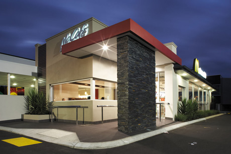
That is arguably the mis-conception around McDonald's...

Burger King has always had the American Fast Food atmosphere involved in its branding, where as the McDonald's brand in the UK has mostly gone its own way from the US stores.

The way McDonald's were 10-15 years ago, is very much how it is presented in the Hotter regions of America, and across locations such as New York.

The UK subsidery have taken steps to limit the unhealthy representation of their menu, by introducing fruit, and sugar-free drinks, to healthy lean cuts of chicken and fish for alternatives to the beef burgers. I don't partake of McDonalds too often, but I have noticed the change in focus, and appreciate the new Decor, prevalent in most of their stores, with the move away from the Reds and Yellows which are used for their deep psycological representation of food. Red berries on trees, and yellow fruit etc, are what many of our ancestors would have eaten as they left their caves, and this is why they are chosen for many fast food signage and branding.

The more "organic" colour pallette, was the key as well as the new menus, whereas their logo font and yellow "golden arches" symbols are a worldwide recognised brand, and so was not to be altered for one region.
Image
DAS
Posts: 925
Joined: Tue 19 Aug, 2003 16.35
Location: The Kingdom of Leather

Nini wrote:I know why they're using the incredibly ugly older logo (blame South Africa) but why use everything which puts the fucking chain back 30 years? It's regrettably 80's and if Wimpy still has anything as a pull, it's a campy retro novelty feel.

I do not understand why why Wimpy will not give it in, nothing worse than seeing a company seemingly backpedal its way further into obscurity.
I'm surprised this seems to be the general opinion. There are a couple of Wimpys in my area, both of which are pretty busy at various times of the day, and do a good trade. I was in a Wimpy yesterday actually and was impressed with how modern and polished it looked. I think it's a clever bit of marketing - why not cash in on the familiar logo and reputation it had in the past, and then build on it with some modern decor and design? Certainly beats the cheapo 90s logo and that yellow thing that followed.
DAS
Posts: 925
Joined: Tue 19 Aug, 2003 16.35
Location: The Kingdom of Leather

DAS wrote:
Nini wrote:I know why they're using the incredibly ugly older logo (blame South Africa) but why use everything which puts the fucking chain back 30 years? It's regrettably 80's and if Wimpy still has anything as a pull, it's a campy retro novelty feel.

I do not understand why why Wimpy will not give it in, nothing worse than seeing a company seemingly backpedal its way further into obscurity.
I'm surprised this seems to be the general opinion. There are a couple of Wimpys in my area, both of which are pretty busy at various times of the day, and do a good trade. I was in a Wimpy yesterday actually and was impressed with how modern and polished it looked. I think it's a clever bit of marketing - why not cash in on the familiar logo and reputation it had in the past, and then build on it with some modern decor and design? Certainly beats the cheapo 90s logo and that yellow thing that followed.
And here's the one I was in yesterday, just in case anybody here is that interested:

Image
Post Reply