Plus, I thought Wimpy went bankrupt, but there are stores popping up all over the place now. Some with the old branding...

and some with the new

Plus, they've just opened a new store in Barnstaple!


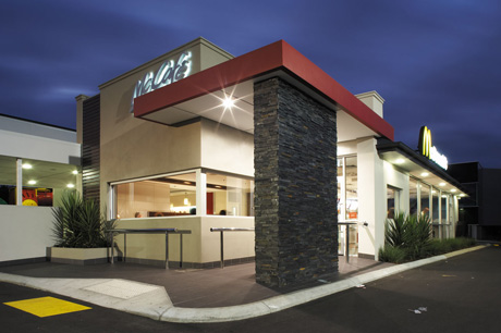
But that's the problem, the new outlets look far too 'grown-up' and proper.timgraham wrote:The ones here had a makeover not that long ago. They almost look vaguely classy - they also have free WiFi now and TV screens which are nice if you're feeling hungover and feel like watching the Morning Show.
That is arguably the mis-conception around McDonald's...Chie wrote:Here's a photo of the redesigned McDonald's in Nottingham:
McDonald's is supposed to be tacky and unhealthy - the American experience of it all was the reason people used to eat there. They've taken all the fun out of McDonald's by doing this I think.
I'm surprised this seems to be the general opinion. There are a couple of Wimpys in my area, both of which are pretty busy at various times of the day, and do a good trade. I was in a Wimpy yesterday actually and was impressed with how modern and polished it looked. I think it's a clever bit of marketing - why not cash in on the familiar logo and reputation it had in the past, and then build on it with some modern decor and design? Certainly beats the cheapo 90s logo and that yellow thing that followed.Nini wrote:I know why they're using the incredibly ugly older logo (blame South Africa) but why use everything which puts the fucking chain back 30 years? It's regrettably 80's and if Wimpy still has anything as a pull, it's a campy retro novelty feel.
I do not understand why why Wimpy will not give it in, nothing worse than seeing a company seemingly backpedal its way further into obscurity.
And here's the one I was in yesterday, just in case anybody here is that interested:DAS wrote:I'm surprised this seems to be the general opinion. There are a couple of Wimpys in my area, both of which are pretty busy at various times of the day, and do a good trade. I was in a Wimpy yesterday actually and was impressed with how modern and polished it looked. I think it's a clever bit of marketing - why not cash in on the familiar logo and reputation it had in the past, and then build on it with some modern decor and design? Certainly beats the cheapo 90s logo and that yellow thing that followed.Nini wrote:I know why they're using the incredibly ugly older logo (blame South Africa) but why use everything which puts the fucking chain back 30 years? It's regrettably 80's and if Wimpy still has anything as a pull, it's a campy retro novelty feel.
I do not understand why why Wimpy will not give it in, nothing worse than seeing a company seemingly backpedal its way further into obscurity.
