
Another High Street Rebrand
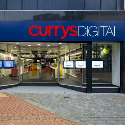
Another brand that seems to have been changed is Currys with the Manchester Arndale Currys Digital store having signage which is predominately navy with a red lowercase Currys lettering and white uppercase Digital lettering. Looked far more slick and modern than the red and green combination but it probably still is far too expensive for products.
http://www.retail-week.com/dsgi-tests-r ... 82.article - apparently this started in September 2008 but its the first i've seen or heard about it!
http://www.retail-week.com/dsgi-tests-r ... 82.article - apparently this started in September 2008 but its the first i've seen or heard about it!
The Currys Digital signage above is only temporary signage as they were due to have a relaunch but couldn't afford it in the end due to the Credit Crunch!
The first I saw of the new Currys branding must have been when they opened a new 'Currys Megastore' store in Wenesbury in West Midlands (which was probably in about September), we got a leaflet through the door I could dig some photos out of it, if you like.
The Currys Digital in the Bulling in Brum seems to get smaller everytime I get in there. It's less that half the size it was when it first opened as 'Dixons XL' but it's still massive.
The Currys Digital in the Bulling in Brum seems to get smaller everytime I get in there. It's less that half the size it was when it first opened as 'Dixons XL' but it's still massive.
They use both terms, they're using Woolies more at the moment to emphasis that it's still the Woolies we all know and love, which it isn't of course.steddenm wrote:Erm... know this might seem a bit strange but since when was the closed-Woolworths rebranded as Woolies?

Does McDonalds have a corporate colour now? They all seem very messed up!
The one in Scarborough Town is blue, with all sepia photos inside.
The one on the outskirts is white, with hideous plastic seats.
Round the corner from my Dads in London, there is a red one, and a green one within about a mile, both with completely different interiors. One has interior walls similar to those in the Inside Sport studio, and one has plain black and white walls.
I do like the new look, its just so, inconsistent.
Here's a photo of the redesigned McDonald's in Nottingham:

McDonald's is supposed to be tacky and unhealthy - the American experience of it all was the reason people used to eat there. They've taken all the fun out of McDonald's by doing this I think.
McDonald's is supposed to be tacky and unhealthy - the American experience of it all was the reason people used to eat there. They've taken all the fun out of McDonald's by doing this I think.
Me too. They've done it in Scuneh too. I'll get some photos when possible.
I like it, much better than the last rehash. That was also carried out in the same "restaurant", and scrapped as soon as possible. Says a lot really.
I like it, much better than the last rehash. That was also carried out in the same "restaurant", and scrapped as soon as possible. Says a lot really.

The New Malpass.

Ireland I think was a test bed for the new designs, ours have been like this for a while, makes a good change from the usual muckyness of Maccy D's
-The Guy Formerly known as djmgpsp
-Follow me... http://www.twitter.com/david_galway
-Catch it, Bin it, Kill it, Bop it!... New to BBC3
-Follow me... http://www.twitter.com/david_galway
-Catch it, Bin it, Kill it, Bop it!... New to BBC3