
Huh, a non-red logo. I've never seen that blue one on the thumbnail before - it's not listed on the Logopedia wiki either.rdobbie wrote: Thu 19 Aug, 2021 04.59 This documentary by Iceland is an absolute belter for supermarket history enthusiasts.
Loads of high quality archive material, thanks to Iceland's in-house archive collection. Very impressive and fascinating.
Another High Street Rebrand
Early sighting of Rail Alphabet 2:
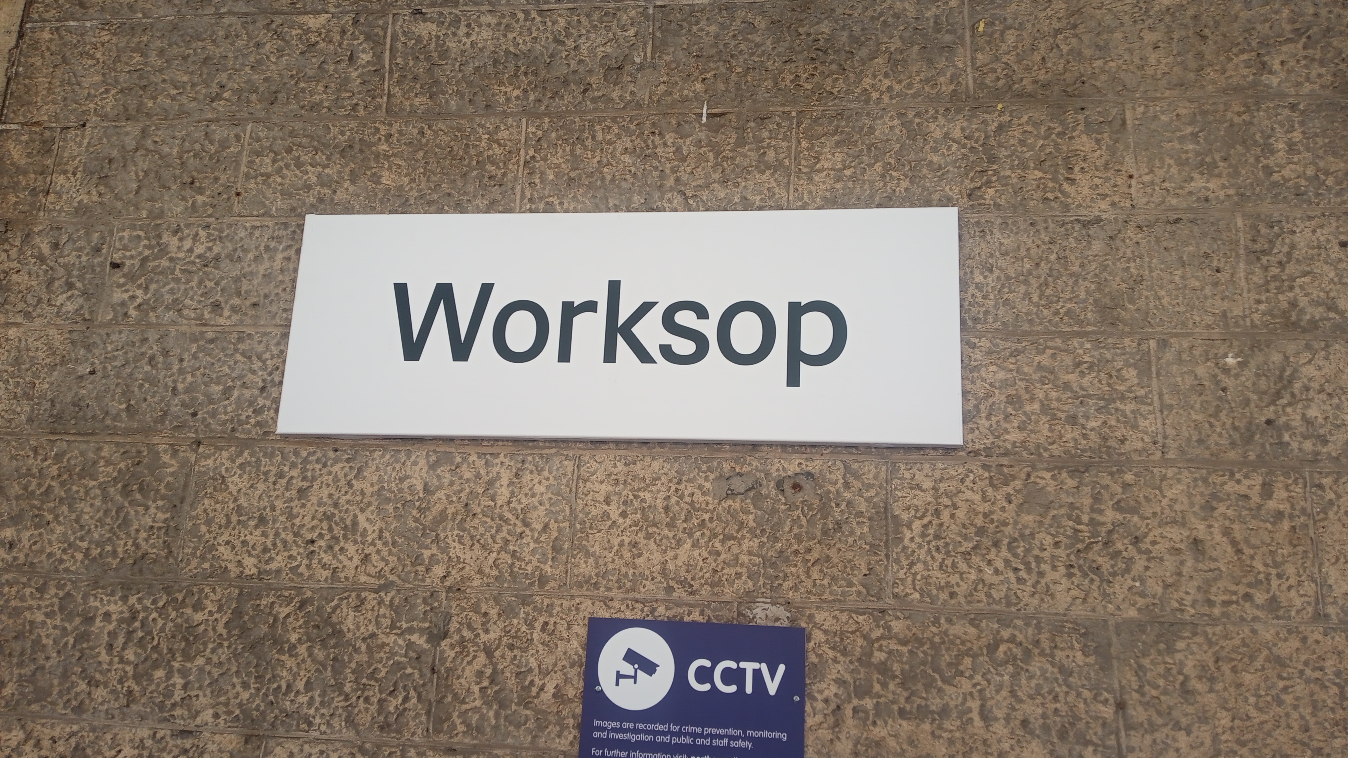
Only on the station nameplates at the moment though, the rest of the signs are a mix of Northern Rail and old British Rail signage.
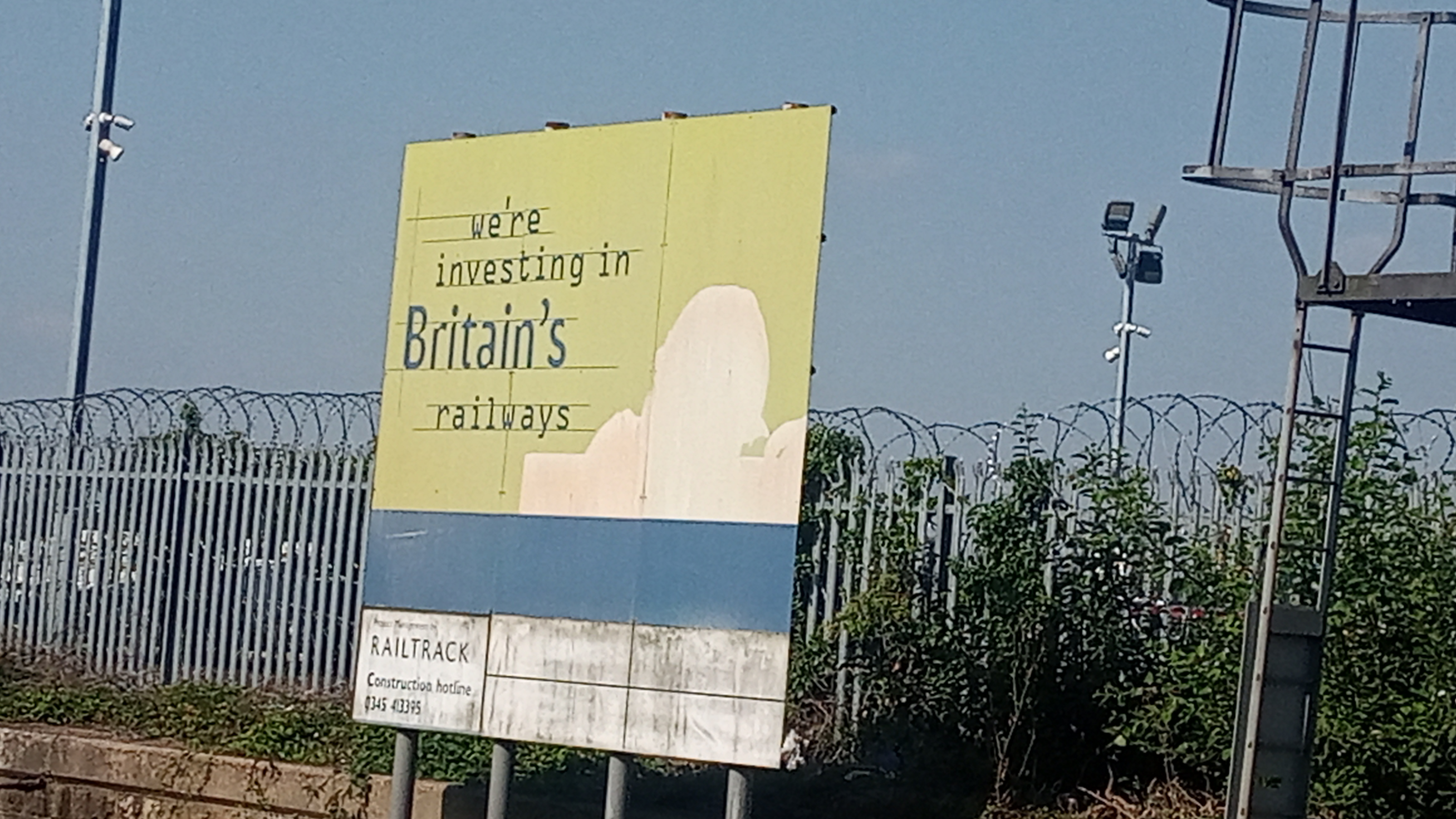
Related, but this is still at one end of the platforms, nearly 20 years after Railtrack ceased to exist:
Only on the station nameplates at the moment though, the rest of the signs are a mix of Northern Rail and old British Rail signage.
Related, but this is still at one end of the platforms, nearly 20 years after Railtrack ceased to exist:
There are plenty of examples of Railtrack signage kicking about still, none as obvious as that one though. What I found interesting is the bridge strike signage which retained the Gill Sans font, some say call Railtrack, others Network Rail but more recent examples (in the last 10 years) simply read 'The railway authority' - I do wonder if this was for the inevitable rebranding of the infrastructure owners or in case the railway was to become renationalised.
Rail Alphabet 2 is cropping up all over now, there was some signage at King's Cross and Cheshunt that uses it - I think the latter were new trespass warning signs.
Rail Alphabet 2 is cropping up all over now, there was some signage at King's Cross and Cheshunt that uses it - I think the latter were new trespass warning signs.
I’ve noticed that John Lewis and Waitrose don’t always verbally include the ‘and Partners’ bit in their advertising. Maybe there are valid reasons for not doing so, but if they’re not going to use their ‘full name’, nobody else will.
I always saw the intention behind the move, but it was never going to catch on. It always felt like a temporary move to me.
I always saw the intention behind the move, but it was never going to catch on. It always felt like a temporary move to me.
-
scottishtv
- Posts: 770
- Joined: Thu 01 Apr, 2004 15.36
- Location: Edinburgh
I see Highways England has re-branded as National Highways.
 >>>
>>>
However, the website URL redirects to https://highwaysengland.co.uk/ and the Traffic England website is all still Highways England branded, as are the motorway camera images and other things.
It's a shame they didn't just revert back to the Highways Agency name (and far superior logo).

However, the website URL redirects to https://highwaysengland.co.uk/ and the Traffic England website is all still Highways England branded, as are the motorway camera images and other things.
It's a shame they didn't just revert back to the Highways Agency name (and far superior logo).
-
thecorrector
- Posts: 8
- Joined: Tue 31 May, 2016 19.57
Homebase have opened their first new store in a very long time (in Oxfordshire) and seem to be trialling a new logo:

That logo was first seen in April.
woah wrote: Wed 14 Apr, 2021 17.02 After Next removed their garden range from their Home stores that had it (which happened a couple of years ago) it looks like they've partnered with Homebase to fill the gap left in the stores:
https://www.retailgazette.co.uk/blog/20 ... s-in-next/
And - it looks like a revised Homebase logo? I wonder if we'll see it roll out more widely.
They do seem to have stopped their endless store closures and put a bigger focus on their homewares, so perhaps they're doing better than they were. The two Homebases near me are both in dire need of modernising though.
It was used in the early-mid 80s before the red and orange blocks were introduced.JAS84 wrote: Sat 21 Aug, 2021 00.25Huh, a non-red logo. I've never seen that blue one on the thumbnail before - it's not listed on the Logopedia wiki either.rdobbie wrote: Thu 19 Aug, 2021 04.59 This documentary by Iceland is an absolute belter for supermarket history enthusiasts.
Loads of high quality archive material, thanks to Iceland's in-house archive collection. Very impressive and fascinating.
-
scottishtv
- Posts: 770
- Joined: Thu 01 Apr, 2004 15.36
- Location: Edinburgh
Some Co-ops (including Glasgow city centre) are now temporarily Co-op 26: