Glad to see the black-on-white Rail Alphabet (or at least an updating of it) signage returning, I've never liked any of the replacement styles used by Network Rail or any of the TOCs, not to mention the fact that when TOCs changed they had to either spend money replacing the signs or keeping up signs in a former company's corporate style. I never felt the old British Rail style of signage had dated even though it was from the mid-60s.martindtanderson wrote: Thu 20 May, 2021 19.29 So a mini-revival of British Rail is coming, with Network Rail updating their Station Signage and Wayfinding guidelines, and the government's plan to unify the Railways under the Great British Railways name, and a re-assertion of the "Double Arrows" icon.
Great British Railways will use updated versions of the classic ‘double arrow’ logo as well as the Rail Alphabet typeface, used in this document. Even after 25 years of privatisation, the logo remains the most widely-used and best-recognised symbol of the railways. It is the standard marker on road signs. It appears on most tickets, online, and at the vast majority of stations. It will stay in those places and increasingly appear on trains, uniforms and publicity material too as and when these are upgraded or replaced as a single, unifying brand for the railways. Keeping it also avoids spending money on yet another new railway logo.
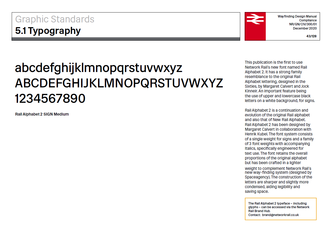
Ironic that the likes of GWR and Transport for Wales have only recently stopped using Rail Alphabet signage and started replacing signs in their new corporate styles, and now we're going back wholesale to it.