
Yet another Morrisons thread
-
bilky asko
- Posts: 1463
- Joined: Sat 08 Nov, 2008 19.48
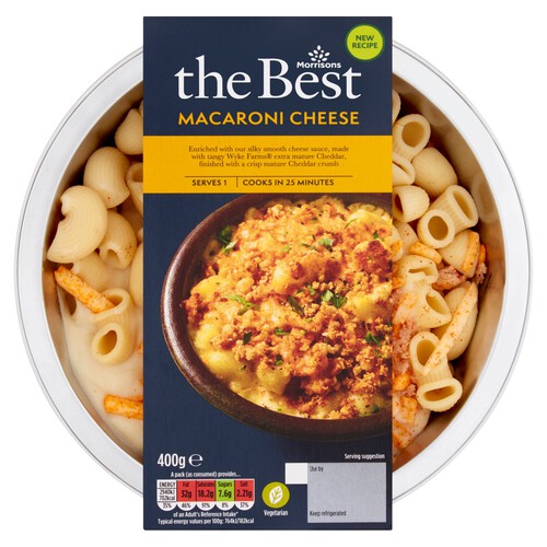
Now the Morrisons More scheme has come to an end, the app has been renamed My Morrisons. I was busy activating my offers when I spotted some new The Best packaging:
Below is the previous packaging:
The new style seems a bit less Morrisons-y to me.
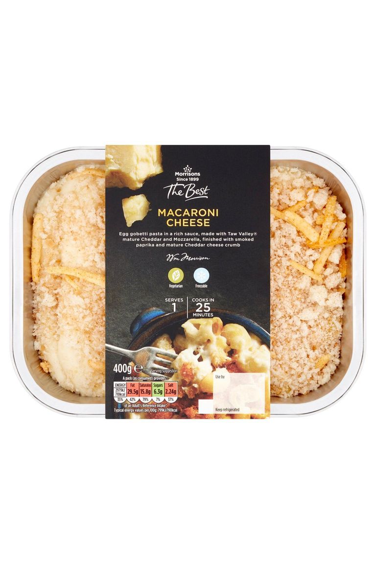
Below is the previous packaging:
The new style seems a bit less Morrisons-y to me.

-
robschneider
- Posts: 324
- Joined: Wed 14 Aug, 2013 14.53
It was.
Never a fan of a photograph when you have a clear window into the product itself.
Never a fan of a photograph when you have a clear window into the product itself.
-
bilky asko
- Posts: 1463
- Joined: Sat 08 Nov, 2008 19.48
Yes, and revived after a period as Morrisons Signature.Pete wrote: Wed 12 May, 2021 15.29 Wasn't the best logo one of the few remaining bits of Safeway still in use?
It was! Here's the original (from rdobbie on page 87 of this thread):Pete wrote: Wed 12 May, 2021 15.29 Wasn't the best logo one of the few remaining bits of Safeway still in use?
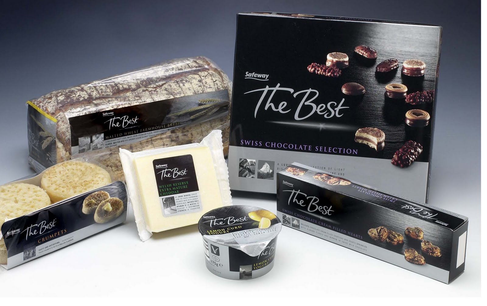
Sad to see it go after about 20 years on and off. I was just thinking the other day how good it still looks (better than the new one, I'd say). It does look a bit awkward in a stack with the tree logo though.
-
all new Phil
- Posts: 2042
- Joined: Sun 13 Feb, 2005 00.04
- Location: Next door to Hell
But the clear window shows the uncooked product, the picture shows it cooked.robschneider wrote: Wed 12 May, 2021 17.44 It was.
Never a fan of a photograph when you have a clear window into the product itself.
-
robschneider
- Posts: 324
- Joined: Wed 14 Aug, 2013 14.53
true, I always thought it was a branding no-no?all new Phil wrote: Wed 12 May, 2021 21.30But the clear window shows the uncooked product, the picture shows it cooked.robschneider wrote: Wed 12 May, 2021 17.44 It was.
Never a fan of a photograph when you have a clear window into the product itself.
I think the issue there is the use of the Since 1899. If they removed that element it'd be more elegant.Jacket wrote: Wed 12 May, 2021 19.52It does look a bit awkward in a stack with the tree logo though.
"He has to be larger than bacon"
-
all new Phil
- Posts: 2042
- Joined: Sun 13 Feb, 2005 00.04
- Location: Next door to Hell
Not a fan of the new More card scheme. Can’t be bothered with this opting in to deals faffing that it seems like all loyalty schemes now do.
In other news Morrisons seem to be using a new font (yet another one) for a lot of their stuff. The updated branding for the More card uses it and I’m seeing it on a few things in store too. Not too sure how to describe it other than it’s a bit wobbly round the edges.
In other news Morrisons seem to be using a new font (yet another one) for a lot of their stuff. The updated branding for the More card uses it and I’m seeing it on a few things in store too. Not too sure how to describe it other than it’s a bit wobbly round the edges.

Nor me, and having looked the offers are 10% off 3 products I've never bought and have no interest in.all new Phil wrote: Thu 27 May, 2021 08.01 Not a fan of the new More card scheme. Can’t be bothered with this opting in to deals faffing that it seems like all loyalty schemes now do.