
Another High Street Rebrand
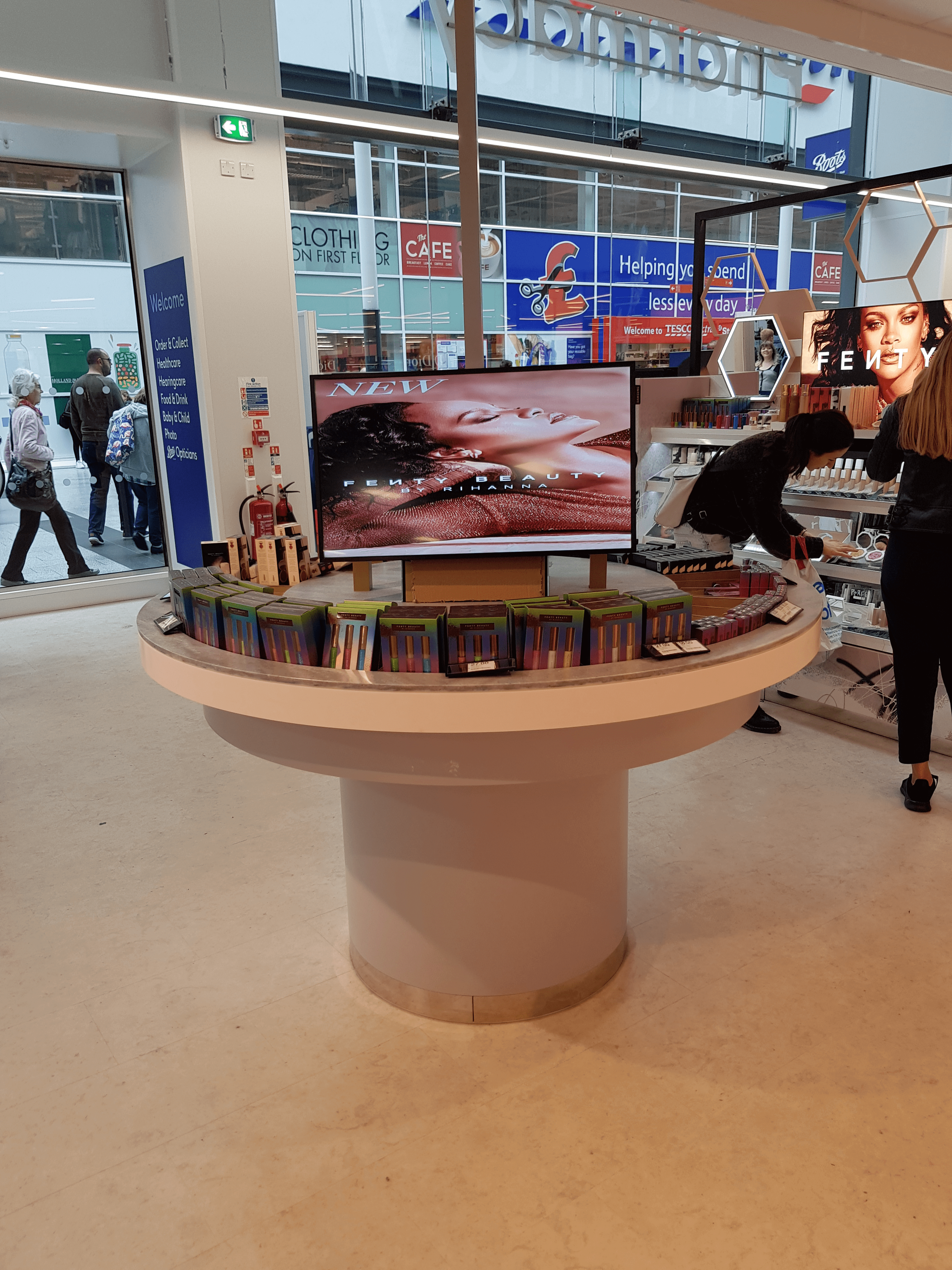
The new branding for Boots is installed at St Pancras International station - the main store located at the rear of the station is undergoing a major refurbishment (hasn't been done since around 2007 apparently). Looks quite nice without the oval.
A fair bit of the VAG branding still in place, there was some with Myriad seen during the works.
A fair bit of the VAG branding still in place, there was some with Myriad seen during the works.
-
bilky asko
- Posts: 1463
- Joined: Sat 08 Nov, 2008 19.48
Congratulations to Benjamin Shatliff on becoming manager of the new Boots in Hull St. Stephen's!

It'll be interesting to see how they roll things out to the smaller stores. One of their perennial problems has always been that signage is designed for big stores and then rammed into the tiny high street pharmacies.
"He has to be larger than bacon"

It also looks pretty shit in older large locations with low ceilings.Pete wrote: Sat 08 Jun, 2019 22.44 It'll be interesting to see how they roll things out to the smaller stores. One of their perennial problems has always been that signage is designed for big stores and then rammed into the tiny high street pharmacies.
There's a fair bit on the web about IKEA's tweaked logo - but I can't see much mention of their new typeface. I'm assuming it's custom; it's less ugly than Verdana but not as nice as Futura; and at the moment all three are being used all over my local store. Maybe it'll be in universal use in about 20 years' time.
Warrington still uses Futura in lots of places, ten years after the switch to Verdana, and not just on permanent signage but printed labels for products.thegeek wrote: Sun 09 Jun, 2019 19.28 There's a fair bit on the web about IKEA's tweaked logo - but I can't see much mention of their new typeface. I'm assuming it's custom; it's less ugly than Verdana but not as nice as Futura; and at the moment all three are being used all over my local store. Maybe it'll be in universal use in about 20 years' time.


Complete with a rebrand for Virgin Money in the process judging by this video: