
The Co Op travel in my town was shut recently in favour of revamping the existing Thomas Cook a minutes walk away. Never understood why Cooks acquired them when they already had a massively bloated estate of travel agents (at one point we also had a Going Places so three Thomas Cook shops in a very small town!)Critique wrote:What's the deal with the national Co-op chain having stores in areas where Scotmid, the EoE Co-op operates? There's one Co-operative in Norwich that I know of, otherwise I can't recall ever having seen one in our area - we used to have Co-operative travel stores here but the one local to me closed years ago now, with an EoE Co-op travel now inside a big co-op here.
Another High Street Rebrand
-
robschneider
- Posts: 324
- Joined: Wed 14 Aug, 2013 14.53
-
thecorrector
- Posts: 8
- Joined: Tue 31 May, 2016 19.57
This...
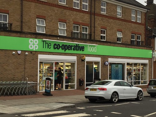
...became this today...

Note the 'Co-operative food' sticker still in the front window. Still, a marked improvement - and interesting they replaced the white hanging sign you can just see in the first picture with a permanent, thicker blue one.
...became this today...
Note the 'Co-operative food' sticker still in the front window. Still, a marked improvement - and interesting they replaced the white hanging sign you can just see in the first picture with a permanent, thicker blue one.

One of the local Co-op's has finally finished it's transformation and opened this morning:

A lot more bright and pleasant on the inside with more open windows at the front of the store - I never did understand why the Co-operative Food refurbishments usually involved moving the kiosk right in front of the windows. New luxuries as well such as self service registers and pleasant staff. They seem to have taken on some new people, and there were what appeared to be a couple of senior managers in the store being quite forceful in ensuring all the staff were being extremely smiley and helpful. Time will tell how things turn out long term...

A lot more bright and pleasant on the inside with more open windows at the front of the store - I never did understand why the Co-operative Food refurbishments usually involved moving the kiosk right in front of the windows. New luxuries as well such as self service registers and pleasant staff. They seem to have taken on some new people, and there were what appeared to be a couple of senior managers in the store being quite forceful in ensuring all the staff were being extremely smiley and helpful. Time will tell how things turn out long term...
Not sure I like this one to be honest. Nowhere near as eye-catching and just exposes the dirty brickwork underneath.thecorrector wrote:This...
...became this today...
Note the 'Co-operative food' sticker still in the front window. Still, a marked improvement - and interesting they replaced the white hanging sign you can just see in the first picture with a permanent, thicker blue one.

-
thecorrector
- Posts: 8
- Joined: Tue 31 May, 2016 19.57
https://www.flickr.com/photos/143605116 ... Ak5-GMPN3GPete wrote:Do you have a bigger version of that photo? Looks really classy
-
thecorrector
- Posts: 8
- Joined: Tue 31 May, 2016 19.57
The Horn Lane Co-op's had even more changes in the last week - going from this...
...to this...
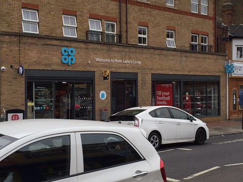
Lettering now in white, window/door frames repainted grey, opening hours sticker updated to reflect the new branding. If anything, though, the store stands out even less with that lack of white.
Interestingly, the hanging Co-op sign lights up at night in a neon blue, but the one over the door doesn't.
...to this...
Lettering now in white, window/door frames repainted grey, opening hours sticker updated to reflect the new branding. If anything, though, the store stands out even less with that lack of white.
Interestingly, the hanging Co-op sign lights up at night in a neon blue, but the one over the door doesn't.
Do you have some sort of influence in high places?Critique wrote:certainly white lettering would have been better IMO.
-
Martin Phillp
- Posts: 1601
- Joined: Wed 11 May, 2011 01.28
That's a lot better.
TVF's London Lite.