
The taste of Cadbury's now is cr@p since they moved the entire production line from Birmingham (and elsewhere in the UK) to Poland. It's not the same anymore, I won't buy Cadbury's chocolate, Galaxy is the next best alternative.WillPS wrote:For a brand with the cache of Cadburys Dairy Milk, it's surprising how often they seem to revise their branding. Are they losing market share or something?
Another High Street Rebrand
-
simonipswich
- Posts: 40
- Joined: Tue 21 May, 2013 14.11
- Location: Ipswich
I'm not sure that's quite true though, is it? They closed down their factory near Bristol. But there hasn't been massive job losses in Birmingham has there?simonipswich wrote:The taste of Cadbury's now is cr@p since they moved the entire production line from Birmingham (and elsewhere in the UK) to Poland.
Also suggestion is the change in shape might be the reason it tastes different.
What I find interesting is they make Dairy Milk and Caramello for the Irish market in Ireland still and big play is made of it. Also Flake for our market, and a few others we get here are made their too.
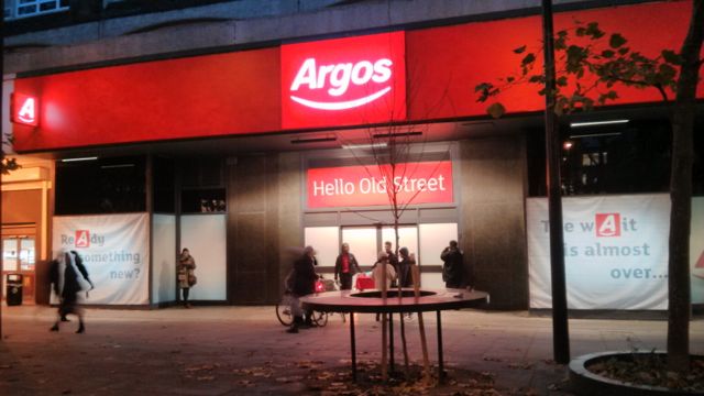
I prefer it to the cyan backdrop of the previous brand. Interesting that they've gone for just the 'A' with the line underneath on the flag box sign though - they don't use an icon in that way anywhere else on their branding and I don't see that it's recognisable enough to say 'Argos' on it's own.thegeek wrote:It's very.. red.
That logo still feels very generic compared to the previous incarnation.

But surely you have to start somewhere.cwathen wrote:they don't use an icon in that way anywhere else on their branding and I don't see that it's recognisable enough to say 'Argos' on it's own.
The old logo looks dated in comparison though.Philip wrote:That logo still feels very generic compared to the previous incarnation.
Sainsbury's have been very quick in rolling the new logo/livery out to the delivery vans, I note. I certainly haven't seen any sporting the old logo in the past month or so - this is quite refreshing compared to how long it took Sky to change the logos on their vans/update the livery so it wasn't *still* advertising Wallace and Gromit: Curse of the Were-Rabbit being 'on Sky Movies' or the Simpsons on Sky ONC.
Wimpy (yes, they're still going) appear to have changed their brand to something that's harking back to the original.
ye olde:

this is how it looked last time I saw one (in Epping, just last year - though it was closed for refurbishment):

the new (apparently rolling out since 2008 - who knew?):

in some places, they appear to be using the Matt Groening handwriting font for their tagline:

but that's by no means consistent:

They also have two websites: http://www.wimpy.uk.com and http://www.wimpyuk.co.uk, and an engaging social media strategy.
ye olde:
this is how it looked last time I saw one (in Epping, just last year - though it was closed for refurbishment):
the new (apparently rolling out since 2008 - who knew?):
in some places, they appear to be using the Matt Groening handwriting font for their tagline:
but that's by no means consistent:
They also have two websites: http://www.wimpy.uk.com and http://www.wimpyuk.co.uk, and an engaging social media strategy.
That news is about 8 years old now. Wimpy UK got bought out by Wimpy South Africa (which had continued to use the original logo after being spun off from the mothership many years ago). Wimpy SA quite wisely realised the only thing going for Wimpy in the UK was nostalgia so decided to roll out its logo over here.thegeek wrote:Wimpy (yes, they're still going) appear to have changed their brand to something that's harking back to the original.
-
all new Phil
- Posts: 2037
- Joined: Sun 13 Feb, 2005 00.04
- Location: Next door to Hell
I only noticed it briefly as I drove past today, but a branch of B&M Bargains near me appears to now be called Kwik Save. Same old red and white logo. Whatsallthataboutthen?