You think? That's a shame. I was considering launching a whole network of pres-related websites featuring such logos.James L H wrote:I'm sorry but what the hell is that?WillPS wrote:Yes. I think the fact its a pastiche of a 2012-specific logo makes it inherently dated.
Something like this would be more contemporary:
The current Metropol logo may be ageing now, however to move from a decent design to something that looks like it uses the SEGA font is ridiculous! Is it actually the SEGA font? If it is then lets be honest, it was dated pretty much from its creation! I sincerely hope it isn't used as the new logo - talk about killing off a good brand.
Metropol logo
I don't get it.....WillPS wrote:James L H wrote:You think? That's a shame. I was considering launching a whole network of pres-related websites featuring such logos.WillPS wrote:Yes. I think the fact its a pastiche of a 2012-specific logo makes it inherently dated.
Something like this would be more contemporary:
I'm sorry but what the hell is that?


-
bilky asko
- Posts: 1463
- Joined: Sat 08 Nov, 2008 19.48
If you're going to make a new logo, I suggest basing it on the much-lambasted London 2012 logo, but match it with the current logo by colouring it red and white. Don't forget a shadow to make it blend in.
Good plan.bilky asko wrote:If you're going to make a new logo, I suggest basing it on the much-lambasted London 2012 logo, but match it with the current logo by colouring it red and white. Don't forget a shadow to make it blend in.
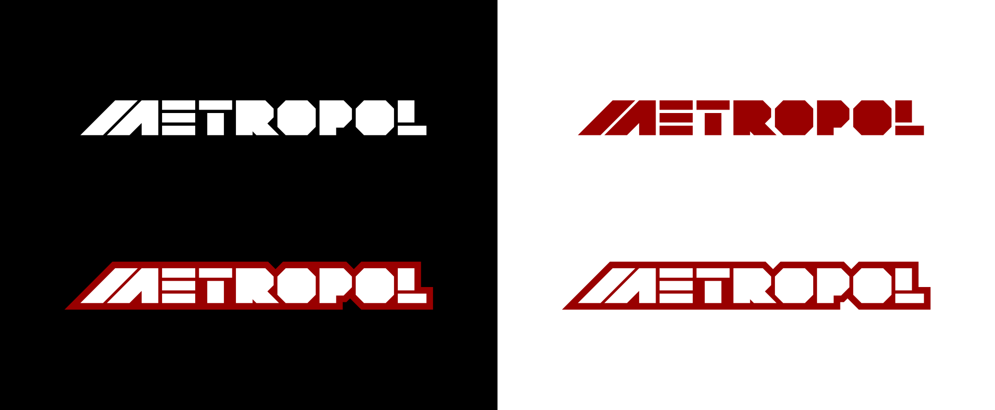
Here is the new logo

*THANK YOU*
"He has to be larger than bacon"
-
martindtanderson

- Posts: 527
- Joined: Tue 23 Dec, 2003 04.03
- Location: London, UK
- Contact:


-
martindtanderson
- Posts: 527
- Joined: Tue 23 Dec, 2003 04.03
- Location: London, UK
- Contact: