

Fits in with Windows 8 but I still think the concept is a bit meh.martindtanderson wrote:Not exactly high-street, more like Back Office, but here is Office 2013
Another High Street Rebrand

Seems to be targeted at the dead/dying person market...
-
martindtanderson

- Posts: 527
- Joined: Tue 23 Dec, 2003 04.03
- Location: London, UK
- Contact:
So you are saying the logo looks like a signature on a DNR form?WillPS wrote:Seems to be targeted at the dead/dying person market...

-
Andrew Wood

- Posts: 279
- Joined: Fri 15 Aug, 2003 23.24
- Location: Location: Location
- Contact:
Again - not a rebrand - but this time a packaging change:
I've just seen an advert for Flash floor cleaners celebrating their 50th(?) anniversary. The pack shot showed the range in a modern yet retro take on their early designs with the emphasis on the Flash typeface and the reintroduction of the black-and-white floor tiles design.
Looks quite good (especially if you can remember the earlier packaging!)
-
scottishtv
- Posts: 770
- Joined: Thu 01 Apr, 2004 15.36
- Location: Edinburgh
Flash seem to be running a TV ad at the moment featuring excerpts of all their ads over the last couple of decades. Can't say if irritates or entertains yet, only spotted it when passing a shop window the other day.

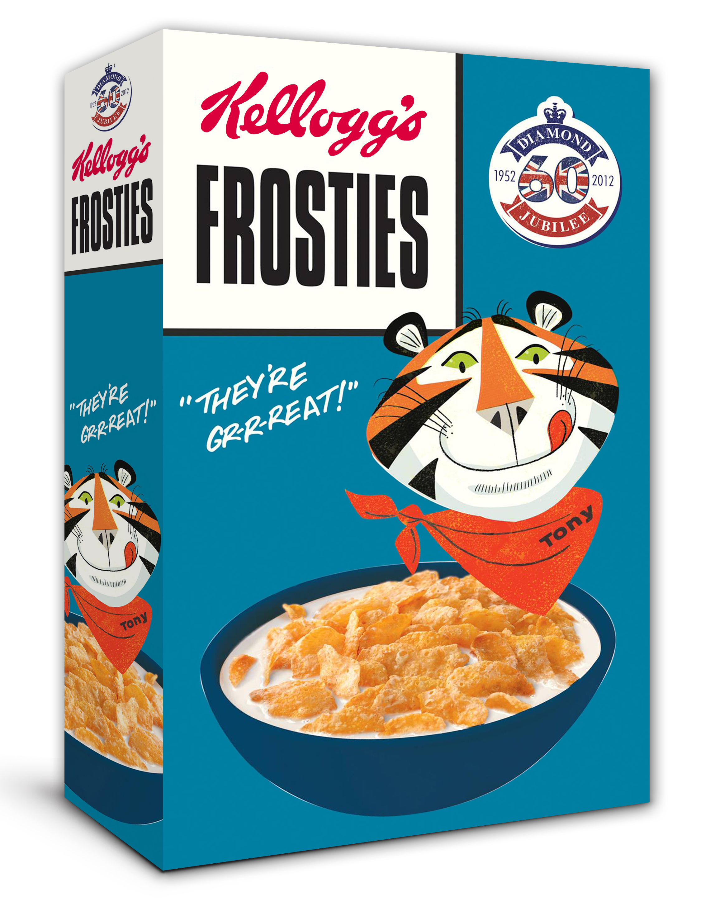
Why don't you keep the box and just replace the bag inside when you buy a new box?Pete wrote:Yes I'm rather fond of this retro packaging thing at the moment. I was rather irked that Kelloggs only used their *FAB* retro Frosties pack for the Jubillee instead of it being a longer term thing.
http://www.clintoncards.co.uk/news
Clintons have introduced a new logo - seems like an effort to improve their offering since they went into administration a while back. I saw it this afternoon as they're opening a newly refurbished store here in Sheffield tomorrow and the signs were being put up, so sounds like they might be refurbishing their 100 biggest, or top selling stores.
Personally I think the logo is pretty rubbish, and the shop in the pictures looks very similar to the standard Clintons store - and from what I could see in our store today though a small gap, our store looks very similar too!
-
Andrew Wood
- Posts: 279
- Joined: Fri 15 Aug, 2003 23.24
- Location: Location: Location
- Contact:
Discussed on the previous page.
You're quite right - must have missed it among the Frosties/Olympic talk. Apologies!Andrew Wood wrote:Discussed on the previous page.