
Microsoft's history with restricting colour schemes does not bode well for this...with XP by default you only had a choice of fisher price blue, overly cold silver, or some minging olive green scheme. With Vista you can have such essentials as pink and teal but not green (unless you want to get the custom colour mixer out anyway).Also there will be a limited selection of colours you can pick from, but they have much more of an impact than the Aero Glass colour does, so the colour schemes have been carefully designed - hence the more limited choice.
Another High Street Rebrand
-
aeonsource

- Posts: 94
- Joined: Tue 03 Jun, 2008 15.02
For comparison, the logo of the first version of Windows.Neil DG wrote:It feels very retro.WillPS wrote:
No I don't like it.

:V
Wasn't there two blues? I seem to remember the standard blue and 'Energy Blue', whatever that means. It reminds me of when sportswear companies refer to colours like "electricity", otherwise known as orange.cwathen wrote:Microsoft's history with restricting colour schemes does not bode well for this...with XP by default you only had a choice of fisher price blue, overly cold silver, or some minging olive green scheme.

The New Malpass.
That scheme was only on the Media Centre edition. The standard selection for Windows XP was indeed blue, silver, and olive green.
http://en.wikipedia.org/wiki/Windows_XP_themes
http://en.wikipedia.org/wiki/Windows_XP_themes

To be fair, XP-era themes were all bitmap-based, so the colour limits were understandable. Re: Vista/7, I'm not sure what your point is - you can't have a colour...unless you....pick....it?cwathen wrote:Microsoft's history with restricting colour schemes does not bode well for this...with XP by default you only had a choice of fisher price blue, overly cold silver, or some minging olive green scheme. With Vista you can have such essentials as pink and teal but not green (unless you want to get the custom colour mixer out anyway).Also there will be a limited selection of colours you can pick from, but they have much more of an impact than the Aero Glass colour does, so the colour schemes have been carefully designed - hence the more limited choice.

Going back to University's rebranding unnecessarily - my university, Sheffield Hallam, has begun it's second rebrand inside of a decade.
Early 00s:

Mid 00s:

2012:
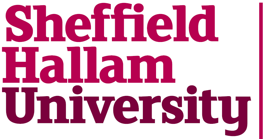
So they've spent another god knows how much of tuition fee revenue on getting a graphic designer to copy The Guardian. Brilliant.
I now face having to either use an outdated logo on my work or breaking the rigid consistency of my presentation for a new, bland, logo. Was it really necessary to dispose of the Hallam crest?
Early 00s:
Mid 00s:
2012:
So they've spent another god knows how much of tuition fee revenue on getting a graphic designer to copy The Guardian. Brilliant.
I now face having to either use an outdated logo on my work or breaking the rigid consistency of my presentation for a new, bland, logo. Was it really necessary to dispose of the Hallam crest?

The mind boggles as to how these universities can justify spending such huge sums of money on rebrands, especially when the logo just involves the designer picking out a nice font and a couple of Pantone colours.
It's the same story with Salford University who've spent an incredible £132,000 on a similar thing:
http://menmedia.co.uk/manchesterevening ... manchester
What's even worse is that the Uni has its own faculty of graphic design, but instead thought it was prudent to give £132,000 to a London agency. I'm sure one of their own students would have happily done something better for free, and would have been delighted with the kudos it gave to his/her CV.
-
tillyoshea

- Posts: 373
- Joined: Sun 23 Nov, 2003 14.34
- Location: Newcastle upon Tyne
- Contact:
rdobbie wrote:It's the same story with Salford University who've spent an incredible £132,000 on a similar thing:
http://menmedia.co.uk/manchesterevening ... manchester
So, presumably, the most important thing to students and staff was "it's near Manchester"...Article above wrote:The University of Salford brand is much more than a logo or design. It was the result of extensive research and consultation, including with more than 500 students and staff who were asked about which university values were important to them.
It really does my head in. The Cantor family recently donated a few million to the University also, so what does the University do? Spend a good chunk of that on new signage to rename a building (which itself only opened 3 years ago) after them. A new building opens in the next 18 months - would it not have been an idea to name that building after them?
Even if not spending that would only take £20 off everybody's tuition fees, it's worth it.
Even if not spending that would only take £20 off everybody's tuition fees, it's worth it.