
That post has led me to this interesting BBC News article http://www.bbc.co.uk/news/business-16469761
Which also reveals that 99p stores have entered the Irish market also with it's 'Euro 50 Stores'.
http://euro50stores.com/
Another High Street Rebrand

Heh - so the situation where Poundland is a penny more over here is reversed in Ireland!

No I don't like it.


A lot of the blurb seems to be saying "no you need to see it in motion, honest" but - meh. Do not like the dodgy perspective on the window, do not like the single colour, do not like the typography. Do not like.Jake wrote:
It's interesting that the logo on the designer's site is different. Can't say I'm a huge fan of either, though I prefer this one, but I'm sure they'll grow on me when I see them in real life usage.
More info on the design here
-
bilky asko
- Posts: 1462
- Joined: Sat 08 Nov, 2008 19.48
I think versatility is the key with the logo. Because of the simplicity, it can be used in myriad different ways. Of course, if they just slap it on everything, it will be shite.WillPS wrote:
I think the logo would be better white-on-blue.
-
martindtanderson

- Posts: 527
- Joined: Tue 23 Dec, 2003 04.03
- Location: London, UK
- Contact:
The Logo's colours will take on the chosen colour in the OS - Similar to the accent colour on Windows Phone.
These are the colours we know about from the leaks so far of Windows 8.
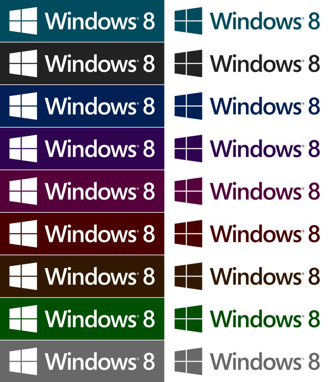
These are the colours we know about from the leaks so far of Windows 8.

-
bilky asko
- Posts: 1462
- Joined: Sat 08 Nov, 2008 19.48
If Windows 7 is anything to go by, it should be possible to select any colour - I have to say it looks much nicer with other colours, and as I mentioned before white-on-colour.martindtanderson wrote:The Logo's colours will take on the chosen colour in the OS - Similar to the accent colour on Windows Phone.
These are the colours we know about from the leaks so far of Windows 8.
If the logo is animated within the OS, hopefully decent rendering will produce a nice-looking result. It's also a massive advantage in terms of advertising, as it will be almost impossible for someobody to bugger up the way the logo is presented if is monochromatic.
-
martindtanderson
- Posts: 527
- Joined: Tue 23 Dec, 2003 04.03
- Location: London, UK
- Contact:
You say that, but according to the design agency Pentagram, the logo should be re-drawn for each size, to ensure the gaps between the tiles/pane on the windows symbol remain the same width. And on the Windows 8 blog post, they used a smaller drawn version of the logo, which is why the gaps are so big!bilky asko wrote: If Windows 7 is anything to go by, it should be possible to select any colour - I have to say it looks much nicer with other colours, and as I mentioned before white-on-colour.
If the logo is animated within the OS, hopefully decent rendering will produce a nice-looking result. It's also a massive advantage in terms of advertising, as it will be almost impossible for someobody to bugger up the way the logo is presented if is monochromatic.
Also there will be a limited selection of colours you can pick from, but they have much more of an impact than the Aero Glass colour does, so the colour schemes have been carefully designed - hence the more limited choice.