
The *OFFICIAL* Asda thread
-
Andrew Wood

- Posts: 279
- Joined: Fri 15 Aug, 2003 23.24
- Location: Location: Location
- Contact:
-
all new Phil
- Posts: 2037
- Joined: Sun 13 Feb, 2005 00.04
- Location: Next door to Hell
No, hence I made reference to *NEW STYLE*.Chie wrote:You mean like this?
The labels have been like that for years.
Tsk.

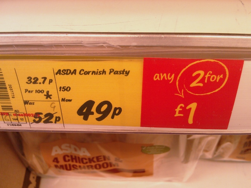
It might be a saving of 3p when you buy ONE but if you buy TWO you're paying 2p more! (49p each or 2 for £1)!Mattarz wrote:WOW. A SAVING OF 3 PENCE.all new Phil wrote:No, hence I made reference to *NEW STYLE*.Chie wrote:You mean like this?
The labels have been like that for years.
Tsk.
I must bulk buy them at once.
-
Nick Harvey

- God
- Posts: 4168
- Joined: Fri 15 Aug, 2003 22.26
- Location: Deepest Wiltshire
- Contact:
I know someone who plays that trick when selling raffle tickets. Ten pence each or nine for a pound!
I've seen the new labels. They look ridiculous and so does this:all new Phil wrote:No, hence I made reference to *NEW STYLE*.
Tsk.

Yuck. The person who designed this effort obviously has no idea that green and black as a combination denote evil and poison, thereby eliciting a strong negative response.

I like it. ASDA Price is such a strong branding message it was stupid to neglect it for so long.

Whereas thankfully they plumped for green and brown, which only elicits semen.Chie wrote:I've seen the new labels. They look ridiculous and so does this:all new Phil wrote:No, hence I made reference to *NEW STYLE*.
Tsk.
Yuck. The person who designed this effort obviously has no idea that green and black as a combination denote evil and poison, thereby eliciting a strong negative response.
-
Invent Meridian
- Posts: 44
- Joined: Sun 19 Apr, 2009 08.02
- Location: Portsmouth
Originally 'ASDA Price' was just a slogan to advertise ASDA's 'low prices'. This new campaign however uses 'ASDA Price' as a name for their money back promise. If you could have got the same shopping at another supermarket cheaper then ASDA will give you the difference back. It is nice to see hoever they have continued with the black and green colours inherited from the 'Permanantly Low Prices Forever' campaign.Chie wrote:
This logo I have made however looks better and less cluttered I think.

Please note it is supposed to be an oval not a rectangle. Metropol cannot seem to handle transparent backgrounds!

