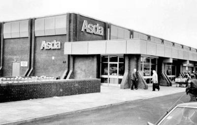
Seems to have worked fine for Asda too.wells wrote:That's very nice branding, although I'm not sure I'm massive fan of supermarket using the colour green, it only seems to work in Waitrose for me.
Yet another Morrisons thread
Tell me about it! I don't think there's much 'Safeway' left about it though in honesty - looks like a rebadged Checkers supermarket.
Any update on the Gibraltar Morrisons? Has it been brought in to the line with the rest of their supermarkets?
Further to my point that Morrisons is managed by idiots: just a few years after they disposed of the smaller 'Safeway compact' stores on the grounds that they're too small, they buy a load of ex-Co-op and Somerfield stores of a similar size. Go figure! That along with my previous point about forking out (probably) millions to rebrand a set of stores only to then rebrand the whole chain a couple of years later...
Oops yes, apologies.wells wrote:You missed for me. I wasn't trying to say no supermarket using those colours, does well. Waitrose (as you'd expect) branding looks and feels classy, Asdas less so.
Am I right in thinking that the old Asda logo used to be a paler green / bluey with blue and red triangles in the gaps of the As?
-
all new Phil
- Posts: 2039
- Joined: Sun 13 Feb, 2005 00.04
- Location: Next door to Hell
Yup!WillPS wrote:Any update on the Gibraltar Morrisons? Has it been brought in to the line with the rest of their supermarkets?
http://www.flickr.com/photos/snapdragon ... 114597753/
Is it so wrong that I want to go to Gibraltar just to visit it?
Yes, that was the first version of the modern ASDA logo, replacing the one with the stylised A (rather like the modern Adio logo). The colours were removed in the mid-90s:Alexia wrote:Oops yes, apologies.wells wrote:You missed for me. I wasn't trying to say no supermarket using those colours, does well. Waitrose (as you'd expect) branding looks and feels classy, Asdas less so.
Am I right in thinking that the old Asda logo used to be a paler green / bluey with blue and red triangles in the gaps of the As?

It was flattened and given a brighter shade so as to work better alongside the Wal*Mart logo - something I notice they seem to have stopped doing??

