
Yet another rebrand thread.

-
Inspector Sands
- Posts: 369
- Joined: Wed 25 Aug, 2004 00.37
- Location: London
They should have justified it by saying that it looks a bit like a PMattarz wrote:I hated the old Pepsi logo, whereas this one, I like.
It looks a lot more modern that the old one, and I actually prefer it to the Coke brand (yet I prefer Coke to drink, obviously). And having worked in marketing before, I know that a massive PDF full of bullcrap like that it produced for pretty much every rebrand by every agency bidding for the design to draw the purchaser in, so the whole 'gravity' idea doesn't surprise me!

-
aeonsource

- Posts: 94
- Joined: Tue 03 Jun, 2008 15.02
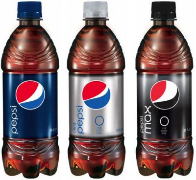
Pepsi Max seems to be using the same bold red 'typeface' which it's old logo used in the UK.Mattarz wrote:Ok, perhaps I don't like it after seeing this.
Each different type has its own variation of the logo, which surely defeats the point on a unified identity?
Also, back when this rebrand happened they also rebranded Tropicana.
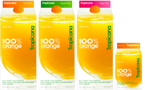
However that was so detested by everyone on the internet that they reverted to the famous(At least in America) Orange with a straw image and old logo.
http://www.logodesignlove.com/peter-arn ... na-rebrand (Explanation of the failed rebrand)
Some people also compare them bottles of pepsi with penises for some reason.
:V

Has anyone seem this floating about on-line:

Its supposed to have the text etc stamped onto the metal saving a fortune in printing. I really like it however I don't think they will go with it as its not Coca Cola Red.
More here: http://gizmodo.com/5408251/the-unibody-coca+cola-can
Edit: I also don't know how they are going to deal with the barcode.
 ?
?

-
Nick Harvey

- God
- Posts: 4170
- Joined: Fri 15 Aug, 2003 22.26
- Location: Deepest Wiltshire
- Contact:
The need for smileys is an admission of an incomplete sense of humour.
-
Nick Harvey
- God
- Posts: 4170
- Joined: Fri 15 Aug, 2003 22.26
- Location: Deepest Wiltshire
- Contact:
So did I.
How do you indicate a trade mark, anyway?
How do you indicate a trade mark, anyway?