Yet another rebrand thread.

User avatar
Cache
Posts: 269
Joined: Sun 16 Mar, 2008 17.19
Location: London

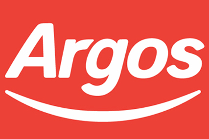
Not sure if anyone has noticed this, but Argos seem to be changing their logo and adopting a simpler presentation style.

This is the current:

Image


But if you take a look at their new advert, you see a new, cutesier logo and a simpler advert style.

Thoughts?

I actually quite like it; simple and effective. Makes the brand look happier and less tired. The current one is getting very old!
Ant
Posts: 630
Joined: Sat 15 May, 2004 13.48
Location: Edinburgh

Looks quite nice actually - never been a huge fan of the old Argos logo.

On another rebrand note, I notice Bank of Scotland are adopting a new logo as we speak. No sign of Halifax in the name either.
scottishtv
Posts: 763
Joined: Thu 01 Apr, 2004 15.36
Location: Edinburgh

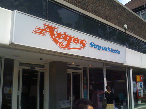
I've always considered the current Argos logo to be quite "new", and think it probably has a bit of life left in it yet.

This is the one I would call old:

Image

It's not been dead *that* long to justify another change, has it?
User avatar
Cache
Posts: 269
Joined: Sun 16 Mar, 2008 17.19
Location: London

Ant wrote: On another rebrand note, I notice Bank of Scotland are adopting a new logo as we speak. No sign of Halifax in the name either.
Hadn't noticed this one, but really there's no need for it to have Hallifax in the name any longer because both brands have been absorbed into Lloyds Banking Group. Better without it anyway in my opinion.
User avatar
Pete
Posts: 7628
Joined: Fri 15 Aug, 2003 13.36
Location: Dundee

If I'm not mistaken, Lloyds Banking Group intend to have Halifax as a brand in England as BOS as a brand in Scotland. There were rumours of them ditching the Lloyds TSB Scotland brand altogether and only having BOS but then there were also rumours about them demerging Lloyds and bringing TSB back.

So its not quite as simple as Argos's ugly little revamp.
"He has to be larger than bacon"
Invent Meridian
Posts: 44
Joined: Sun 19 Apr, 2009 08.02
Location: Portsmouth

Image
They seem to have replaced the hideous 1990s style logo with an even worse 1980s style logo. However the presentation of the advert and their new colour scheme is much better than that rather odd green they used before.
Image
User avatar
Cache
Posts: 269
Joined: Sun 16 Mar, 2008 17.19
Location: London

A little bit of digging pulled this up.

"An updated website will launch on 23 January [this year], while the Spring/Summer 2010 catalogue will display the new look. The company said that since it last re-branded, it has added the Argos Extra brand, additional catalogues and internet-only ranges to its portfolio, and needs to improve customer understanding of the brand."

So expect a new website from tomorrow, and from the look of the advert, expect each 'service' (catalogue, mobile, web etc.) to have a little cartooney logo in a red box associated with it.
Works for me.
Jake
Posts: 216
Joined: Tue 27 Jun, 2006 13.00
Location: Derbyshire

Image

Can't say I'm a fan. Looks like a cross between Woolworths and one of those discount stores you get on the high street.
User avatar
rdobbie
Posts: 277
Joined: Thu 08 Jul, 2004 18.12

Reminds me of the E.ON logo with its seriously weird cartoony font:

Image

I don't know what amazes me more, the audacity of the graphic designer who thought he'd pitch that to the powers-that-be at one of the world's biggest energy companies (he did it for a laugh, surely), or the fact that they actually gave it the nod!
User avatar
DVB Cornwall
Posts: 519
Joined: Fri 24 Jun, 2005 21.42

The new Argos logo really does exude sophisticated retailing doesn't it. :lol:
Image
Critique
Posts: 986
Joined: Mon 17 Aug, 2009 10.37
Location: Suffolk

I hate the new logo, just so, retro, and in a bad way.

I liked the old one.
Please Respond