I find scanning my Nectar card often takes off some reductions/promotions.WillPS wrote:Weird bug with JS self scans that. Press "go back" after subtotal, then it works it out.Sput wrote:Tsk at the self serve checkout not showing the correctly reduced price for two baked products until it was actually giving me the change. I almost aborted the whole transaction in RAGE.
The Unofficial Sainsbury's Thread
-
all new Phil
- Posts: 2023
- Joined: Sun 13 Feb, 2005 00.04
- Location: Next door to Hell
That confused me the other day too - had the right change for what it was saying on screen, but it spat out my receipt and told me to piss off and take my bags before I'd had chance to put it all in.
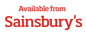
In the last two days, I've spotted this numerous times:

(Yes, I know that's not the actual font, but you get the idea.)
It was on a Bacardi billboard advert, and I've seen it used on a couple of print ads too.
It seems odd that they'd make the statement "available from Sainsbury's" in the new font on someone else's advert, if the Sainsbury's text isn't actually the logo. When Asda or Tesco do this kind of thing, they always include their logo, and that makes sense - people recognise brands more readily than brand components like colour or typeface, and when someone else's brand or product has 95% of the poster, you need to make the most of the little corner that you've got to work with.
Is it possible that these are the first steps towards a logo update, or am I reading too much into this?
-
Philip Cobbold
- Posts: 84
- Joined: Thu 02 Jun, 2005 11.24
I'd say a logo change is pretty unlikely, considering they're just in the middle of updating most of the own brand packaging, which obviously has the current logo. Plus to update signage on 1000 stores would probably be pretty costly.
Hi folks.
So obviously you all know about Interstate, which is commercially available. This is the de-facto font for formal communications within Sainsbury's.
Then there's Voss (as it's known), the informal font designed by Jonny Voss. The font is actually named Sainsburys Big One. The Regular weight is commonly used but there is a lighter version which has been used internally. Jonny Voss has also produced a catalogue of cartoon characters to illustrate colleague communications such as training materials. A lot of the same characters were used in advertising campaigns a few years ago.
Sainsbury's is clearly concerned about the over use of Voss and has briefed designers restrict use for higher impact headlines and messages.
So that's where the new font comes in, for headlining offers etc. It's called Sainsburys Slab. There's a Bold and heavier Black variety. Personally, I like its retro look.
There is another font in use called Sainsburys Stag which I've seen as a Light font and appears very similar to the serif Slab font but it is very light indeed.
The serif thing posted by BBC LDN is something I've never seen before. I'd be interested to see the actual graphic if anyone can post it.
I saw this "available at Sainsburys" thing somewhere today actually. Can't remember where, might have been on a billboard and it stuck out like a sore thumb.
In a completely unrelated note whatsoever, the @font-face entries in the stylesheet of http://www.sainsburys-kelso.co.uk are fascinating. *ahem*
In a completely unrelated note whatsoever, the @font-face entries in the stylesheet of http://www.sainsburys-kelso.co.uk are fascinating. *ahem*
"He has to be larger than bacon"
In a more unrelated note, but on the subject of fonts, does anyone happen to know the name of the chunky handwriting font that B&Q use for their namebadges? I know they've recently started using a new handwriting font called Marydale for smaller signs however the namebadge chunky one has always eluded me.
It's for a project for my GCSEs. Naturally.
It's for a project for my GCSEs. Naturally.
"He has to be larger than bacon"
Pete wrote:I saw this "available at Sainsburys" thing somewhere today actually. Can't remember where, might have been on a billboard and it stuck out like a sore thumb.
In a completely unrelated note whatsoever, the @font-face entries in the stylesheet of http://www.sainsburys-kelso.co.uk are fascinating. *ahem*
You might also want to check the @font-face entries on www.j-sainsbury.co.uk
And I also forgot to mention one more font that Sainsbury's uses: ITC Lubalin Graph. Of course, this one is commercially available too.
And I also forgot to mention one more font that Sainsbury's uses: ITC Lubalin Graph. Of course, this one is commercially available too.
