Page 123 of 184
Re: The Tesco & Other non-Morrisons Supermarket Thread
Posted: Thu 05 Oct, 2017 16.13
by Philip
Alexia wrote: ↑Thu 05 Oct, 2017 14.26
all new Phil wrote: ↑Thu 05 Oct, 2017 01.33
Good grief, the new Tesco SELs look awful with such big text for the price.
I'm sure people with poor eyesight share your concern for aesthetics over function.
Because they were tiny beforehand?
Re: The Tesco & Other non-Morrisons Supermarket Thread
Posted: Thu 05 Oct, 2017 18.56
by Philip
Perhaps writing "Well, they were hardly tiny beforehand" would have gotten across the tone of my post better.
Re: The Tesco & Other non-Morrisons Supermarket Thread
Posted: Thu 05 Oct, 2017 20.08
by all new Phil
If they were designed for people with poor eyesight, they would be consistently big. They aren’t. Unless people with poor eyesight are only interested in specific products of course.
Re: The Tesco & Other non-Morrisons Supermarket Thread
Posted: Fri 06 Oct, 2017 01.48
by Alexia
Any increase in size, legibility, distinctiveness etc is welcome. I don't know how your eyesight is but as someone whose prescription at Specsavers is changing for the worse year on year, these things are perhaps more relevant, important and (emotionally) significant for me. They are SELs. They perform a function before all else. They tell a price. If they can do that in as clear, legible a way as possible, um so besser. My distance vision is appalling and, combined with my social anxiety, the ability to scan, glance up and down an aisle and quickly ascertain various prices in a busy supermarket environment is vital. Not earth-shatteringly vital, but vital to me. It's why I hated that slab font used by Sainsbury's, it's why I hate buses using oh-so-trendy but ultimately utterly useless-as-they-always-break dot matrix signs. It's why I hate corporate fonts on railway signs replacing Rail Alphabet. Don't get me wrong - I love aesthetics, design, graphics - they're great and I encourage variation and colour in corporate and business life --- but not at the expense of, or by compromising, the core message or information that piece of signage or whatever is meant to convey. Form and function, formality and frippery can coexist but there's a time and a place for it. Little bits of paper on the edge of a shelf that say PARSNIPS 60p should be largely free wherever possible of the sometimes overzealous and overeager desire on the part of management and graphic designers to brand every fking thing that moves.
Re: The Tesco & Other non-Morrisons Supermarket Thread
Posted: Fri 06 Oct, 2017 14.43
by bilky asko
I remember the LED dot matrix signs on the buses in Cambridge. Some had blue text on black - hard to read as it was, but even harder to read as the glasses I had at the time blurred that particular wavelength of LED, as part of the UV protection (I presume).
Re: The Tesco & Other non-Morrisons Supermarket Thread
Posted: Fri 06 Oct, 2017 16.08
by Alexia
New modern electronic ones aren't so bad but the slightly older mechanical Luminous yellow ones were appalling. They always always failed.
Re: The Tesco & Other non-Morrisons Supermarket Thread
Posted: Fri 06 Oct, 2017 18.38
by bilky asko
Alexia wrote: ↑Fri 06 Oct, 2017 16.08
New modern electronic ones aren't so bad but the slightly older mechanical Luminous yellow ones were appalling. They always always failed.
Ah, the flip-disc ones? Apparently they'd often have stuck discs when installing from new, so far from reliable things.
Re: The Tesco & Other non-Morrisons Supermarket Thread
Posted: Thu 02 Nov, 2017 19.54
by Critique
Something I've been trying to figure out recently - is the nice Tesco font where the edges of lots of the capital letters were shaped like the red bars below the Tesco logo still being used anymore? I've been in a couple of stores recently which were refitted fairly recently which use it, but it doesn't appear anywhere else which seems a shame as it was quite nice!
Re: The Tesco & Other non-Morrisons Supermarket Thread
Posted: Thu 02 Nov, 2017 21.17
by thegeek
I'm not quite sure I know which one you mean, but I've just found OTFs of the recently depreciated Tesco font family (presumably extracted from web fonts?) here:
https://www.download-free-fonts.com/search/tesco
Re: The Tesco & Other non-Morrisons Supermarket Thread
Posted: Thu 02 Nov, 2017 21.28
by Critique
Ah, looks like 'Tesco Display Bold' is the aforementioned font. There's an Express near me that had a refit last year and the font is used for the window vinyls and also above the different areas of the store (Spirits, for example). I know the new aisle signage in the bigger stores uses the new font that has also made it onto the SELs, but had wondered if they were still using the font which more clearly looked 'Tesco'. No is the answer then!
Re: The Tesco & Other non-Morrisons Supermarket Thread
Posted: Tue 07 Nov, 2017 15.22
by ph2o
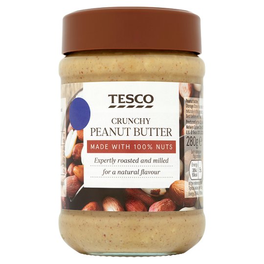
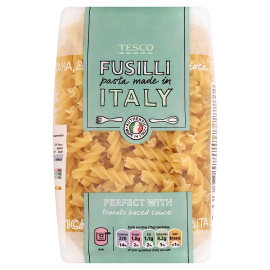
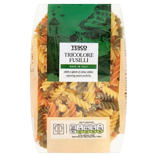
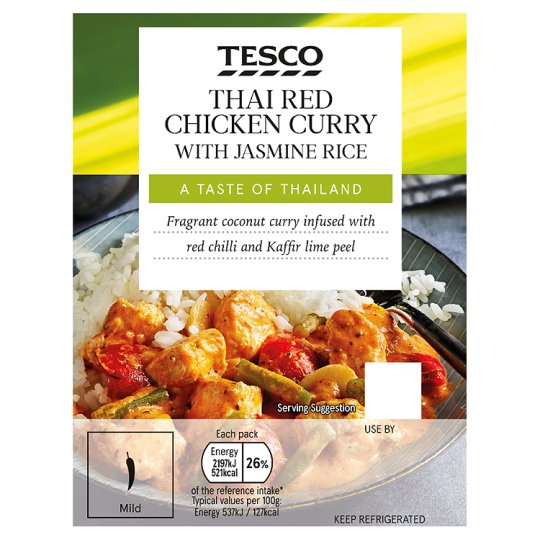
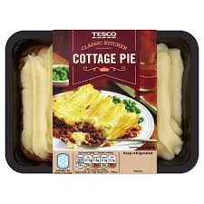
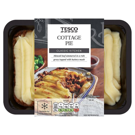
Tesco is rebranding its own label goods. Gone is the old fonts and inconsistencies in design. Now packages are all uniform but beautifully designed and looks a lot more upmarket.
I have found some old and new images - check in stores for more. This is now on most Ready Made Meals and Italian Pasta Sauce.

Old -

New -

Old -

New -

Old -

New -
 What does everyone think?
