I notice Poundland have opened their first few Irish stores under the Dealz brand. They've also opened one on the Isle of Man
www.dealz.ie
The branding appears to be exactly the same as Poundland apart from the name and they proudly claim to be 'part of the Poundland group'.
The fixed price point in Ireland is €1.49 and on the Isle of Man £1.20 they cite the shipping costs as being the reason they can't sell for a quid, although I suspect it's in line with the competition selling at a higher price.
If they couldn't maintain the £1 price point in the UK in the future this is a brand they could adopt in years to come.
Another High Street Rebrand

:O I hope nobody has told the "World Famous £1.20 Shop", of Tenby, Aberaeron and New Quay! Their shops seem to have a suspicious number of items I've seen at 99p Stores - leading me to think they've made a business out of a 21p margin.
That post has led me to this interesting BBC News article http://www.bbc.co.uk/news/business-16469761
Which also reveals that 99p stores have entered the Irish market also with it's 'Euro 50 Stores'.
http://euro50stores.com/
Which also reveals that 99p stores have entered the Irish market also with it's 'Euro 50 Stores'.
http://euro50stores.com/
Heh - so the situation where Poundland is a penny more over here is reversed in Ireland!

No I don't like it.


A lot of the blurb seems to be saying "no you need to see it in motion, honest" but - meh. Do not like the dodgy perspective on the window, do not like the single colour, do not like the typography. Do not like.Jake wrote:
It's interesting that the logo on the designer's site is different. Can't say I'm a huge fan of either, though I prefer this one, but I'm sure they'll grow on me when I see them in real life usage.
More info on the design here
-
bilky asko
- Posts: 1403
- Joined: Sat 08 Nov, 2008 19.48
I think versatility is the key with the logo. Because of the simplicity, it can be used in myriad different ways. Of course, if they just slap it on everything, it will be shite.WillPS wrote:
I think the logo would be better white-on-blue.
-
martindtanderson

- Posts: 527
- Joined: Tue 23 Dec, 2003 04.03
- Location: London, UK
- Contact:
The Logo's colours will take on the chosen colour in the OS - Similar to the accent colour on Windows Phone.
These are the colours we know about from the leaks so far of Windows 8.
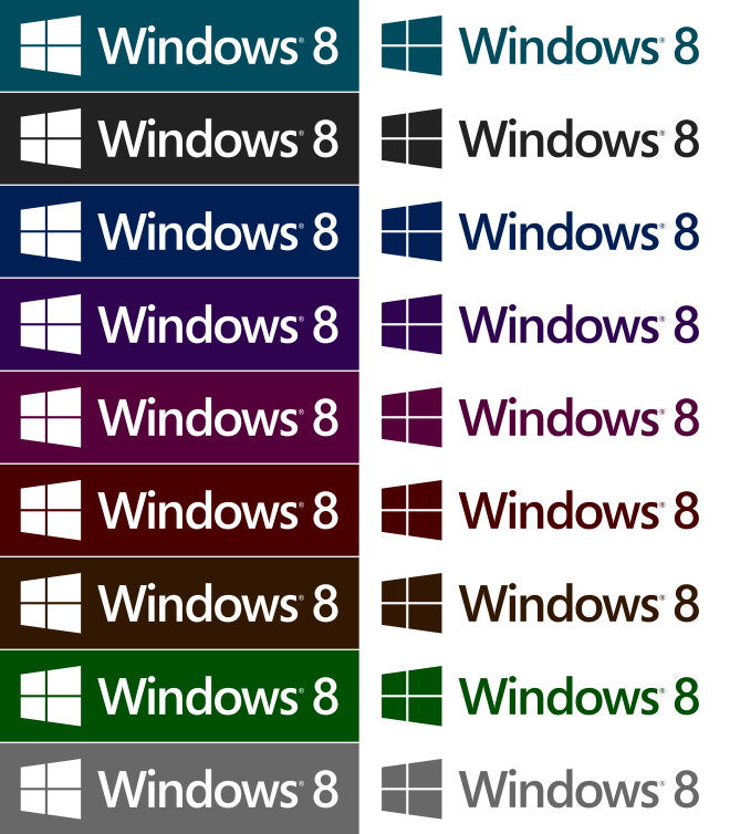
These are the colours we know about from the leaks so far of Windows 8.