
Of course that logo was revealed when the move was first announced. Personally I love the fact it's just a modernisation of what I can remember from my childhood.nodnirG kraM wrote:Philip wrote:Well, it is what the old TSB called itself.nodnirG kraM wrote:According to all the reports I heard, it'll be "TSB Bank". Oh good. To go with your PIN number I suppose.
How inspiring.
Another High Street Rebrand
-
simonipswich
- Posts: 40
- Joined: Tue 21 May, 2013 14.11
- Location: Ipswich
I rather like the new logo, it's a nice fresh update of the old one.nodnirG kraM wrote:Philip wrote:Well, it is what the old TSB called itself.nodnirG kraM wrote:According to all the reports I heard, it'll be "TSB Bank". Oh good. To go with your PIN number I suppose.
How inspiring.

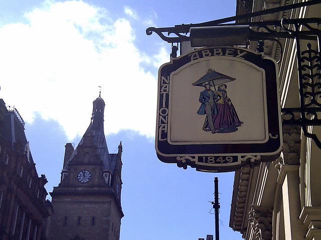
Abbey did have another logo for a couple of years in between the 'Umbrella Couple' logo and the soft pastel-y one. The 'Because life's complicated enough' one,their best in my opinion. The new TSB logo is ok, it's certainly not fantastic. But Lloyds aren't exactly going to spend a massive amount on a logo for what will soon be a competitor

It was discussed only 2 pages back: http://www.metropol247.co.uk/forum/view ... ey#p117741
WillPS wrote:Yeah, that's a weird brand that I don't recognise as well... they had 4 different logos over the course of the 00s:
-
Andrew Wood

- Posts: 279
- Joined: Fri 15 Aug, 2003 23.24
- Location: Location: Location
- Contact:

more guff in the post about TSB including a booklet explaining such delights as "cashpoint" shall be known as "cash machine" and "phonebank" shall be "telephone banking".
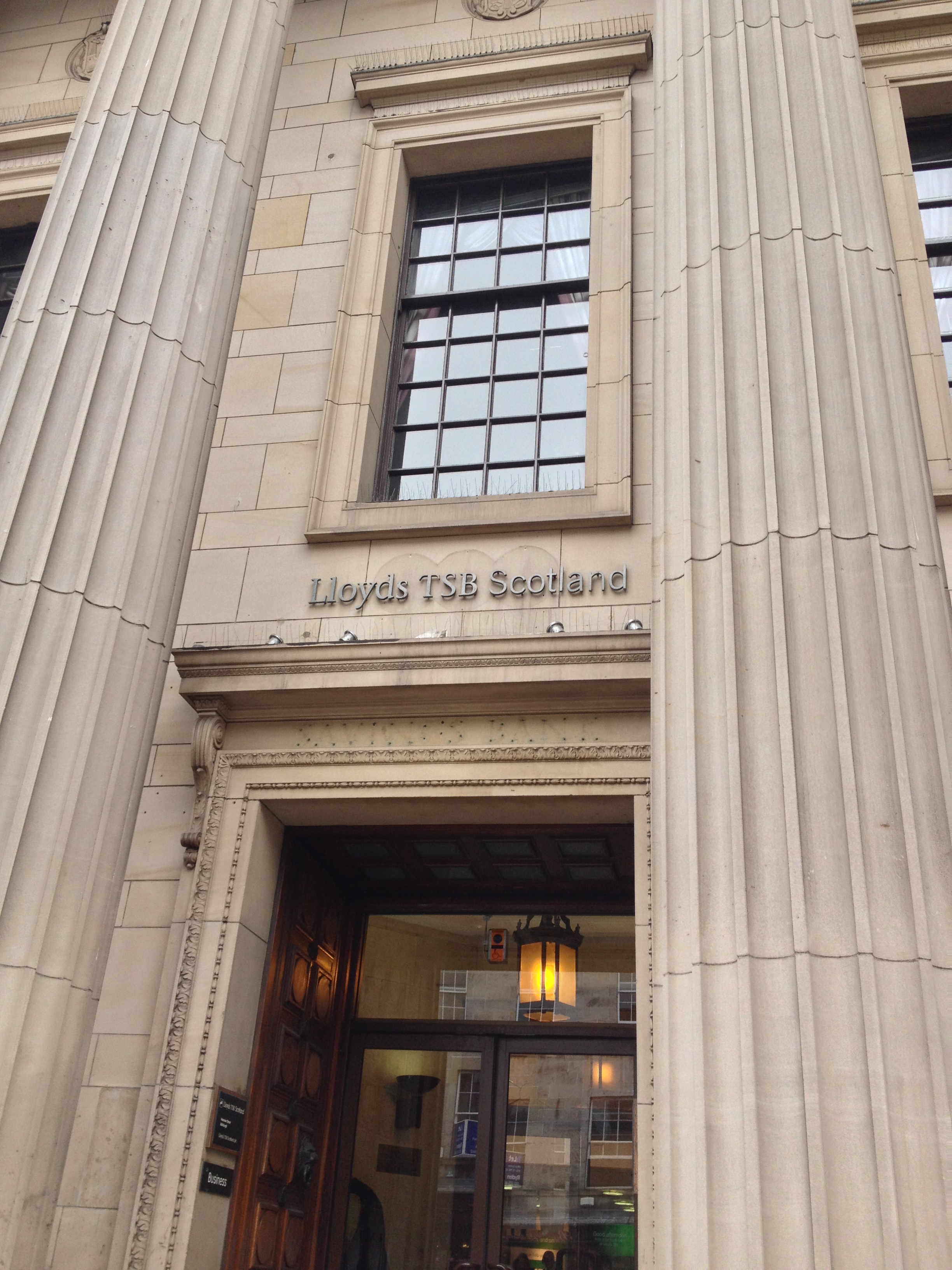
The branch in Edinburgh city centre has nicely pre-dirtied the front of the building ready for the signage.

I must note it's a shame they aren't restoring some of the original fixtures by the look of it. I wonder if they'll reuse the glass TSB logo on the St Andrews branch which currently is done in Lloyds TSB colours.
Is LTSB in England preparing to rebrand back to Lloyds Bank btw? Are they doing the signs with stickers ready to pull off down south too?
The branch in Edinburgh city centre has nicely pre-dirtied the front of the building ready for the signage.
I must note it's a shame they aren't restoring some of the original fixtures by the look of it. I wonder if they'll reuse the glass TSB logo on the St Andrews branch which currently is done in Lloyds TSB colours.
Is LTSB in England preparing to rebrand back to Lloyds Bank btw? Are they doing the signs with stickers ready to pull off down south too?
"He has to be larger than bacon"
Yes, they are. Cheltenham & Gloucester appear to have got first dibs on the crap temporary signage, but there's at least one branch of Lloyds TSB I've seen with the temporary boxy signage (Sherwood, Nottingham).