
Instead of closing the Gamestation here down, they're just making it into another GAME, so we now have two GAMES at separate ends of the high street. And neither of them are particularly big, just rectangular boxes that are impossible to move around in when there's a line for the till, as the line usually stretches most of the shop, down very tight isles.
In other news, the former JJB space is now taken up by a 'Yippee it's 99p' store, which doesn't really need all the space that it has, and as a result has enormously wide isles. They've also opened up a café in-store. I haven't risked using it yet, and doubt I ever will. This *fabulous* store is also right next to Poundland.
And most of the town seem to think Sports Direct is closing, after they purchased a load of JJB stock, and have big signs up saying 'STOCK LIQUIDATION SALE' and then 'Store is not closing. Stock liquidation sale due to the purchase of £50m of JJB stock.' underneath.
Another High Street Rebrand
-
bilky asko
- Posts: 1463
- Joined: Sat 08 Nov, 2008 19.48
In Princes Quay in Hull, the old TK Maxx turned into "Pennywise", a shop that could have fit in a store a quarter its size (in fact, I think it did, as there was a Pennywise on the floor above that was much smaller.
Unsurprisingly, it closed, and was replaced by an "Original Factory Store", which seems to be a better fit.
The Sports Direct branches I've seen have much more obvious signs saying they're not shutting, although they're quite prominent ones.
Unsurprisingly, it closed, and was replaced by an "Original Factory Store", which seems to be a better fit.
The Sports Direct branches I've seen have much more obvious signs saying they're not shutting, although they're quite prominent ones.
-
madmusician

- Posts: 153
- Joined: Mon 11 Dec, 2006 19.11
- Location: Worcester, UK
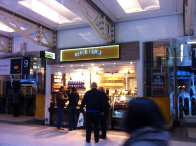
I notice that the Liverpool Street station Upper Crust has got a new branding, with an open rear so the customer can see what's going on behind the scenes.
I haven't seen this anywhere else yet, but presumably it's in the stages of being rolled out?
I haven't seen this anywhere else yet, but presumably it's in the stages of being rolled out?


I noticed that there was a new sign being put up at my Lloyds TSB Scotland branch the other day however it still says LTSB Scot.
However on closer inspection in daylight I notice that the Lloyds logo is just a sticky sheet stuck over the sign so I presume it reads TSB underneath in advance of the rebrand.
However on closer inspection in daylight I notice that the Lloyds logo is just a sticky sheet stuck over the sign so I presume it reads TSB underneath in advance of the rebrand.
"He has to be larger than bacon"

Looks like the brand will change in September regardless of whether or not the Co-op are able to proceed with the deal.Pete wrote:I noticed that there was a new sign being put up at my Lloyds TSB Scotland branch the other day however it still says LTSB Scot.
However on closer inspection in daylight I notice that the Lloyds logo is just a sticky sheet stuck over the sign so I presume it reads TSB underneath in advance of the rebrand.

This happens every time banks rebrand en-masse. It's weird, most retailers are happy trading under 2 brands in the interim, but when banks change it has to be overnight.
Although Santander's 'Abbey House' in Oxford kept the Abbey branding on it until about a year ago (and a gold plaque with their logo on it until around 2008).
http://goo.gl/maps/IVLRU | 2008
http://goo.gl/maps/Fbt0y | 2012
I'm not sure if it's to do with them treating it as a special case and preserving heritage, legal issues (maybe it's a listed building?) or just idleness/carelessness.
http://goo.gl/maps/IVLRU | 2008
http://goo.gl/maps/Fbt0y | 2012
I'm not sure if it's to do with them treating it as a special case and preserving heritage, legal issues (maybe it's a listed building?) or just idleness/carelessness.

Isn't all the signage in Oxford strictly controlled and has to match certain criteria? It may have been that they were too lazy to ask for clearance on a change in the sign?
I would guess the banking industry need to update their branding as soon as they can due to being regulated by the FSA. I guess there could be "mis-selling" implications if it isn't made clear to the customer who the provider is when signing up/changing terms & conditions.
I would guess the banking industry need to update their branding as soon as they can due to being regulated by the FSA. I guess there could be "mis-selling" implications if it isn't made clear to the customer who the provider is when signing up/changing terms & conditions.
Good Lord!
Yeah, that's a weird brand that I don't recognise as well... they had 4 different logos over the course of the 00s:cdd wrote:Although Santander's 'Abbey House' in Oxford kept the Abbey branding on it until about a year ago (and a gold plaque with their logo on it until around 2008).
http://goo.gl/maps/IVLRU | 2008
http://goo.gl/maps/Fbt0y | 2012
I'm not sure if it's to do with them treating it as a special case and preserving heritage, legal issues (maybe it's a listed building?) or just idleness/carelessness.

Slightly subverting the topic somewhat, but Hafod high street within Swansea was, until recently, one of the blots on the city. Now after urban regeneration grants, the whole street has been "rebranded" and now looks dead smart with uniform yet classical signage, plinths and embellishments on house doors, and being next to the Liberty Stadium and Morfa Retail Park, house prices have rocketed.iSon wrote:Isn't all the signage in Oxford strictly controlled and has to match certain criteria? It may have been that they were too lazy to ask for clearance on a change in the sign?
Have a wander through and take a look.
More info : http://www.swansea.gov.uk/index.cfm?articleid=1378
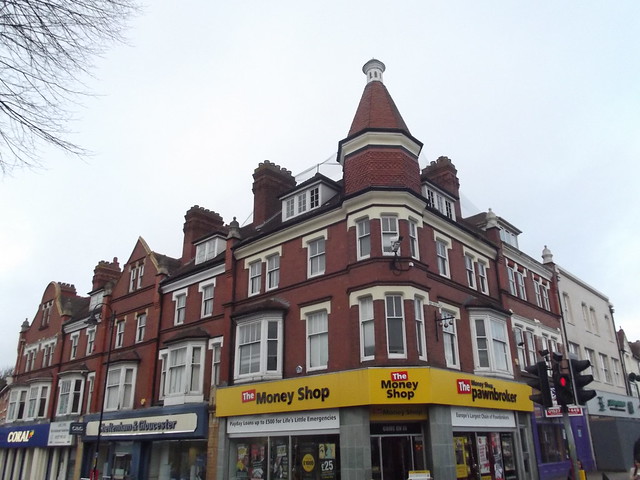
Also earlier in the week, I noticed the signage changed on our Cheltenham and Gloucester branch.Pete wrote:I noticed that there was a new sign being put up at my Lloyds TSB Scotland branch the other day however it still says LTSB Scot.
However on closer inspection in daylight I notice that the Lloyds logo is just a sticky sheet stuck over the sign so I presume it reads TSB underneath in advance of the rebrand.
Before

Now
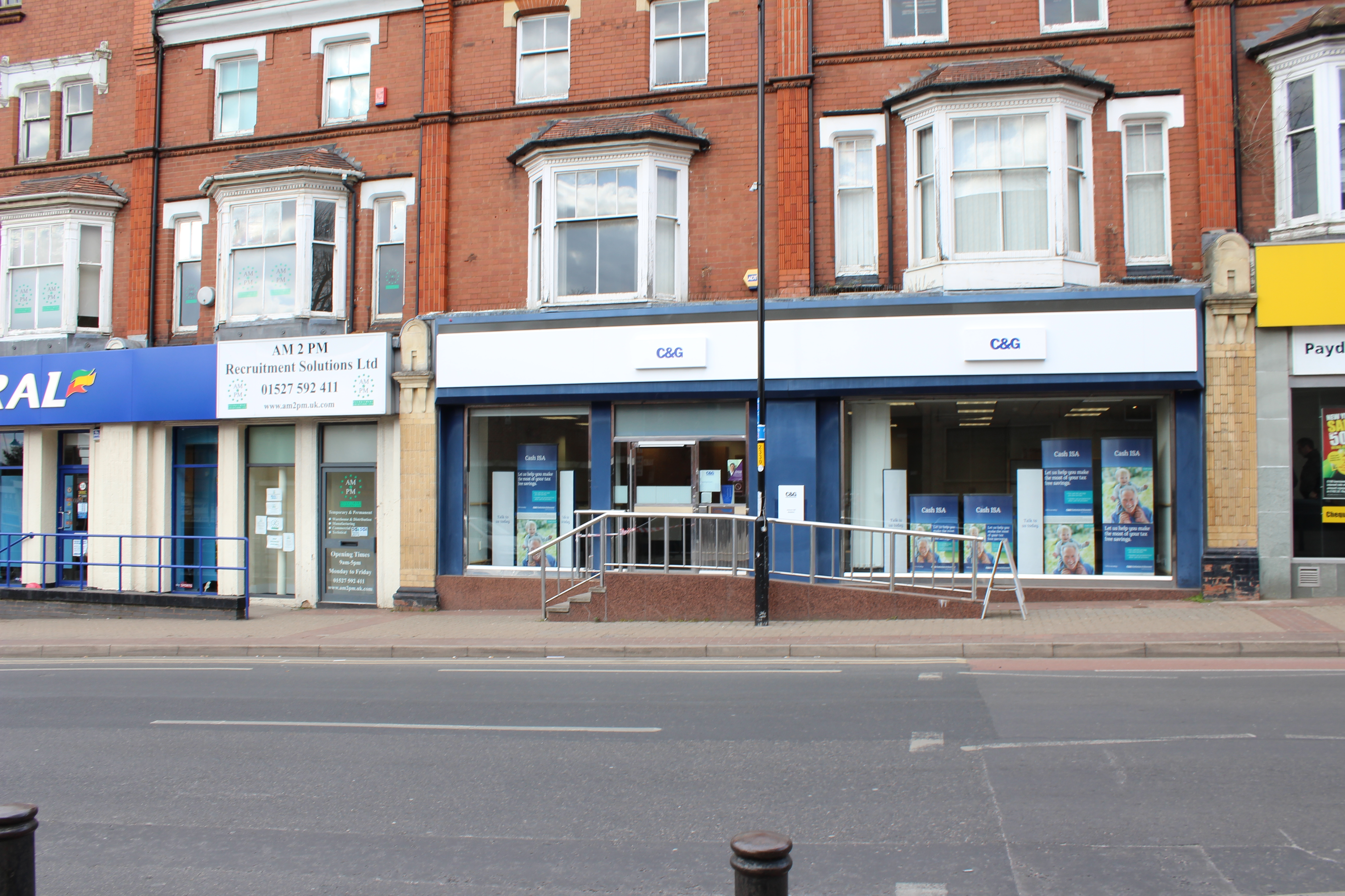
As I've stated before that Coral bookmakers next to C&G was my parents branch of TSB before it was merged with Lloyds in the late 90s so it's going to be surreal it being back in nearly the same position after all these years.