
T.E. Stockwell and Albert Cohenjay wrote:The TES are the Initials of the man who started it all T.E.Stockwell. The 'Co' bit comes from his partner in the business, somebody Cohen.
Presentation Other Than TV
-
scottishtv
- Posts: 770
- Joined: Thu 01 Apr, 2004 15.36
- Location: Edinburgh
Maybe it's just me but the word "sex" jumps out whenever I glance at this quickly. (in 'morrisonsextra')jay wrote:
Incidently I had the same problem when looking at the Lib Dem's Battlebus on TV the other night. Takes a bit for my eyes to work out "www.therealalternative.org". My brain was thinking 'there alalter native' or something.
Maybe it's just me
-
Blob from TVForum
- Posts: 22
- Joined: Thu 05 Aug, 2004 15.42
- Location: Pudsey, Leeds
how about this...

fusionlad I KNOW MY SIG IS BROKEN
I've always though that Morrisons should have taken on the Safeway logo.

There's no question that Safeway had the better branding of the two - it would have saved on rebranding costs in the existing Safeway stores, and given the existing Morrisons stores a fresh modern look.
Morrisons' current look is horrible - who cares if it's recognisable, it makes the company look like it's stuck in the dark ages. It's all stubborness on the part of the company directors that they've kept it for so long. Pretty soon I'm sure they're going to be forced to wake up to this, and then they'll undertake another costly rebranding exercise for all of their stores.
Thought I would bump this as Sainsbury's is getting a new look soon. They're scrapping the 'Making Life Taste Better' slogan for 'Try something new today'.
The changes are being made to carrier bags, trolleys and lorries. It'll preview tonight at 10.45pm on a TV advert (don't know which channel, doesn't say in the article).
I wonder how long it'll take all stores to get the new look...
BBC News Article
The changes are being made to carrier bags, trolleys and lorries. It'll preview tonight at 10.45pm on a TV advert (don't know which channel, doesn't say in the article).
I wonder how long it'll take all stores to get the new look...
BBC News Article
Completely irrelevantly, I don't suppose anyone knows what font, or could have a good guess what font Wilkinson uses for the main logo?
(Long story short: I work there and I got in trouble when the management found my blog where I talked about them, and I want to change the blog layout to look like the Wilko brand, in an act of petty rebellion... this is the closest I've got so far).
(Long story short: I work there and I got in trouble when the management found my blog where I talked about them, and I want to change the blog layout to look like the Wilko brand, in an act of petty rebellion... this is the closest I've got so far).

I read the other week that the Co-Op is being rebranded. Apparantly they dropping all the sub-names and just using the brand "Cooperative" followed by a one word description
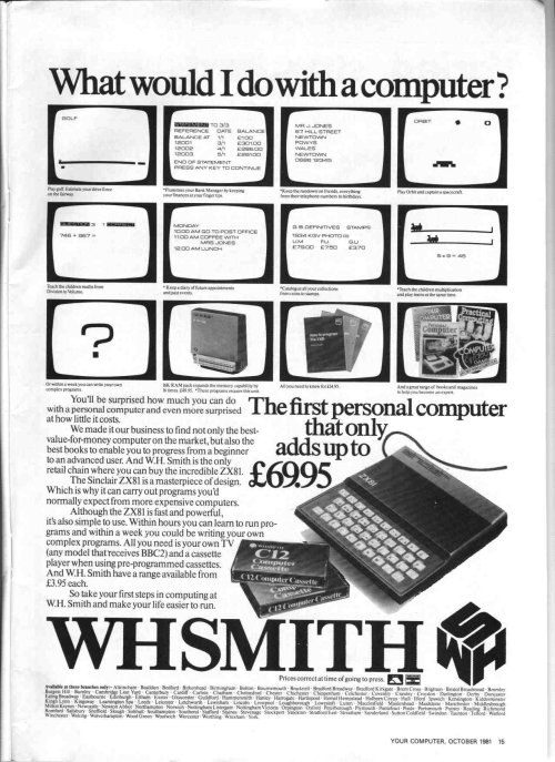
And also one my local WHSmith's has closed down. When they were stripping the store out they took down those headers round the top of the shelves (you know the ones that say Magazines, Stationary etc), uncovering the original branding that must actually be printed on the original metal fittings. Some very 80s looking branding from the WHSMITH era was uncovered.
Sadly they then white washed the windows so you couldn't see in anymore!