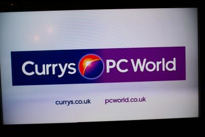
Another High Street Rebrand
- Gavin Scott
- Admin
- Posts: 6442
- Joined: Fri 15 Aug, 2003 13.16
- Location: Edinburgh
- Contact:
Ah yes - Benjamin Shatlift assisted with the signage.
-
bilky asko
- Posts: 1463
- Joined: Sat 08 Nov, 2008 19.48
Perhaps this link will clear things up.Alexia wrote:Sorry Bilky - what exactly is wrong with the Carpetright logo in that GSV picture you've linked to? Looks fine to me.
And just because a logo is made up of two different fonts and mixing small and capital letters, doesn't mean it isn't one word.
Also, I know perfectly well what a word is. I find it unusual that their logo differs to their official name, however. They do it in their official way on their corporate site.
- Nick Harvey
- God
- Posts: 4169
- Joined: Fri 15 Aug, 2003 22.26
- Location: Deepest Wiltshire
- Contact:
I wonder if they're leaving themselves the option of adding an apostrophe at the end of 'Currys' at some point in the future and simply make it a single name?
Why doesn't it have an apostrophe now? As in Curry's - shop owned by the Curry family? (namely H Curry & Sons).Nick Harvey wrote:I wonder if they're leaving themselves the option of adding an apostrophe at the end of 'Currys' at some point in the future and simply make it a single name?
Also I notice Boots isn't Boot's (John Boot). Dixons was just a random name picked from the telephone book, apparently.
It would be Currys' - a shop belonging to the Currys (plural).
Boots also began life as a family business according to this page.
Boots also began life as a family business according to this page.
So Boots' is punctually correct, but I think Boots is more aesthetically pleasing.The Boot family began trading in 1849, selling herbal remedies from a small store in Goose Gate, Nottingham.


