Re: Another High Street Rebrand
Posted: Mon 13 Sep, 2010 14.07
Haven't seen 'gaspies' used in ages on here or TVF.Sput wrote:I had to sit down to prevent the onset of gaspies.
Well done, that man.
Haven't seen 'gaspies' used in ages on here or TVF.Sput wrote:I had to sit down to prevent the onset of gaspies.
Not the worst, BHS are very inconsistant. Have a look at this branch of BhS: http://bit.ly/cPPIKqWillPS wrote:I swear I've seen that one for a little while now?
And tsk at the inconsistent shop-front branding; who do they think they are, Zavvi?!
That's the latest BHS branding, according to Wikipedia 'the 'British Home Stores' was brought back recently and will be used for housewares (non-clothes) outlets. The others have the plain black and white 'BHS' along the lines of Next and DebenhamsJamesypoo wrote:How about this unusual branding at the BHS in Kirkstall? You can play spot the Allders branding, too.
Oh dear, why would Bhs want to ditch their iconic 'script' logo in favour of that dull, plain Sans Serif text?Inspector Sands wrote: But they're now using this as a logo in some shops: http://www.bhs.co.uk/
Hardly iconic - it's barely 10 years old!Invent Meridian wrote:Oh dear, why would Bhs want to ditch their iconic 'script' logo in favour of that dull, plain Sans Serif text?Inspector Sands wrote: But they're now using this as a logo in some shops: http://www.bhs.co.uk/
It was never that nice anyway, what is it with that 'h', it's barely there?WillPS wrote:Hardly iconic - it's barely 10 years old!Invent Meridian wrote:Oh dear, why would Bhs want to ditch their iconic 'script' logo in favour of that dull, plain Sans Serif text?Inspector Sands wrote: But they're now using this as a logo in some shops: http://www.bhs.co.uk/
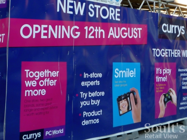
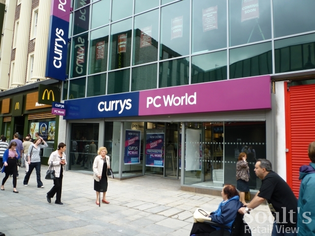
I can see a full merger arriving soon...Mattarz wrote:So as predicted, most Currys stores are now absorbing PC World and taking on a very simple but nice brand. It was pointless to have both running side by side with so much product crossover.
What do you mean by that? PC World and Currys are already the same company; DSG (Dixons).xwing123456 wrote:I can see a full merger arriving soon...Mattarz wrote:So as predicted, most Currys stores are now absorbing PC World and taking on a very simple but nice brand. It was pointless to have both running side by side with so much product crossover.