Page 27 of 238
Re: Another High Street Rebrand
Posted: Fri 11 Jun, 2010 15.58
by bilky asko
rdobbie wrote:ashley b wrote:Oldham's another to rebrand recently, changing from:

to

That's the one that cost £100,000. Yep, you heard right. They paid an advertising agency
ONE HUNDRED THOUSAND POUNDS to design that. Absolutely un-bloody-believeable. It must have taken all of 2 minutes in Adobe Illustrator.
So would the BBC Logo. It doesn't mean it's not a good logo - which, in my opinion, it is.
Re: Another High Street Rebrand
Posted: Fri 11 Jun, 2010 17.42
by steddenm
Why does the Southampton City Council logo have an ® attached to it? Aren't they all registered trademarks?
Re: Another High Street Rebrand
Posted: Fri 11 Jun, 2010 17.46
by tillyoshea
This is Newcastle's... a bit handwriting-font-tastic for my liking:

Re: Another High Street Rebrand
Posted: Fri 11 Jun, 2010 18.14
by marksi
North Down Borough Council's crest:

...now reinterpreted by Snow Patrol following their (fab) gig in Bangor last weekend:

Re: Another High Street Rebrand
Posted: Fri 11 Jun, 2010 18.23
by Alexia
Re: Another High Street Rebrand
Posted: Fri 11 Jun, 2010 18.27
by Malpass93
North Lincs' neighbours:

Lincolnshire
proper's logo is a green version of the Lincoln Imp. I thought it was a green rose for a long time.

Great Grimsby and Cleethorpes has this as their logo.

Over the bridge, they use this...

...and further north still is Hull, home to this.
Re: Another High Street Rebrand
Posted: Fri 11 Jun, 2010 18.59
by Aidy
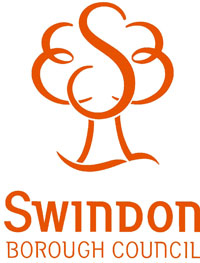
This is the Swindon Borough Council logo, a tree with a subtle 'S' inside. It's a good effort, however the main gripe is that everything council related tends to be garishly orange, including the household recycling boxes

Re: Another High Street Rebrand
Posted: Fri 11 Jun, 2010 20.29
by Beep
Re: Another High Street Rebrand
Posted: Fri 11 Jun, 2010 22.15
by Alexia
Yes your beloved Brum and it's councillors are the source of endless DailyMail xenophobic seasonal outrages. You must be so proud.
Re: Another High Street Rebrand
Posted: Fri 11 Jun, 2010 22.29
by Gareth
bilky asko wrote:madmusician wrote:
That is Suffolk County Council's logo - nothing special, but not too bad either.
Why have they one the "3D" so badly? It looks like they started off with a cube, but decided to change it into a shield.
The 3D isn't the worst part of the logo... it's the bad implementation of it - there are about 100 different versions from the older one that had Suffolk County Council in one line to 'home made' ones where the 'cube' is centred above the text.
To add another Suffolk logo, here's my district council - "where quality of life... counts". It fits the district well, being waves for the coast!

Re: Another High Street Rebrand
Posted: Sat 12 Jun, 2010 00.03
by Jovis
martindtanderson wrote:Its nice seeing all these quaint and cheesy logos for UK councils/cities, but who and how will the best ones be decided, perhaps we need a poll, a metropoll.
Yep, that one's been done. For about two months.


