Page 3 of 6
Re: Metropol logo
Posted: Tue 31 Jul, 2012 21.14
by AJ
Andrew Wood wrote:Philip wrote:It looks good now but when you first did it the forum skin was this horrid pink and yellow which made it hard to read anything, presumably part of the joke
If anyone wants a visual reminder of how 'bright' everything was:
http://www.screenshots.com/metropol247.co.uk/
Ooooh! I remember this. It was FAB!

That said, the current look has an element of class to it (perhaps it's DIMBLEBOT?), and the logo itself is a Metropol institution nowadays. Don't change it!
Re: Metropol logo
Posted: Wed 01 Aug, 2012 10.33
by Bail
I made that! Yay

Re: Metropol logo
Posted: Thu 09 Aug, 2012 22.21
by Philip
How about making a theme based on Microsoft's Metro UI?
Geddit?
Re: Metropol logo
Posted: Thu 09 Aug, 2012 22.25
by scottishtv
Philip wrote:How about making a theme based on Microsoft's Metro UI?
Geddit?
Ah, but it's no longer going to be called that.
Ooops.
Re: Metropol logo
Posted: Thu 09 Aug, 2012 22.44
by Philip
scottishtv wrote:Philip wrote:How about making a theme based on Microsoft's Metro UI?
Geddit?
Ah, but it's no longer going to be called that.
Ooops.
All the more reason for us to use it!
Re: Metropol logo
Posted: Fri 10 Aug, 2012 19.13
by Andrew Wood
A vaguely related comment - having re-installed Windows, then added in a couple of extra thousand fonts, it's interesting to see how differently websites are rendered when not using default fonts.
On that, Metropol and Facebook render quite nicely when Lucida Grande is installed :
http://font.pendownload.com/2009/10/luc ... book-font/
Re: Metropol logo
Posted: Thu 16 Aug, 2012 14.57
by JAS84
The logo is missing! 404 error when I tried "Open image in new tab".
Re: Metropol logo
Posted: Thu 16 Aug, 2012 15.00
by Pete
YES I AM FIXING THAT
Re: Metropol logo
Posted: Fri 17 Aug, 2012 01.02
by bilky asko
Philip wrote:scottishtv wrote:Philip wrote:How about making a theme based on Microsoft's Metro UI?
Geddit?
Ah, but it's no longer going to be called that.
Ooops.
All the more reason for us to use it!
If a new logo were to be made, it would have to be based on another shit logo.

Re: Metropol logo
Posted: Fri 17 Aug, 2012 18.36
by Sput
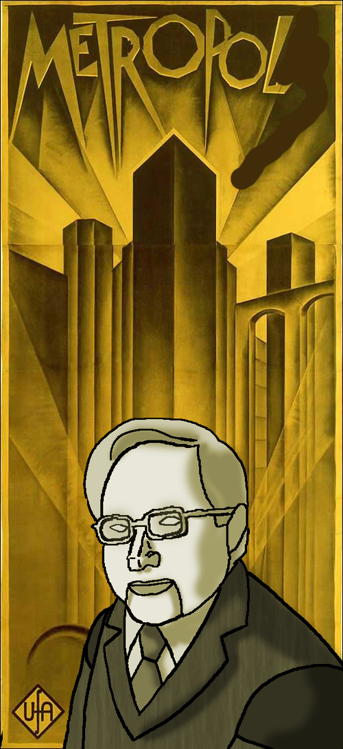
FIXED IT
You're welcome, world.
Re: Metropol logo
Posted: Fri 17 Aug, 2012 19.46
by Critique
And never has Dimblebot looked so sinister.