Page 3 of 7
Re: Yet another rebrand thread.
Posted: Sun 24 Jan, 2010 23.55
by Pete
If Halifax, RBS and Lloyds TSB were all involved in the massive banking collapse, where have they suddenly got all this extra cash from to go about introducing new logos and rebranding branches?
Well not least via the savings from shutting down the branches where there is a Halifax and Lloyds opposite one another.
Having said that, rebranding a few branches (on the orders of the Treasury) costs pittance to the sort of money involved during the collapse.
Re: Yet another rebrand thread.
Posted: Thu 04 Mar, 2010 17.25
by DVB Cornwall
RBS have started the disposal of the 'Williams and Glyn's' asset portfolio according to BBC News.
BBC News
Robert Peston has blogged about it too.
BBC Blogs - Peston's Picks
Re: Yet another rebrand thread.
Posted: Thu 04 Mar, 2010 21.44
by Andrew Wood
Maybe this could go in the advert thread, but courtesy of TVARK
'Pigarro'
Re: Yet another rebrand thread.
Posted: Sat 06 Mar, 2010 04.43
by WillPS
The Pepsi rebrand is finally happening over here (you know, the one with the
gravitational pull). No sign of Mountain Dew or Sierra Mist yet though

Re: Yet another rebrand thread.
Posted: Sat 06 Mar, 2010 09.49
by Sput
WillPS wrote:The Pepsi rebrand is finally happening over here (you know, the one with the
gravitational pull). No sign of Mountain Dew or Sierra Mist yet though
You may scoff, but in certain situations such as where the density of marketing bullshit is extremely high the laws of newtonian mechanics start to break down!
Re: Yet another rebrand thread.
Posted: Sat 06 Mar, 2010 14.04
by Alexia
Didn't we have Moutain Dew for a brief period in the mid-late 90s? A sickly green-yellow sweet concoction that makes Sunny Delight look like fresh spring water. I loved it.
Re: Yet another rebrand thread.
Posted: Sat 06 Mar, 2010 16.28
by TG
Sod that, I want Tab Clear back!
Re: Yet another rebrand thread.
Posted: Sun 07 Mar, 2010 10.30
by Cache
I hated the old Pepsi logo, whereas this one, I like.

It looks a lot more modern that the old one, and I actually prefer it to the Coke brand (yet I prefer Coke to drink, obviously). And having worked in marketing before, I know that a massive PDF full of bullcrap like that it produced for pretty much every rebrand by every agency bidding for the design to draw the purchaser in, so the whole 'gravity' idea doesn't surprise me!
Re: Yet another rebrand thread.
Posted: Sun 07 Mar, 2010 10.48
by Pete
I don't like it. It looks like sony ericsson but with a less remarkable font. Coke's branding is fab, however I dislike their current plastic 500ml bottles intensely. The little plastic label on it is far too small in comparison to the size of the bottle and everything seems to be crammed onto it. Looks poor.
Re: Yet another rebrand thread.
Posted: Sun 07 Mar, 2010 11.27
by Cache
Ok, perhaps I don't like it after seeing this.
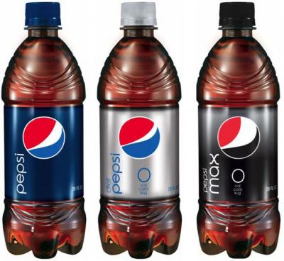

Each different type has its own variation of the logo, which surely defeats the point on a unified identity?
Re: Yet another rebrand thread.
Posted: Sun 07 Mar, 2010 11.38
by Invent Meridian
Ironically the 'e' in the new logo seems to based on the old Pepsi 'globe'.