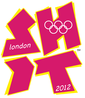
New London 2012 Logo
I think it's best been described as Lisa Simpson giving a BJ, where the diamond thing is her arm(s) and the tail of the first two is the Harvard-sized endowment.Jamez wrote:Someone commented that the new 2012 logo looks like an abstract of a woman performing oral sex on a man with a small, square willy.

Why?rdobbie wrote:I'd be embarrassed to put that piece of cack on a poster for a school sports day.
Did I miss something in what a logo is supposed to mean, or do you work for DOCOG?
User removed
They've mentioned the "mistake" on the editors blog: http://www.bbc.co.uk/blogs/theeditors/2 ... ctics.html
Edit: LOL! Just heard the headlines on N24, the "flashing logo has been removed from the official website due to concerns that it may cause fits for sufferers of epilepsy." The whole thing is beyond a joke now.
Edit: LOL! Just heard the headlines on N24, the "flashing logo has been removed from the official website due to concerns that it may cause fits for sufferers of epilepsy." The whole thing is beyond a joke now.

Any company or organisation that willingly pays some designers (and obviously not very good ones) £400,000 for this ridiculous and universally hated logo and branding, then they deserve to be a laughing stock.
How on earth dirty, smelly, crowded and expensive London won the Olympic games I really don't know.
£50 says that the Olympics in London will be just like the farce that was Wembley stadium.
How on earth dirty, smelly, crowded and expensive London won the Olympic games I really don't know.
£50 says that the Olympics in London will be just like the farce that was Wembley stadium.
User Removed

