Looks like it is a new logo then! Hasn't made it to the website yet though, they have updated their YouTube avatar since I looked when I posted earlier. They must have uploaded that advert just after I checked!
james2001 wrote: Sat 06 Apr, 2019 21.10
It wasn't one of the film/TV show spoof adverts, is it? They've been using logos in the style of whatever they've been using. I presume it was either the Ghostbusters of Wizard of Oz one, unless they've put the fat bloke in some other film now.
Looks like we've seen the last of those ads. Thanks for posting that video, Jake. Yes, that's the ad I saw.
Re: Another High Street Rebrand
Posted: Sun 07 Apr, 2019 00.15
by james2001
JAS84 wrote: Sun 07 Apr, 2019 00.05
Looks like we've seen the last of those ads.
Thank god, I was wondering what film they were going to ruin next by putting him in.
Re: Another High Street Rebrand
Posted: Sun 07 Apr, 2019 01.34
by dosxuk
JAS84 wrote: Sun 07 Apr, 2019 00.05
Looks like we've seen the last of those ads.
PLEAS!
Re: Another High Street Rebrand
Posted: Mon 08 Apr, 2019 10.10
by thegeek
I know the Halifax is supposed to be LBG's slightly less classy brand, but... is that Arial?
Re: Another High Street Rebrand
Posted: Mon 08 Apr, 2019 12.01
by Ben
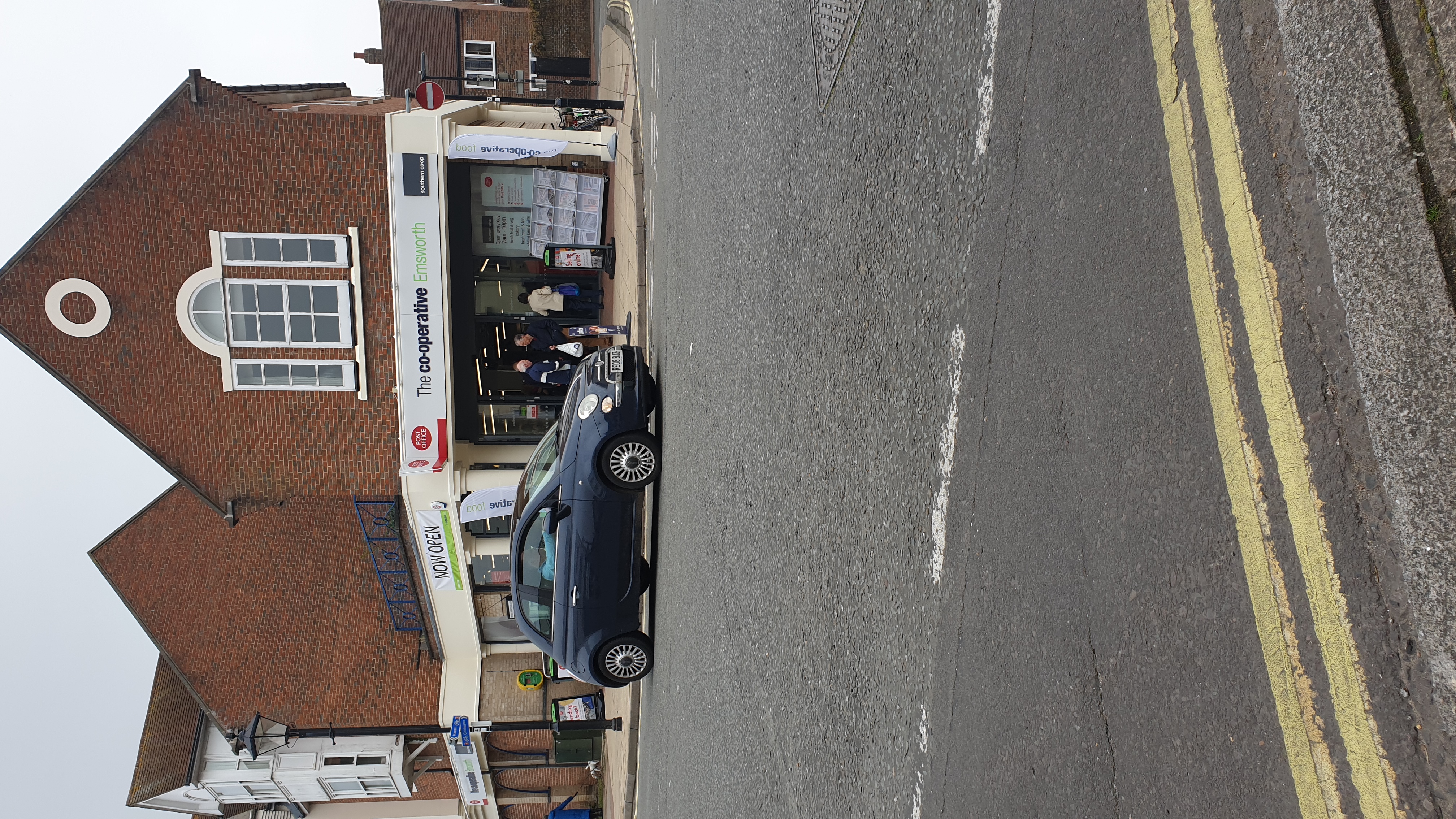
My local Southern Cooperative has reopened today having been refurbished. The outside still uses a varient of thecoperative food branding but i think this is temporary as inside everything uses the southern cooperatives new logo which is also added to the outside signage.
Inside its all grey and black but not really the same as the coop group
Re: Another High Street Rebrand
Posted: Tue 09 Apr, 2019 08.06
by Pete
has the post office sign been hit by a van?
I wonder what the logic behind this sort of thing is? I appreciate they want to retain their independence from CWS but at the same time why stick with a generally hated incarnation of the brand rather than embrace the universally praised return to the 60s logo?
There would be several easy ways to integrate the southern coop branding on the 2016 identity which would surely be better :/
Re: Another High Street Rebrand
Posted: Tue 09 Apr, 2019 10.03
by WillPS
Pete wrote: Tue 09 Apr, 2019 08.06
has the post office sign been hit by a van?
I wonder what the logic behind this sort of thing is? I appreciate they want to retain their independence from CWS but at the same time why stick with a generally hated incarnation of the brand rather than embrace the universally praised return to the 60s logo?
There would be several easy ways to integrate the southern coop branding on the 2016 identity which would surely be better :/
I don't think any of the societies have taken it on. Central England are still opening new branches with that branding. Of course Lincolnshire are still using the 90s circular version.
I'm beginning to wonder whether TCG are preventing the new/old logo from being used in some way.
Re: Another High Street Rebrand
Posted: Tue 09 Apr, 2019 21.51
by thegeek
I happened to pass the flagship branch in London today - the sign-changing fairies hadn't been visiting, but the digital sign next to the front door did have this version of the logo:
with the chevron being the transition between slides.