Page 20 of 238
Re: Another High Street Rebrand
Posted: Tue 11 May, 2010 22.43
by Nick Harvey
Square Eyes wrote:That's a dreadful name.
Yes, Conservative and Liberal Democrat Party would have been far better.
Re: Another High Street Rebrand
Posted: Tue 11 May, 2010 23.12
by Inspector Sands
Square Eyes wrote:
That's a dreadful name.

It's ok as a slogan which is how it'll be used. The problem they have is that Orange is a very strong brand name, T-Mobile isn't as strong in the UK but along with Orange is very well known internationally.
The only choice they have really is to pick a common name for both and do dual branding
Re: Another High Street Rebrand
Posted: Tue 11 May, 2010 23.27
by Nick Harvey
So are they planning to rebrand Freeserve, sorry Wanadoo, sorry Orange Internet as Everything Everywhere Internet, I wonder?
Re: Another High Street Rebrand
Posted: Wed 12 May, 2010 10.42
by aeonsource
Nick Harvey wrote:So are they planning to rebrand Freeserve, sorry Wanadoo, sorry Orange Internet as Everything Everywhere Internet, I wonder?
There are areas in the country where we will open new Everything Everywhere stores: they could be Orange branded; they could be T-Mobile branded or they could be a combination of both..
Seems more like they will use some stores with the old Orange and T-Mobile brands.
Re: Another High Street Rebrand
Posted: Wed 12 May, 2010 10.48
by Nick Harvey
Wasn't meaning the stores. I was meaning the internet service itself. I think it might just have had enough names already.
Re: Another High Street Rebrand
Posted: Wed 12 May, 2010 11.02
by Sput
Well that's why the new name is designed to be ABSOLUTELY future proof. How can you have a more encompassing name than everything everywhere?
Re: Another High Street Rebrand
Posted: Thu 13 May, 2010 20.24
by AxG
I come not with just one rebrand but two.
Looking at my local Comet it seems some of the boards are displaying a new logo.
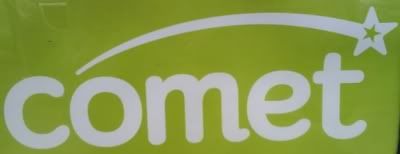
Also walking past
Waterstones, they have ditched their serif logo in favour of sans-serif

Re: Another High Street Rebrand
Posted: Thu 13 May, 2010 20.41
by Jamesypoo

Not a good move for Waterstones, I think...
Re: Another High Street Rebrand
Posted: Thu 13 May, 2010 21.45
by WillPS
90s logo:

Early-2000s:

Late-2000s:

2010:

Sit that alongside the 2008 HMV Logo:

and it sort of looks alright.
As an aside, I think the 2008 HMV logo is perfect, and adapts really well for the seasons:

Re: Another High Street Rebrand
Posted: Thu 13 May, 2010 21.58
by m-in-m
TheAxG wrote:I come not with just one rebrand but two.
Looking at my local Comet it seems some of the boards are displaying a new logo.
Also walking past
Waterstones, they have ditched their serif logo in favour of sans-serif
The Waterstones logo is just a bit too much of a jump in one step. Perhaps it will grow but it just looks out of place in my mind.
Re: Another High Street Rebrand
Posted: Thu 13 May, 2010 22.00
by lukey
Boo @ Waterstones - that subtle change to the title-case logo a few years back worked wonders, I thought
