Sad they're ditching the green. The new logos just look like M&S.
Re: Another High Street Rebrand
Posted: Thu 28 Jun, 2018 01.26
by Pete
Also ditching that iconic font
It was one of the reasons I hated them renaming Bainbridge in Newcastle. It was so clearly John Lewis bc it had that font.
Re: Another High Street Rebrand
Posted: Thu 28 Jun, 2018 08.13
by WillPS
Pete wrote: Thu 28 Jun, 2018 01.26
Also ditching that iconic font
It was one of the reasons I hated them renaming Bainbridge in Newcastle. It was so clearly John Lewis bc it had that font.
Are you sure Bainbridge got a version with the 00s font? All the named stores I knew (Jessops of Nottingham, Bonds of Norwich and Cole Brothers of Sheffield) were branded with this font:
and all were rebranded in the early 00s as John Lewis with the logo they've just replaced. The only store I knew of which got branding with the new font was Peter Jones (which retains it to this day, for some reason possibly related to its Royal Warrants):
Re: Another High Street Rebrand
Posted: Thu 28 Jun, 2018 20.35
by DJDave
I think the George Henry Lee brand was dropped when they moved the store to Liverpool One.
Re: Another High Street Rebrand
Posted: Thu 28 Jun, 2018 22.32
by Jacket
Those black and white logos are awful - competely bland and generic.
Also, I can't wait for my local petrol station to adopt the snappy moniker of "Little Waitrose & Partners at Shell Select".
Re: Another High Street Rebrand
Posted: Sun 29 Jul, 2018 22.35
by sqwidge1978
Tesco are due to rebrand some of their stores (along with opening some mothballed stores) as a new brand of discount store to compete with Aldi and Lidl, called Jack's after their founder Jack Cohen.
A Tesco subsidery PTLL Ltd. has lodged the following with the trademarks office.
Re: Another High Street Rebrand
Posted: Mon 03 Sep, 2018 10.29
by Pear
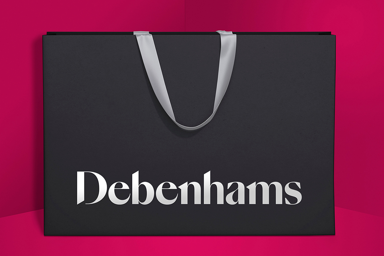
Debenhams seem to be rebranding.
Re: Another High Street Rebrand
Posted: Mon 03 Sep, 2018 19.55
by james2001
First major rebranding since the 80s, surely? Apart from getting rid of the stylised D in the mid-90s anyway.
Re: Another High Street Rebrand
Posted: Mon 03 Sep, 2018 21.55
by tillyoshea
james2001 wrote: Mon 03 Sep, 2018 19.55
First major rebranding since the 80s, surely? Apart from getting rid of the stylised D in the mid-90s anyway.
At first sight, I thought the D in the new logotype echoed that stylised D - but after looking it up, it's rather different to how I remembered it.
Re: Another High Street Rebrand
Posted: Tue 04 Sep, 2018 13.45
by thegeek
tillyoshea wrote: Tue 26 Jun, 2018 20.12Retail Week is reporting a planned major rebrand by John Lewis and Waitrose to "John Lewis & Partners" and "Waitrose & Partners" respectively.
Gut reaction: feels like a bit of a stunt that'll be forgotten in a couple of years. Though, in fairness, that's not usually JLP's style.
This appears to have gone live today (though I spotted some PoS in Waitrose last week that seemed to be in the new style)
This is clearly going to be the sole spot in a break in tonight's Bake Off.
Re: Another High Street Rebrand
Posted: Tue 04 Sep, 2018 18.08
by JAS84
james2001 wrote: Mon 03 Sep, 2018 19.55
First major rebranding since the 80s, surely? Apart from getting rid of the stylised D in the mid-90s anyway.
Font was different in the 80s. The old logo was introduced in 1992.