Whenever I've seen the Aldi or Lidl logos in recent times I've wondered when one of the two would get a rebrand away from their outdated and rubbish looking logos, so nice to see a bit of a step here from Aldi, even if A) It isn't particularly revolutionary or 2) It isn't particularly good. Lidl's very minimalist white and grey #LidlSurprises stuff always seems to me like it is awaiting a rebrand with a logo that fits the surrounding stuff in a much nicer way - the video below shows a very nice Lidl Concept store which looks slightly odd with the rubbishy logo on the exterior. I'd love to see the style of store there rolled out across the estate.
EDIT: Can't get the YouTube tag to work - tried the full URL and also just the video code bit but neither threw a video up.
Re: Another High Street Rebrand
Posted: Wed 08 Mar, 2017 01.01
by bilky asko
Lidl has just opened in Scarborough with a similar look to that concept store. The opening hours on the totem sign disagree with the ones at the (heavily bakery scented) entrance, which is a nice touch.
The self service tills there are a newer model of Wincor Nixdorf - same annoying note acceptor as the old models, but a nice and speedy coin hopper, as opposed to a coin conveyor. The change comes out into a woefully undersized tray, undesirably warm as ever.
Re: Another High Street Rebrand
Posted: Fri 10 Mar, 2017 12.47
by jonathan
bilky asko wrote: Wed 08 Mar, 2017 01.01
Lidl has just opened in Scarborough with a similar look to that concept store. The opening hours on the totem sign disagree with the ones at the (heavily bakery scented) entrance, which is a nice touch.
The self service tills there are a newer model of Wincor Nixdorf - same annoying note acceptor as the old models, but a nice and speedy coin hopper, as opposed to a coin conveyor. The change comes out into a woefully undersized tray, undesirably warm as ever.
Lidl have just opened a new store in Craigmillar Edinburgh to replace the existing one, which was horrible. It's also like the concept store.
The bakery didn't have a bread slicer so a woman returned the loaf she'd picked up. Lidl in France and Spain have the baker items enclosed and I would have liked to see that introduced in UK.
My personal preference is version one, as with the horizontal bars being higher it keeps the appearance of the 'A' more prominent, whereas version with version 2 it appears more like a lower case 'H' which would be suited to their Hoffer brand.. However it appears as if they have gone with version 2 as evident from the one adopted by Aldi China
Re: Another High Street Rebrand
Posted: Sun 12 Mar, 2017 01.26
by all new Phil
Looks shit either way.
Re: Another High Street Rebrand
Posted: Mon 13 Mar, 2017 19.35
by sqwidge1978
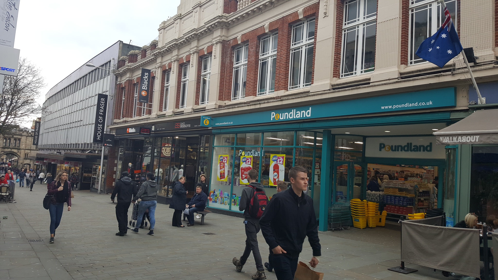
Poundland in Lincoln displaying the new logo
Re: Another High Street Rebrand
Posted: Fri 17 Mar, 2017 12.51
by Finn
At a nearby Asda garage (Hulme, Manchester) and discovered that Morrisons are making a sneaky bid to rebrand their opposition
Re: Another High Street Rebrand
Posted: Sun 19 Mar, 2017 12.12
by JAS84
A grey No Entry symbol?
Re: Another High Street Rebrand
Posted: Sun 19 Mar, 2017 19.29
by AgainWTheNorth
Well, makes sense; if they make it seem as though you can't go to Asda, you'll go to Morrisons instead! At least, it could work that way.