Page 154 of 238
Re: Another High Street Rebrand
Posted: Sun 14 Aug, 2016 22.01
by B.E. El-Zebub
Poundland & More is a trial format in some of the Family Bargains stores they acquired along with 99p Stores:
https://www.retail-week.com/sectors/gen ... 08.article
Re: Another High Street Rebrand
Posted: Sun 14 Aug, 2016 23.51
by james2001
Philip wrote:That's just going to remind me of this whenever I see it.

Or
Re: Another High Street Rebrand
Posted: Mon 15 Aug, 2016 20.56
by Alexia
Guinness getting a new logo.

Re: Another High Street Rebrand
Posted: Tue 16 Aug, 2016 13.34
by JAS84
Re: Another High Street Rebrand
Posted: Tue 16 Aug, 2016 19.45
by thegeek
old:

new:
I spotted it on a van a couple of weeks ago, and it's in an ad in the local council freesheet - but not yet on their website.
Quite an uninspiring refresh (and a further evolution of
this one, which presumably dates back to the 80s)
Re: Another High Street Rebrand
Posted: Tue 16 Aug, 2016 19.52
by Pear
thegeek wrote:old:
new:
I spotted it on a van a couple of weeks ago, and it's in an ad in the local council freesheet - but not yet on their website.
Quite an uninspiring refresh (and a further evolution of
this one, which presumably dates back to the 80s)
Not a fan of that font. Reminds me of the tacky one Boots uses in-store, comes across a bit naff and childish.
Re: Another High Street Rebrand
Posted: Tue 16 Aug, 2016 23.54
by Alexia
You didn't post it here so it doesn't count and....er.... yeah fuck you

Re: Another High Street Rebrand
Posted: Thu 18 Aug, 2016 15.23
by Finn
Pear wrote:Not a fan of that font. Reminds me of the tacky one Boots uses in-store, comes across a bit naff and childish.
It's probably the shape of the 'a' that makes you think that. A single-storey 'a' (looking like the way most people handwrite it, without a top hook) is a godsend to teachers trying to find a typeface to make reading of a worksheet or book easier (unfortunately leading to the use of Comic Sans, when Century Gothic or Tw Cen are better options), but looks odd to most adults used to reading a double-storey 'a' like the ones in most typefaces...
Or it could be the fact that it's a rounded typeface...
Re: Another High Street Rebrand
Posted: Thu 18 Aug, 2016 16.51
by Nick Harvey
I quite like Comic Sans. Oh, but you probably already knew that.
Re: Another High Street Rebrand
Posted: Thu 18 Aug, 2016 17.03
by Alexia
If the logo was representative, the colour would be a deep, murky dark grey-green.
Re: Another High Street Rebrand
Posted: Sat 20 Aug, 2016 09.57
by StevieB
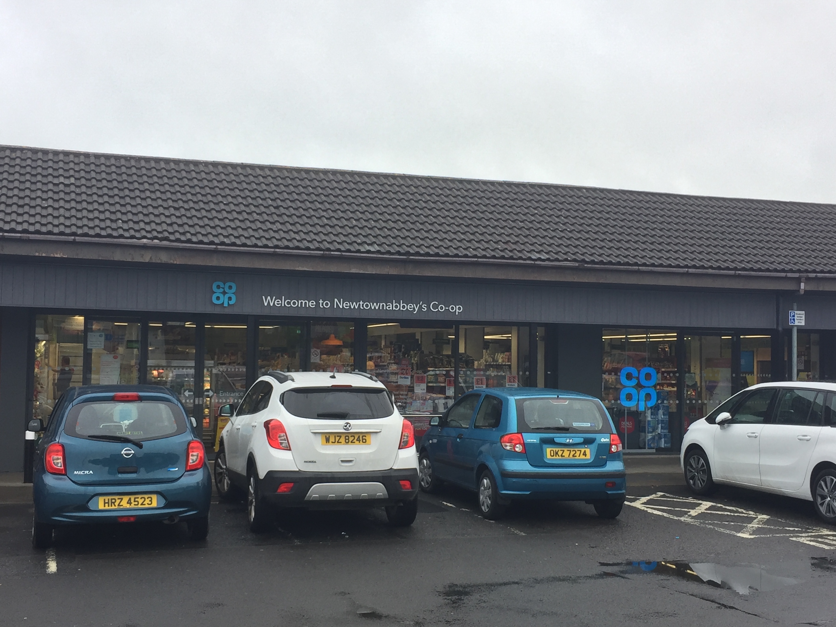
Our local Co-Op has just been given the new signage this week and has strangely been renamed Newtownabbey's Co-Op (it was previously known as Beverley Co-Op, named after the road it was on). Strange because there's more than one Co-Op in Newtownabbey!