Page 152 of 238
Re: Another High Street Rebrand
Posted: Sat 06 Aug, 2016 09.09
by JAS84
Re: Another High Street Rebrand
Posted: Sat 06 Aug, 2016 10.00
by james2001
And just like the Co-op, it's more like going back to the "old logo"! Well not exactly the same, but very similar!
Re: Another High Street Rebrand
Posted: Sat 06 Aug, 2016 11.59
by scottishtv
On one hand the rollout could be easy as they just have to update the logo when they buy the sandwich wrapping paper, and disposable cups etc. There are few slow moving branded items, or a vast product range, to worry about.
However, new store signage for well over 2,000 outlets can't be cheap. You'd presume franchise holders don't have to pay extra for the rebrand.
Re: Another High Street Rebrand
Posted: Sat 06 Aug, 2016 17.32
by james2001
Re: Another High Street Rebrand
Posted: Sun 07 Aug, 2016 01.34
by JAS84
Wow, didn't know Subway was even in the UK until after the newer logo (which that shop is also showing - why didn't they change the main sign at the same time?) was introduced.
Re: Another High Street Rebrand
Posted: Sun 07 Aug, 2016 12.06
by Solent James
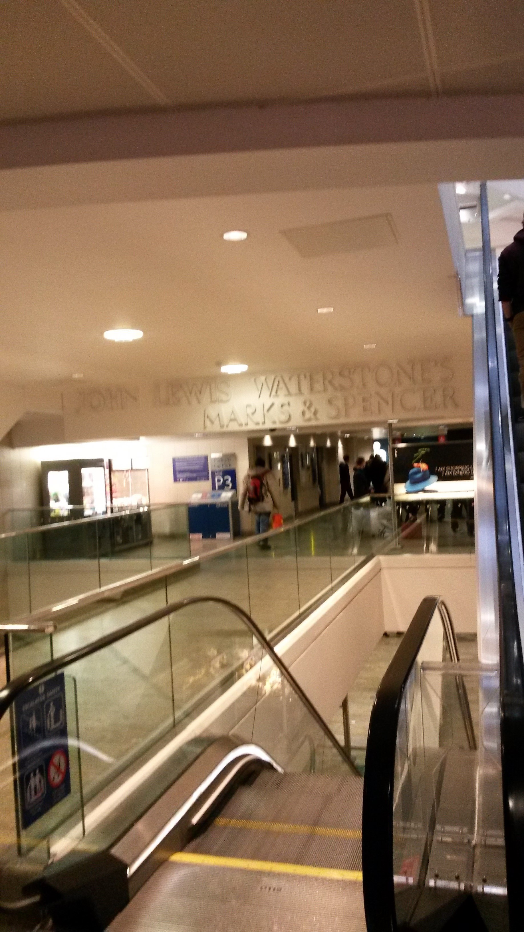
I love this sign in West Quay Southampton dating from when the centre opened in 2000 now containing 3 well out of date logos! (sorry it's a bit blurry!)
Re: Another High Street Rebrand
Posted: Sun 07 Aug, 2016 12.10
by Jovis
They all look like they're the same font to me - surely not out of date, rather never actually designed to be the logos at all?
Re: Another High Street Rebrand
Posted: Sun 07 Aug, 2016 12.45
by JAS84
Looks like they jumbled up the fonts from the three logos...


They are meant to be the logos, but the signmakers screwed up.
Re: Another High Street Rebrand
Posted: Sun 07 Aug, 2016 12.55
by james2001
The Marks & Spencer logo starts right, then moves into the wrong font after a few letters!
Re: Another High Street Rebrand
Posted: Sun 07 Aug, 2016 22.31
by JAS84
Yeah, the R in Waterstone's should be the R in Spencer. The first E and N in the word Spencer belong on the John Lewis logo (and the other E is one of Waterstone's's). Like I said, someone screwed up.
Re: Another High Street Rebrand
Posted: Sun 07 Aug, 2016 23.28
by gottago
Did there used to be another name to the left of Marks and Spencer or are they just awful at allignment as well?