
I quite liked the 1993 version, and some societies did some pretty good stuff with it - PSW's 2000's effort was particularly smart prior to their absorption into TCG. Personally I'd rather they went back to that (which would also tie it up with the other societies still using that logo) than go back to the 1968 logo which looks a bit too retro.
We've been here before of course - CRS first rejected the cloveleaf logo in the mid-90's, viewing it as old fashioned and rolled out a rebrand to 'Co-Operative' back then (the one with the 4 coloured squares). In fairness, they also did a lot more as part of this rebrand (such as finally introducing EPOS which was very late, until 1996 or so their food shops were still using manual cash registers and non-food was still working from paper invoices) but the branding fundamentally didn't work in that everyone continued to refer to it as 'Co-Op'. During the 2000 merger with CWS to form The Co-Operative Group it was unsurprising to see the rebrand attempt rejected and the CWS-led 1990's cloverleaf logo got rolled out to ex-CRS stores rather than any value in this rebrand attempt being seen.
It was surprising though to see them essentially try this again with the 2008 'The Co-Operative' branding which, despite the effort that went into it (and the expansion of it as TCG took over PSW and other societies started using it) still sounds just as awkward now as it did in the 90's.
Unless other societies get behind this rebrand, this does now of course mean that there are going to be 3 sort-of official Co-Op logos in use all at the same time!
Another High Street Rebrand
Interestingly there was a Co-op in Sheffield that still had the 1968 cloverleaf on the outside until at least 2012 (it's since become a B&M)
https://www.google.co.uk/maps/@53.40370 ... 312!8i6656
The Co-op department store in Derby still had one on the roof until the early-00s as well (and still had an old illuminated sign advertising co-op milk for several years after that!)
https://www.google.co.uk/maps/@53.40370 ... 312!8i6656
The Co-op department store in Derby still had one on the roof until the early-00s as well (and still had an old illuminated sign advertising co-op milk for several years after that!)

I think the repeated mistakes can be explained to some extent by the way the Group and the Societies have been run - or rather who's been running them and the disparity between them and the average customers. The governing bodies are in love with the history, the politics, the ethics - and I think that was the drive behind both "Co-operative" rebrands. I think that connects well with one subset of customers (and you can see all the other supermarkets trying to do their bit for that demographic), but it doesn't mean an awful lot to the convenience, quality and/or value driven masses.cwathen wrote:I quite liked the 1993 version, and some societies did some pretty good stuff with it - PSW's 2000's effort was particularly smart prior to their absorption into TCG. Personally I'd rather they went back to that (which would also tie it up with the other societies still using that logo) than go back to the 1968 logo which looks a bit too retro.
We've been here before of course - CRS first rejected the cloveleaf logo in the mid-90's, viewing it as old fashioned and rolled out a rebrand to 'Co-Operative' back then (the one with the 4 coloured squares). In fairness, they also did a lot more as part of this rebrand (such as finally introducing EPOS which was very late, until 1996 or so their food shops were still using manual cash registers and non-food was still working from paper invoices) but the branding fundamentally didn't work in that everyone continued to refer to it as 'Co-Op'. During the 2000 merger with CWS to form The Co-Operative Group it was unsurprising to see the rebrand attempt rejected and the CWS-led 1990's cloverleaf logo got rolled out to ex-CRS stores rather than any value in this rebrand attempt being seen.
It was surprising though to see them essentially try this again with the 2008 'The Co-Operative' branding which, despite the effort that went into it (and the expansion of it as TCG took over PSW and other societies started using it) still sounds just as awkward now as it did in the 90's.
Unless other societies get behind this rebrand, this does now of course mean that there are going to be 3 sort-of official Co-Op logos in use all at the same time!
I expect the current fascia will be dropped by the societies in time. Whether they unite behind the new (old) brand, go for new branding of their own or revert to some other logo... I don't know.
The bank is keeping the current fascia.WillPS wrote:I wondered that too - It'll be up to the society itself. Same for the societies that use their own branding.james2001 wrote:I'm wondering, will the co-ops in Lincolnshire which are still using the 1993 cloverleaf move to the new (or old) one, or will they stick with the 1990s one?
I also would like to know what's going to happen to the bank, brand wise. I imagine, hope in fact that they go their own way. The continued use of the "co-operative" brand bothers me as it's essentially false advertising - the government acknowledged as much but permitted its use for fear that forcing the bank to rebrand would hurt its chances of survival.
The Co-op’s most recent identity was designed by Pentagram in 2007 and made use of the organisation’s expanded name: ‘The co-operative’ – with ‘food’, ‘funeralcare’ ‘bank’ and so on added as a suffix. (The banking arm of the business, which is now only 20% owned by The Co-op Group, will retain this name and branding going forward.)
New logo already on receipts today, before any POS explaining about the change has appeared anywhere else.
On other defunct Co-op brands surviving, what is now 'The Co-Operative Food' in Truro still traded as 'Co-Operative Pioneer' until April 2011, over a decade after the branding became defunct. Despite being a prime city centre location it neither got the early 2000s white & blue Co-Op branding when every other store in Cornwall did, nor was it even near the top of the list for 'The Co-Operative Food' rollout either, again with many pokey corner shop outlets (and all of the former PSW estate) getting done first. It also took until then for it to get a proper interior refit, which was still largely unchanged from when it was opened (in the 70's) as an Argyll Lo-Cost supermarket (who had sold the chain to CRS in 1994).
Hardly a unique case though is it? Many Virgin-branded businesses ultimately end up with Virgin as a minority shareholder but the brand remaining for the recognition it has being to the benefit of the business.WillPS wrote:The continued use of the "co-operative" brand bothers me as it's essentially false advertising - the government acknowledged as much but permitted its use for fear that forcing the bank to rebrand would hurt its chances of survival.
The Homeworld stores which were closed by CRS in 1999 seemingly as a pre-requesite to the merger with CWS the following year mainly (all?) still had a 1968 cloverleaf logo on the building up until closure, even though in the final 3/4 years CRS was no longer using this logo (and even for several years before that the fact that Homeworld was part of a Co-Op was no longer actively promoted).james2001 wrote:Interestingly there was a Co-op in Sheffield that still had the 1968 cloverleaf on the outside until at least 2012 (it's since become a B&M)
https://www.google.co.uk/maps/@53.40370 ... 312!8i6656
The Co-op department store in Derby still had one on the roof until the early-00s as well (and still had an old illuminated sign advertising co-op milk for several years after that!)
On other defunct Co-op brands surviving, what is now 'The Co-Operative Food' in Truro still traded as 'Co-Operative Pioneer' until April 2011, over a decade after the branding became defunct. Despite being a prime city centre location it neither got the early 2000s white & blue Co-Op branding when every other store in Cornwall did, nor was it even near the top of the list for 'The Co-Operative Food' rollout either, again with many pokey corner shop outlets (and all of the former PSW estate) getting done first. It also took until then for it to get a proper interior refit, which was still largely unchanged from when it was opened (in the 70's) as an Argyll Lo-Cost supermarket (who had sold the chain to CRS in 1994).
But the word "co-operative" means something definitively with regards to the structure of the business. The word "virgin" does not.cwathen wrote:Hardly a unique case though is it? Many Virgin-branded businesses ultimately end up with Virgin as a minority shareholder but the brand remaining for the recognition it has being to the benefit of the business.WillPS wrote:The continued use of the "co-operative" brand bothers me as it's essentially false advertising - the government acknowledged as much but permitted its use for fear that forcing the bank to rebrand would hurt its chances of survival.
I don't know if it would have necessarily worked had they not had the fallow years of 'The co-operative', but my goodness that's a good looking branding.
Old Street in London's trendy Shoreditch (right next door to the first of the iPad Argoses, as it happens) has had the full refresh:
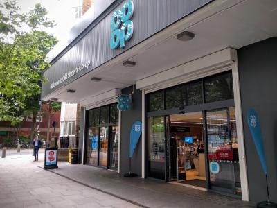
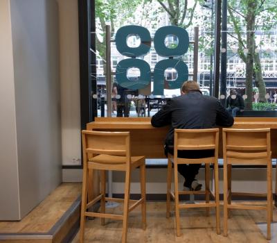

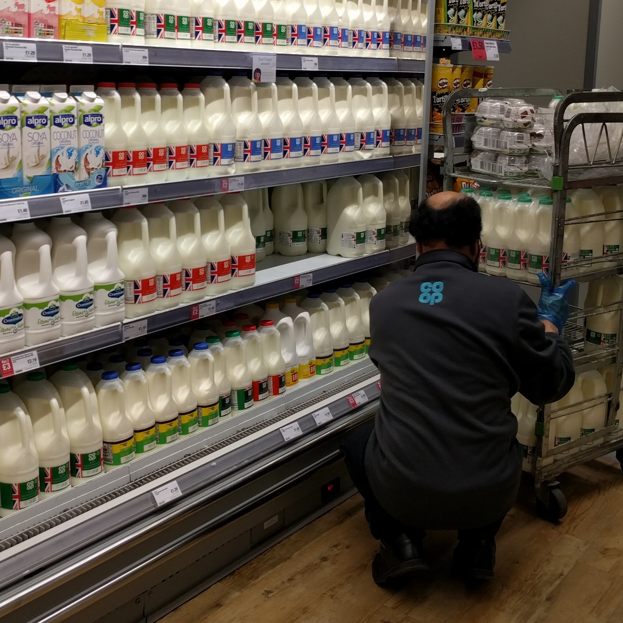
and a reasonable amount of the fresh foods have got new packaging too - you may be able to make it out on the milk above. The screens above the tills all had a nice white-on-blue logo on them, and it's all just quite pleasingly retro.
Brand New, on the whole, like it - there's a lot of nice shots on there too.
I hope it works for them - the previous branding was all just a bit 'meh'. I think it's possibly leapfrogged the new Morrison's branding for best supermarket branding.
Old Street in London's trendy Shoreditch (right next door to the first of the iPad Argoses, as it happens) has had the full refresh:


and a reasonable amount of the fresh foods have got new packaging too - you may be able to make it out on the milk above. The screens above the tills all had a nice white-on-blue logo on them, and it's all just quite pleasingly retro.
Brand New, on the whole, like it - there's a lot of nice shots on there too.
I hope it works for them - the previous branding was all just a bit 'meh'. I think it's possibly leapfrogged the new Morrison's branding for best supermarket branding.
Brand New are surprisingly quick at covering UK rebrands (considering the context needed for some of them)

Are Tesco going to bring back the blocky sans-serif logo and typewriter font next? 
And one place where the CRS Co-operative branding is going to live on forever is in late 90s/early 00s episodes of Last Of The Summer Wine where you see it quite in bit of it in scenes shot in and around the branch in Holmfirth.
And one place where the CRS Co-operative branding is going to live on forever is in late 90s/early 00s episodes of Last Of The Summer Wine where you see it quite in bit of it in scenes shot in and around the branch in Holmfirth.
I totally agree with Brand New on the food packaging falling just slightly short of the quality of the overall package. It has the look and feel of a value range (which itself is a testament to how much the others have upped their game on those ranges).
I thought this was one area the 2008 brand had nailed. Although that said there's not many products on the shelves conforming to those guidelines now.
Thinking about it Sainsburys did a similar thing with their 1999 rebrand - the packaging for fresh foods became very simple. What happened in the years following is probably what'll happen to the Co-op - as ranges get refreshed they'll gradually make the designs more eye catching.
It's the one weak point - the execution is otherwise absolutely spot on. I can't wait to see this rather 70s funeral parlour, which I always felt looked better with the propriety branding Sheffield Co-op used, with a massive cloverleaf on its high-pitched roof.