
Another High Street Rebrand
-
tillyoshea

- Posts: 373
- Joined: Sun 23 Nov, 2003 14.34
- Location: Newcastle upon Tyne
- Contact:
I understand that's as a result of a court ruling after CSL rebranded to Sofaworks, and DFS claimed that the new name was rather too similar to their Sofa Workshop brand.Andrew wrote:You can't fail to have not noticed the TV adverts surely?scottishtv wrote:Driving past a retail park at the weekend, I noticed that Sofaworks is now Sofology.
-
scottishtv
- Posts: 770
- Joined: Thu 01 Apr, 2004 15.36
- Location: Edinburgh
Yes, but I thought it was just an ad campaign (akin to "That's Travelogical!" for Travelodge) rather than a rebrand of the business.Andrew wrote:You can't fail to have not noticed the TV adverts surely?scottishtv wrote:Driving past a retail park at the weekend, I noticed that Sofaworks is now Sofology.
The Co-operative does something that nobody expected (read: everybody) and has brought back its classic clover leaf logo, renaming itself (again) to Co-op.
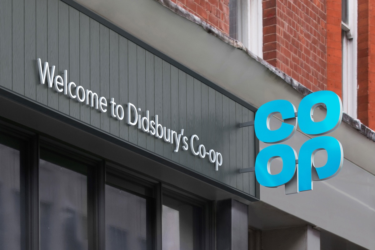
More here: http://www.creativereview.co.uk/cr-blog ... from-1968/
More here: http://www.creativereview.co.uk/cr-blog ... from-1968/


As reported here back before Christmas: viewtopic.php?p=124538#p124538Philip wrote:The Co-operative does something that nobody expected (read: everybody) and has brought back its classic clover leaf logo, renaming itself (again) to Co-op.
More here: http://www.creativereview.co.uk/cr-blog ... from-1968/
I think that is slightly overstating it. Certainly it looked old hat to me wherever I saw remains of its original incarnation. I admired the Co-operative group's vision to massively simplify their branding in a not dissimilar vein to the BBC 1997 rebrand - unfortunately where the BBC retained a much simplified 'blocks' the Co-op essentially threw away the baby with the bath water.It’s a symbol and a wordmark and that’s impossible to beat for a graphic designer. It’s never dated
It seemed the group were unwilling to use the Co-op brand as it stood for 'serious' things like the funeral and banking businesses. I don't really know why, it's always been 'the co-op bank' and 'co-op funerals' colloquially, I never personally saw that as a problem.
I think going back to the blue cloverleaf makes a real statement, and the execution here is absolutely top notch. That said, the retro appeal will fade with time - hopefully they'll find a way to properly evolve the cloverleaf logo (again) at that stage.
There's a view of the new Funeralcare look here: http://www.thenews.coop/105734/news/bus ... -rebrands/
-
AgainWTheNorth

- Posts: 22
- Joined: Thu 28 Jan, 2016 03.12
And also, that's not QUITE the cloverleaf logo British people of a certain age love; the C is more closed, but that's only a nominal change.
Then again, I'm an American - what do I know?
I wondered that too - It'll be up to the society itself. Same for the societies that use their own branding.james2001 wrote:I'm wondering, will the co-ops in Lincolnshire which are still using the 1993 cloverleaf move to the new (or old) one, or will they stick with the 1990s one?
I also would like to know what's going to happen to the bank, brand wise. I imagine, hope in fact that they go their own way. The continued use of the "co-operative" brand bothers me as it's essentially false advertising - the government acknowledged as much but permitted its use for fear that forcing the bank to rebrand would hurt its chances of survival.