Re: Another High Street Rebrand
Posted: Tue 21 Jul, 2015 20.07
Indeed... Hence why I see it as a refresh, instead of a rebrand as others have described it
That's weird. The website has now relaunched, and that link redirects to https://www.national-lottery.co.uk/new-look, which doesn't exist.thegeek wrote:the taglines with the URL at the bottom is a bit messy - and the URL doesn't currently work.
For some reason the address is http://www.national-lottery.co.uk/lp/new-look, so they've used the wrong link twice!JAS84 wrote:That's weird. The website has now relaunched, and that link redirects to https://www.national-lottery.co.uk/new-look, which doesn't exist.thegeek wrote:the taglines with the URL at the bottom is a bit messy - and the URL doesn't currently work.
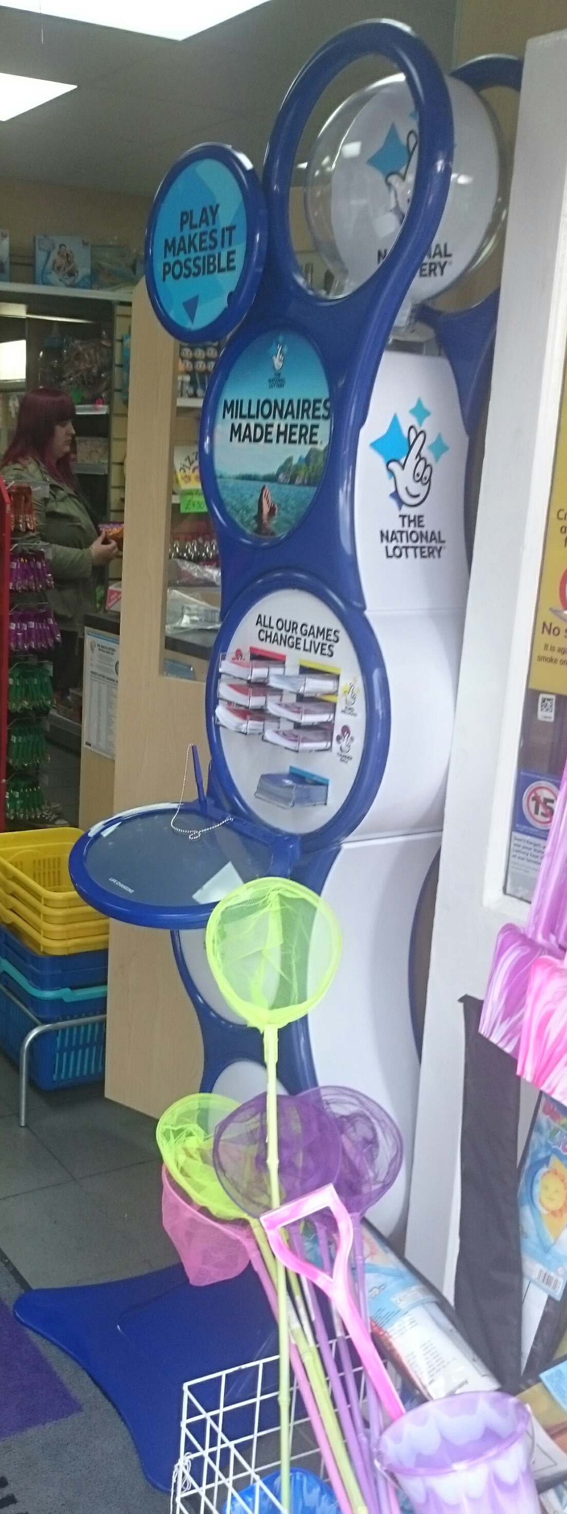
The whole thing is new. The little bin, for example, now has the green recycling swoosh on, and as Critique noted, there is now only one writing surface. The surfaces that were silver are now white as well (perhaps not obvious in that photo).Critique wrote:As I've been saying throughout that appears to be a new stand in bilky_asko's post, so not only have they rolled out new card inserts for the current stands, but they're replacing them with new ones quite quickly too.
On another note, the customer-facing screen on the Lottery terminal now shows adverts with the new branding, but there were one or two that were just the same adverts as before but with a different logo - the EuroMillions advert (on TV with Hector Riva) on the screen just looked a bit 'off' featuring the new logo.
Would it be that economical to change the writing surface, the colour of a significant portion of the stand, some of the decals, and bring it up to brand new condition?Whataday wrote:I'm sure the stand in the photograph is one that was introduced under the old branding. In fact there is an identical stand at my local Tesco which still has the old branding. Also, I notice "LIFE CHANGING" on the writing surface. Isn't that slogan from a few years back?