The Tesco & other non-Morrisons supermarket thread
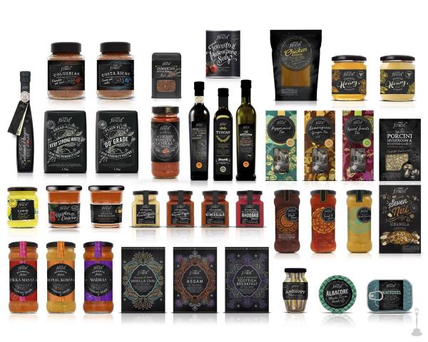
Sainsbury's are in the process of doing the complete opposite: they're phasing out their uniform packaging design featuring Avant Garde font, and giving each product range a bespoke design (although they're keeping "by Sainsbury's" underneath the product name).ph2o wrote: Tue 07 Nov, 2017 15.22 Tesco is rebranding its own label goods. Gone is the old fonts and inconsistencies in design. Now packages are all uniform but beautifully designed and looks a lot more upmarket.
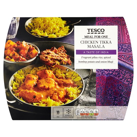
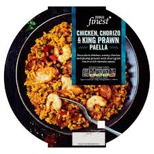
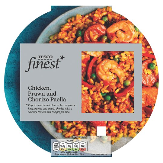
I have found some old and new images - check in stores for more. This is now on most Ready Made Meals and Italian Pasta Sauce.
I don't know why British supermarkets change their own label packaging designs so frequently. Anecdote time: 32 years ago while visiting family in Norway I got instantly hooked on the taste of a sweet mustard (similar to IKEA hot dog mustard) from their local supermarket. They've sent me a bottle every Christmas since, and the design hasn't changed one bit in 32 years - it's just the supermarket logo with the product name in lower case Helvetica bold.
It's a company name in itself, not a description.MarkAshley wrote: Wed 08 Nov, 2017 19.13 Incidentally, how on earth is "Cornish Sea Salt" a registered trade mark??

They also provided the salt to the Mr Filbert's Nut company once upon a time. See if you can spot where their logo used to be.

Also - Red Thai Chicken Curry sounds better than Thai Red Chicken Curry, because the latter sounds like it's a curry made from red chickens.
Not quite sure about the new Finest look. They have stepped back to the old look but I don't like the new font of the product description.
It's a shame just as I think they are improving their own brand standard products, they pull a poor 'new look' on their premium line 'finest', which I think should deserve a better design. The only good thing about it is it's uniformity as I guess its easier to spot the Finest product but doesn't have the edge and bespoke feel of before.

I wonder if they are rebranding all the Finest lines.
Before -

After -

-
- Posts: 1538
- Joined: Wed 11 May, 2011 01.28
Sainsbury's appear to be discontinuing the 'Basics' brands for some products. Recently noticed this with a hair product which was axed,. while their ready meal range is now called 'Mini Ready Meals' with a hike of 60p on them from today!
TVF's London Lite.
I think I know why Tesco have done this. That gastropub arty chalkboard style with rustic fonts looked great when they introduced it, but it's since been done to death by so many different brands and products (many of them not even premium) that it's lost its ability to stand out on the shelf and to convey the premium message. The minimalist design on silver is a much safer bet for that purpose.
-
- Posts: 1447
- Joined: Sat 08 Nov, 2008 19.48
Co-op seem to be replacing their existing IBM cash registers with Wincor Nixdorf ones, with a similar screen facing the customer with purchase information and advertising. They look a lot more modern but for now at least they seem to be running the same software - as the on-screen graphics are identical except they look slightly stretched (presumably not compatible with widescreen resolution). I presume they'll be transitioning to a new EPOS system in time.
- Nick Harvey
- God
- Posts: 4160
- Joined: Fri 15 Aug, 2003 22.26
- Location: Deepest Wiltshire
- Contact:
Thank you Mark. I love to see the continued use of the verb 'to Shatliff'.