
Maybe we need all petrol station branding talk to have its own thread. That would stop this whole sorry saga from happening again.Philip wrote: Sun 03 Sep, 2017 12.35That would have necessitated my Tesco post being in your Sainsbury's thread though.all new Phil wrote: Sun 03 Sep, 2017 12.28 I didn't go to the trouble of starting a Sainsbury's thread in 2011 for you all to post about Sainsbury's in the Tesco thread
The Tesco & other non-Morrisons supermarket thread
-
all new Phil
- Posts: 2040
- Joined: Sun 13 Feb, 2005 00.04
- Location: Next door to Hell
Or the thread renaming to "The Tesco & Other non-Morrisons or Sainsbury's Supermarket Thread".all new Phil wrote: Sun 03 Sep, 2017 13.40Maybe we need all petrol station branding talk to have its own thread. That would stop this whole sorry saga from happening again.Philip wrote: Sun 03 Sep, 2017 12.35That would have necessitated my Tesco post being in your Sainsbury's thread though.all new Phil wrote: Sun 03 Sep, 2017 12.28 I didn't go to the trouble of starting a Sainsbury's thread in 2011 for you all to post about Sainsbury's in the Tesco thread
A local Tesco Extra has undergone a major refit over the summer, with new wood panelled totem, extensive new external and internal photographic signage, wood panelled deli/butcher, etc. counters... all using the old font, mostly in uppercase just to make it even more glaring. Not a trace of the new anywhere outside, bar the promo banners.
The "motorway" signage is in the new font but the mid-aisle additional pointers (where the old signs used to hang) are all resolutely old style.
Although it's all a step up from the faded blue, white and red "£ cut by scissors" look it was previously sporting, I guess that's that store cemented in a mish-mash of styles for the next 15-20 years or so.
-
all new Phil
- Posts: 2040
- Joined: Sun 13 Feb, 2005 00.04
- Location: Next door to Hell
SELs aren’t supposed to be on-brand are they? It’s certainly not something that seems to trouble other supermarkets.


JS have always kept their SELs consistent with their branding, even when they went through that brief period using that god-awful slab font.all new Phil wrote: Wed 27 Sep, 2017 21.25 SELs aren’t supposed to be on-brand are they? It’s certainly not something that seems to trouble other supermarkets.
-
bilky asko
- Posts: 1463
- Joined: Sat 08 Nov, 2008 19.48
It seems they've helpfully designed them for the vision impaired.
https://twitter.com/dresserman/status/9 ... 0166251520
https://twitter.com/dresserman/status/9 ... 0166251520
So, er, some Willow Farm chicken has just been repackaged Lidl rejects.
Tesco admits error over repackaging of returned Lidl chicken
Tesco admits error over repackaging of returned Lidl chicken
-
all new Phil
- Posts: 2040
- Joined: Sun 13 Feb, 2005 00.04
- Location: Next door to Hell
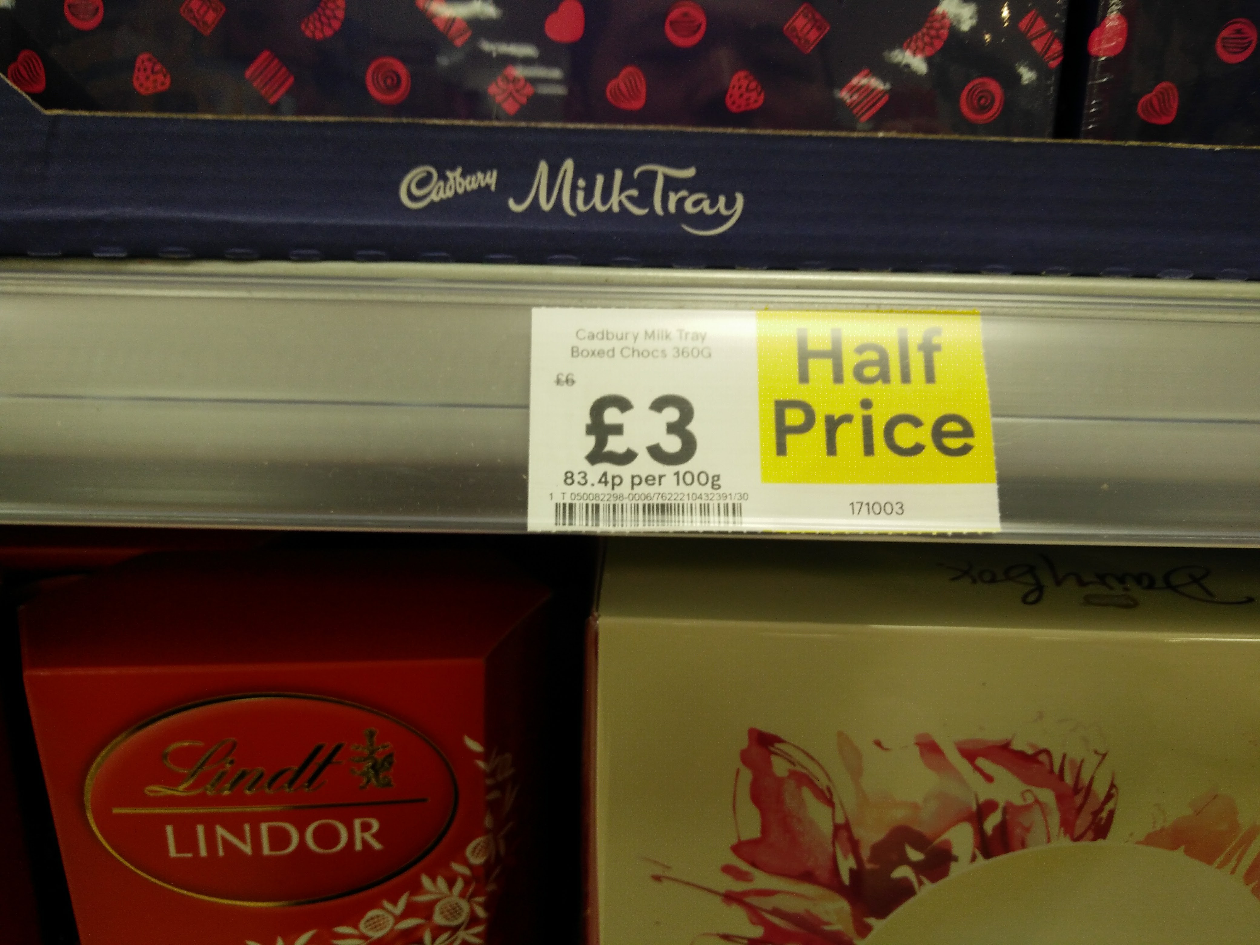
Good grief, the new Tesco SELs look awful with such big text for the price.
I'm sure people with poor eyesight share your concern for aesthetics over function.all new Phil wrote: Thu 05 Oct, 2017 01.33 Good grief, the new Tesco SELs look awful with such big text for the price.
Because they were tiny beforehand?Alexia wrote: Thu 05 Oct, 2017 14.26I'm sure people with poor eyesight share your concern for aesthetics over function.all new Phil wrote: Thu 05 Oct, 2017 01.33 Good grief, the new Tesco SELs look awful with such big text for the price.
