
Another High Street Rebrand
Wouldn't be the first time a logo's been introduced on shop fronts before it became the official logo. Comet were using their new logo on store signage back in 2000, but the old logo was still in use on things like adverts, posters, the website and carrier bags for years-I don't think it was until 2005 when the logo they'd been using on stores finally started appearing elsewhere.
Yeah think the Carpet Right logo has been scrapped as our local one has moved over the road to a new unit and has the old logo outside.
Also on the same topic as B&M 99p Stores do the signs cheap too. One of our old stores was taken over by 99p and you can see the old black sign under it.
Also on the same topic as B&M 99p Stores do the signs cheap too. One of our old stores was taken over by 99p and you can see the old black sign under it.

That second image reminds of what Abbey proposed for new look branches during the brief 2003 rebrand.

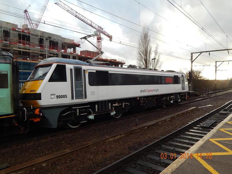
Greater Anglia, the primary rail provider for most of the East of England, has done a Rakuten-Play.com rebrand and now appears to be abellio Greater Anglia. I thought it was a more recent development, but it looks like they were using the new logo last November... In the process, their logo has gone all lowercase they've gained a new tagline, along the lines of 'more than just a to b'. It looks odd.


-
madmusician

- Posts: 153
- Joined: Mon 11 Dec, 2006 19.11
- Location: Worcester, UK
Good grief - that looks awful! How far has this spread? Is it in trains/signs/etc?Critique wrote:Greater Anglia, the primary rail provider for most of the East of England, has done a Rakuten-Play.com rebrand and now appears to be abellio Greater Anglia. I thought it was a more recent development, but it looks like they were using the new logo last November... In the process, their logo has gone all lowercase they've gained a new tagline, along the lines of 'more than just a to b'. It looks odd.
The TfL forum suggests that it's making appearances on trains:madmusician wrote:Good grief - that looks awful! How far has this spread? Is it in trains/signs/etc?Critique wrote:Greater Anglia, the primary rail provider for most of the East of England, has done a Rakuten-Play.com rebrand and now appears to be abellio Greater Anglia. I thought it was a more recent development, but it looks like they were using the new logo last November... In the process, their logo has gone all lowercase they've gained a new tagline, along the lines of 'more than just a to b'. It looks odd.
However, I would think it'll be quite a slow changeover - new timetables will most probably already have the new logos on but other signage and the like that isn't changed often I would think that the switch won't be immediate.

P&G have given Pampers a subtle logo tweak, following Huggies all but exiting most European markets last year.

Which itself had only existed as a brand since 2007, replacing 'one'. Abellio are gearing up to become a major player, the previous logo looked extremely temporary to me (even for a 'caretaker franchisee'). If the Northern "an Abellio and serco joint venture" vinyls are anything to go by, they'll be rolled out pretty quickly.JAS84 wrote:Especially considering that the old logo didn't even last two years. Abellio only took over from National Express in 2012.
It's not that amusing - it happens all the time in fact - East Coast have (or had) loads of mixed sets with their own silver, NX's silver and white and GNER's blue.Alexia wrote:Rather amusingly to those of us rail bods, that class 90 all shiny in its new white coat and faux window frame with new logo is pulling a tatty mk3 which, from the door colour, appears to still be in "one" livery, two franchise brands ago...