
The Tesco & other non-Morrisons supermarket thread
-
Martin Phillp
- Posts: 1597
- Joined: Wed 11 May, 2011 01.28
Did Tesco change the ad agency this time round?
TVF's London Lite.
Yes:Martin Phillp wrote:Did Tesco change the ad agency this time round?
http://www.thegrocer.co.uk/channels/sup ... 38.article
http://www.campaignlive.co.uk/article/i ... gy/1368667
-
scottishtv
- Posts: 770
- Joined: Thu 01 Apr, 2004 15.36
- Location: Edinburgh
Embarrassing and dated sums it up. The slapstick Tesco family looks even worse when you see Sainsbury's doing the aspirational middle-class family situation stuff in their Christmas food adverts:gottago wrote:God I'd give anything to see Tesco's market share fall as a direct result of their atrocious ad campaign this Christmas. Utterly woeful, dated shite. I don't see how it could appeal to anyone.
Mum, dad and son:
Mum, dad, son and girlfriend:
Mum, dad, son and boyfriend:

On the subject of nostalgia with talks of 'the cooperative' bringing back the 'co-op' logo. Is there still any more old Tesco stores with the lovely vintage logos like the stores in these photos? I think Tesco should bring back this logo and the famous blue stripes.
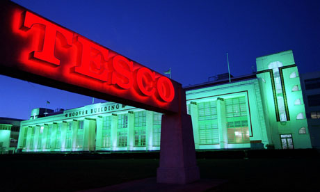
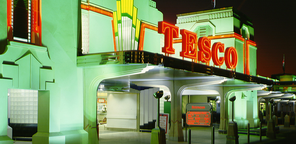
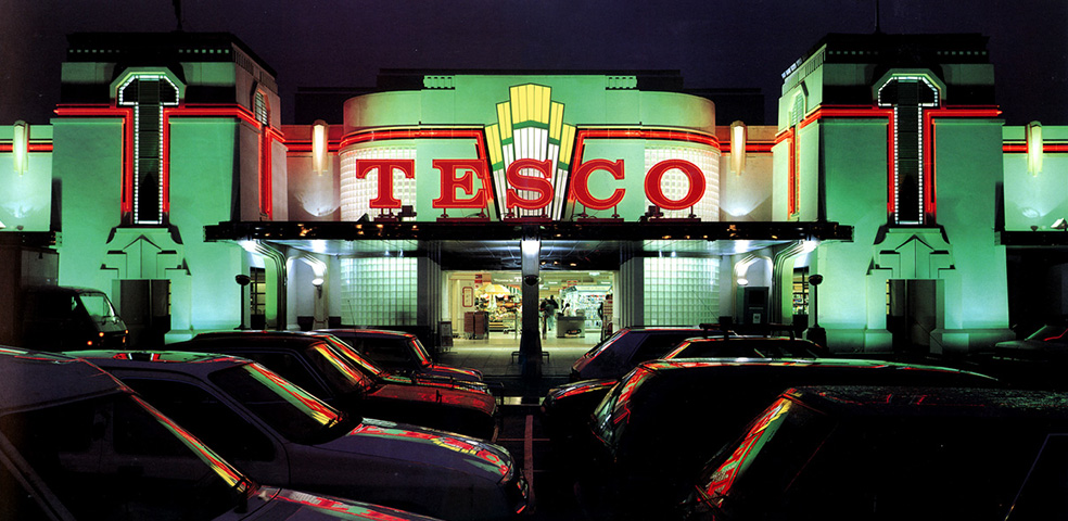


Those photos make it look like an American cinema from the 50s (which is no bad thing)

the Sevenoaks store still had old branding when I was there in 2012 - the 2009 Street View image shows it even had a 'Home 'n' Wear' department. It seems to have become a standard Metro by 2014 though

You can occasionally see that Tesco out of the window of the cab at the end of The Apprentice.

Wow, I didn't know there were any stores still with decor from that era. The "look" you refer to you was, I'm pretty sure, launched in 1982 and certain elements tied in with their marketing campaign of the same year, "Checkout 82" - TV ad here.james2001 wrote:The one in Worksop still has the logo BEFORE that one, and the white & cream stripes around the inside, and the "typewriter" font everywhere, or at least it did last time I was there earlier this year.
Funny old company, Tesco. They change their own brand pack designs to the point of obsession (I've previously reported on here that their Olive Spread had 3 designs in the space of 1 year) yet they'll leave store signage unchanged for a third of a century!
I assume their signage department/contractor still produces signs to the 1982 branding guidelines for when those old stores need replacement or updated signs but want to keep a consistent appearance. That was certainly the case when I last checked a few years ago in the Hanley store - it had the 1982 look but new signs were still produced in Typewriter font, red on white, with the red piping around the edge, for things like car park prices and opening times.