Another High Street Rebrand
Thomas Cook have had a rebrand today, replacing their old logo which had been in place since 2001.
Old logo:

New logo:

http://www.telegraph.co.uk/travel/trave ... -logo.html
It's different. I do think the old logo is a classic though but it had been through tough times recently so I can understand for the need of a rebrand.
Old logo:

New logo:

http://www.telegraph.co.uk/travel/trave ... -logo.html
It's different. I do think the old logo is a classic though but it had been through tough times recently so I can understand for the need of a rebrand.
The 'sunny heart' is also being used for their European brands:

http://www.thomascookgroup.com/brand-st ... nd-symbol/

http://www.thomascookgroup.com/brand-st ... nd-symbol/
-
- Posts: 2020
- Joined: Sun 13 Feb, 2005 00.04
- Location: Next door to Hell
I always thought the old logo looked a bit cheap so I'm glad it's changed. It's still a bit non-descript though.
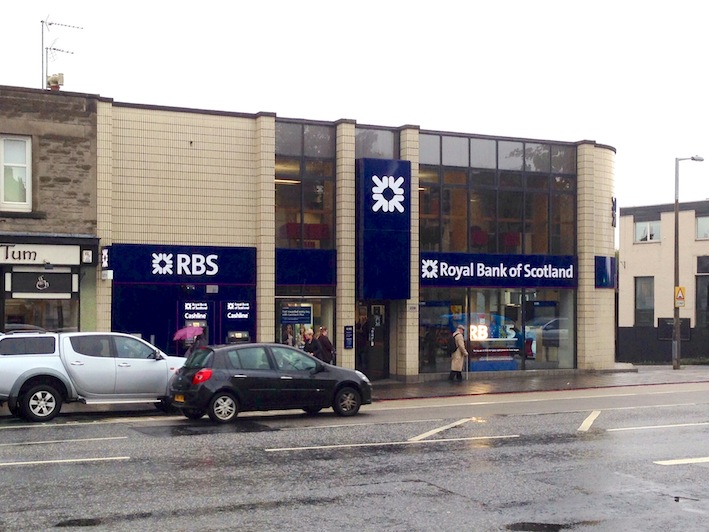
As promised, a photo. I must have been looking at the branch from a different angle the other day - didn't notice the 'RBS' logo remained too. But still…Ant wrote:On the subject of RBS, my branch in Edinburgh has new signage sporting a new logo. The arrows remain but 'RBS' has been replaced with 'Royal Bank of Scotland'. I'll try and get a photo in the next couple of days, but imagine the old logo with a new font.
The branch featured on an RBS advert a couple of years ago so it could be some form of concept branch.

The new William Hill that has opened up in Town centre here appears to be using one of N6's BARCOs as part of it's window display. I'm not sure what it actually is, as it isn't a BARCO, but it appears to be an LED screen, which I haven't actually seen turned on yet either, meaning I am yet to see it as anything more than a chunky black cuboid. Looking inside, they also appeared to have a full video wall displaying TV channels and the like, which looked very nice.