

I'm not sure it fits that definition either...bilky asko wrote: Wed 31 May, 2023 22.06Perhaps he meant ironic in the Alanis Morrisette sense of "unfortunate"WillPS wrote: Wed 31 May, 2023 21.07Wouldn't be unique by any extent. Nor would it be ironic.JetixFann450 wrote: Wed 31 May, 2023 01.50
Going to be pretty ironic, a fairly recent EG Garage near me opened with a Spar, I presume that's going to inevitably be replaced by an ASDA on the Go.
Another High Street Rebrand
-
scottishtv
- Posts: 770
- Joined: Thu 01 Apr, 2004 15.36
- Location: Edinburgh
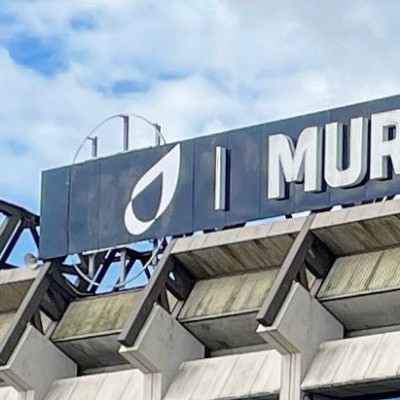
In former-nationalised-utilities and rugby news, "BT Murrayfield" stadium has become "Scottish Gas Murrayfield" stadium, following a change of sponsor.
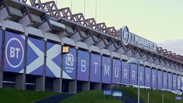
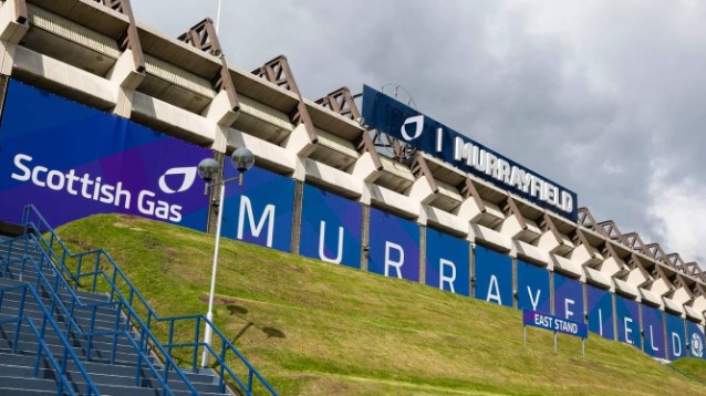
They didn't do a great job converting the round BT logo to the Scottish/British Gas flame:
...and everyone will just call the place Murrayfield, as before.
They didn't do a great job converting the round BT logo to the Scottish/British Gas flame:
...and everyone will just call the place Murrayfield, as before.
Looking forward to watching the Scottish Gas Scottish Cup Scottish Final Scottish Highlights.thegeek wrote: Tue 25 Jul, 2023 20.43 I see they're also now title sponsors of the Scottish Gas Scottish Cup.

I normally log in to Bank of Scotland's online banking, but had cause to use the Halifax-skinned version of it today, and see that they're still using the old branding on there. I mean, it's only been four years. Why rush these things?JAS84 wrote: Sat 06 Apr, 2019 20.26 Just saw a TV ad for Halifax bank, with what looked like an updated logo on it - it's no longer stripy and has a new font.
Well GWR are now only a month away from their rebrand being 8 years old and still not finished.thegeek wrote: Tue 08 Aug, 2023 13.58I normally log in to Bank of Scotland's online banking, but had cause to use the Halifax-skinned version of it today, and see that they're still using the old branding on there. I mean, it's only been four years. Why rush these things?JAS84 wrote: Sat 06 Apr, 2019 20.26 Just saw a TV ad for Halifax bank, with what looked like an updated logo on it - it's no longer stripy and has a new font.
I do wonder if it is partly planned (a bit like how years ago Comet held off for a very long time on updating the branding on the website such was the slowness of their rebrand of the store estate).
I have several accounts and credit cards with LBG. They were still renewing my cards with landscape embossed versions (and for Halifax accounts with the old logo on) as recently as last year. In fact the only new design card I hold is my Halifax current account debit card issued this year. I guess this was to use up all the old stock that had already been paid for, but if they knew they were issuing cards with old branding which might be valid for 5 years, a decision may have been made that it would be better for some vestiges of the old brand to hang around?
The previous Lloyds landscape cards had the correct post-TSB-demerger branding.cwathen wrote: Tue 08 Aug, 2023 21.33Well GWR are now only a month away from their rebrand being 8 years old and still not finished.thegeek wrote: Tue 08 Aug, 2023 13.58I normally log in to Bank of Scotland's online banking, but had cause to use the Halifax-skinned version of it today, and see that they're still using the old branding on there. I mean, it's only been four years. Why rush these things?JAS84 wrote: Sat 06 Apr, 2019 20.26 Just saw a TV ad for Halifax bank, with what looked like an updated logo on it - it's no longer stripy and has a new font.
I do wonder if it is partly planned (a bit like how years ago Comet held off for a very long time on updating the branding on the website such was the slowness of their rebrand of the store estate).
I have several accounts and credit cards with LBG. They were still renewing my cards with landscape embossed versions (and for Halifax accounts with the old logo on) as recently as last year. In fact the only new design card I hold is my Halifax current account debit card issued this year. I guess this was to use up all the old stock that had already been paid for, but if they knew they were issuing cards with old branding which might be valid for 5 years, a decision may have been made that it would be better for some vestiges of the old brand to hang around?
I doubt there was any rationale to it other than not getting around to it yet. I have no idea how much card stock they hold but I doubt very much that it's years worth.
Sainsburys own brand stuff with their pre-1999 logo was still about well in to the 2010s - the last examples of it were finally dropped when they rolled out the 'by Sainsburys' brand. Just a question of priorities.
Nationwide's new 'bragging about not closing branches' advert features its new logo. Gone is the serif typeface, now it's fine for the vogue of minimalist design. I really don't like it. Having it all lowercase doesn't strike me as formal, and the house icon is barely discernable. The negative space on it doesn't work. Maybe the colours are too dark
-
tillyoshea

- Posts: 373
- Joined: Sun 23 Nov, 2003 14.34
- Location: Newcastle upon Tyne
- Contact:
Weirdly, I've had conversations with three different people where they've moaned about this campaign in light of the seemingly recent closure of the Nationwide branch on Gosforth High Street. I don't often have conversations about TV ads, so this is unusual.Blewatter wrote: Sun 22 Oct, 2023 11.37 Nationwide's new 'bragging about not closing branches' advert features its new logo. Gone is the serif typeface, now it's fine for the vogue of minimalist design. I really don't like it. Having it all lowercase doesn't strike me as formal, and the house icon is barely discernable. The negative space on it doesn't work. Maybe the colours are too dark
It might be a specific local thing, perhaps underlined by lots of recent Gosforth High Street bank branch closures plus Newcastle Building Society doing a lot of marketing around retaining their branch. But I wonder whether it's a local picture repeated in many places nationally, and whether therefore the approach might be received less well than they anticipate.