
Another High Street Rebrand
Evri looks like Evil to me. Not a great brand.
turns out it really is 'according to Wikipedia'
Morphy Richards has a new look. They must've had that old logo since the 80s at least.
https://www.morphyrichards.com/en-gb
https://www.morphyrichards.com/en-gb
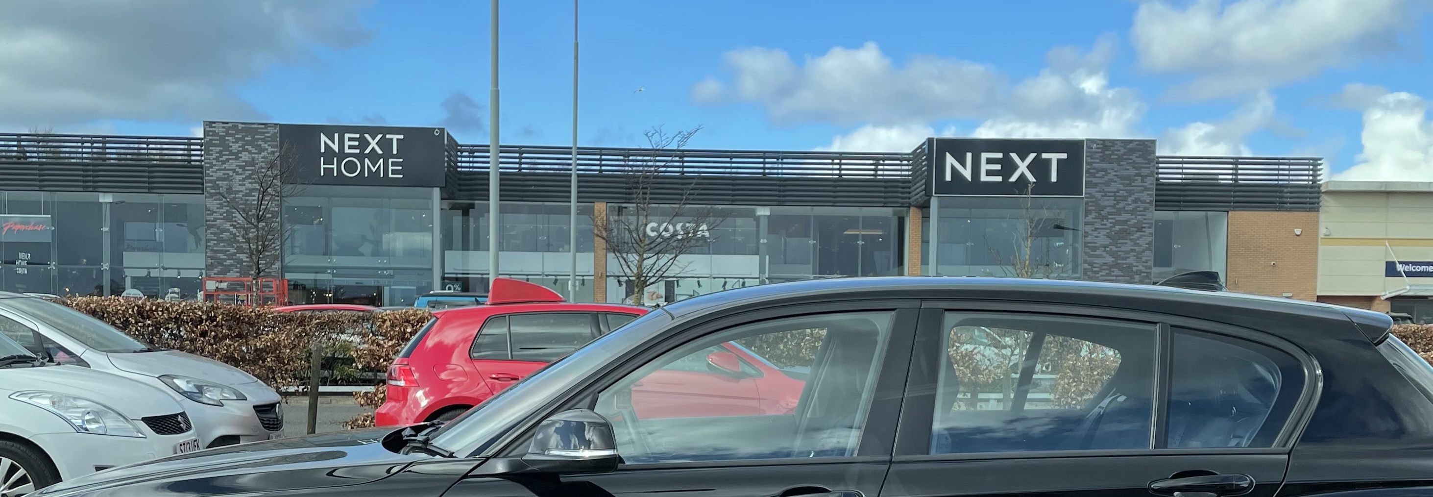
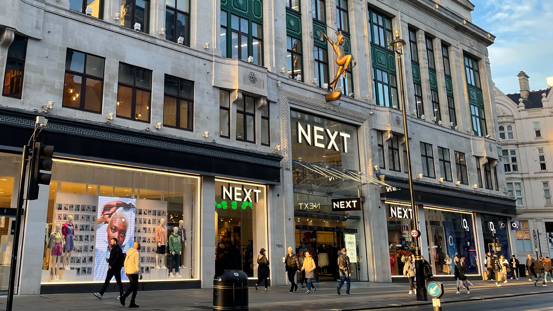
It's being rolled out across their stores between now and the end of the year.Bob wrote: Thu 31 Mar, 2022 17.59 The very first post in this thread is about Next changing their logo from NEXT to next in 2007. These signs were put up yesterday so they are going back to the capitalised logo. I've not seen it on their website or social media yet.
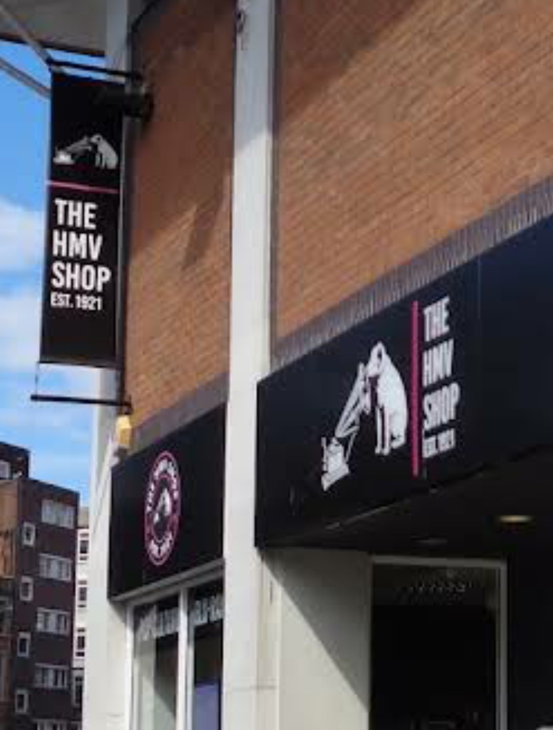
HMV is currently rebranding as The HMV Shop.
The Cardiff branch has been closed for several weeks for a refurb.
The Cardiff branch has been closed for several weeks for a refurb.
I've definitely noticed a softening on this. Their email about being closed for the Queen's funeral referred twice to 'Waitrose stores'. I feel like a year or two ago they'd have gone out of their way to call them 'Waitrose & Partners stores'.Joe wrote: Fri 24 Sep, 2021 20.40 I’ve noticed that John Lewis and Waitrose don’t always verbally include the ‘and Partners’ bit in their advertising. Maybe there are valid reasons for not doing so, but if they’re not going to use their ‘full name’, nobody else will.
I thought something looked different about their new advert - just a plain "John Lewis" wordmark at the end, no "& Partners" nor the barcode logo design.thegeek wrote: Fri 16 Sep, 2022 23.09I've definitely noticed a softening on this. Their email about being closed for the Queen's funeral referred twice to 'Waitrose stores'. I feel like a year or two ago they'd have gone out of their way to call them 'Waitrose & Partners stores'.Joe wrote: Fri 24 Sep, 2021 20.40 I’ve noticed that John Lewis and Waitrose don’t always verbally include the ‘and Partners’ bit in their advertising. Maybe there are valid reasons for not doing so, but if they’re not going to use their ‘full name’, nobody else will.
That rebrand was such a retrograde step. It resulted in two unwieldy brand names that would inevitably be shortened and wordmarks that are much less distinctive.

Yup, the original wordmarks were so distinct with that sharp point on the J and L. Some of the brand elements around it could have done with some freshening but honestly don't know what they were thinking with the new logos.Jonny wrote: Sat 17 Sep, 2022 23.38 That rebrand was such a retrograde step. It resulted in two unwieldy brand names that would inevitably be shortened and wordmarks that are much less distinctive.
"He has to be larger than bacon"