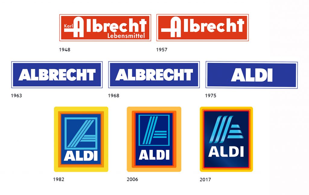
I belive the second tweaked logo was to also symbolise the H of Hofer. Aldi's brand in Austria. As well as the A in Aldi.
Another High Street Rebrand
-
sqwidge1978
- Posts: 77
- Joined: Sat 25 Jun, 2016 15.42
I belive the second tweaked logo was to also symbolise the H of Hofer. Aldi's brand in Austria. As well as the A in Aldi.
-
sqwidge1978
- Posts: 77
- Joined: Sat 25 Jun, 2016 15.42
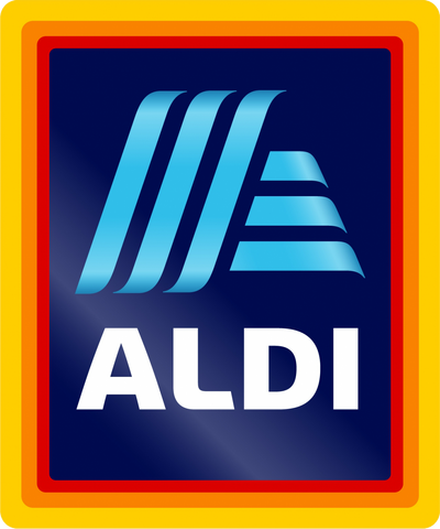
History of Aldi logo evolution.
New logo set to launch in June across the Aldi Süd network.
https://www.esmmagazine.com/aldi-sud-ro ... june/39826
Austria's Hofer is also to get it own treatment of rebranded logo.

New logo set to launch in June across the Aldi Süd network.
https://www.esmmagazine.com/aldi-sud-ro ... june/39826
Austria's Hofer is also to get it own treatment of rebranded logo.
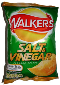
Does it not remind anyone else of the ghastly 2007-era Walkers packaging?

-
sqwidge1978
- Posts: 77
- Joined: Sat 25 Jun, 2016 15.42
The second A logo could clearly be read as A and HAlexia wrote: Sun 05 Mar, 2017 14.38 The bands are thicker on the Hofer version, and my mental conditioning is such that no matter how hard I look at it I can only see an A, not an H.

Staples near me is now 'Office Outlet'. I imagine within a year it will be gone.
https://www.retail-week.com/home/staple ... 07.article
"Office Outlet" appears to have no web presence.
https://www.retail-week.com/home/staple ... 07.article
"Office Outlet" appears to have no web presence.
I don't dispute it COULD be, I'm just saying to me it ISN'T. Now run along.sqwidge1978 wrote: Sun 05 Mar, 2017 18.30The second A logo could clearly be read as A and HAlexia wrote: Sun 05 Mar, 2017 14.38 The bands are thicker on the Hofer version, and my mental conditioning is such that no matter how hard I look at it I can only see an A, not an H.
The application for the colour version of that logo has been withdrawn, thank goodness. The monochrome version remains, and was officially registered last week.TheAxG wrote: Tue 04 Oct, 2016 22.03Afraid not ... Intellectual Property Office, there is also a monochrome version with slightly different 'BT' text.dosxuk wrote:Please tell me the source for that image is the mock forum...
Also trade marks for 'BT BE THERE', 'Be There. BT' and 'BT. THE HEART OF SPORT'
Via this CR blog post about Logobook, a fancier version of Logopedia, I've discovered that a Brazilian bank use pretty much the same logo:AgainWTheNorth wrote: Tue 27 Sep, 2016 04.16NatWest have introduced a new version of their logo, calling back to an old rendition of the chevrons symbol...
Apparently some of their content is taken from Logopedia and other similar places (Brand New?), and they admit it:
“The more recent logos have been collected from open online resources such as Google and some logo websites,” he continues.
-
sqwidge1978
- Posts: 77
- Joined: Sat 25 Jun, 2016 15.42
The Chinese version of the logo which has already rolled out, the rest of the Aldi Süd stores are to see roll out from June onwards.