Do you have some sort of influence in high places?Critique wrote:certainly white lettering would have been better IMO.
Another High Street Rebrand

-
Martin Phillp
- Posts: 1474
- Joined: Wed 11 May, 2011 01.28
That's a lot better.
TVF's London Lite.
-
scottishtv
- Posts: 744
- Joined: Thu 01 Apr, 2004 15.36
- Location: Edinburgh
On one hand the rollout could be easy as they just have to update the logo when they buy the sandwich wrapping paper, and disposable cups etc. There are few slow moving branded items, or a vast product range, to worry about.
However, new store signage for well over 2,000 outlets can't be cheap. You'd presume franchise holders don't have to pay extra for the rebrand.
However, new store signage for well over 2,000 outlets can't be cheap. You'd presume franchise holders don't have to pay extra for the rebrand.
I wonder how long it will take them to update all the stores though, there's a branch in Nottingham that still has the pre-2001 logo on it!
-
Solent James
- Posts: 12
- Joined: Thu 07 Jan, 2016 22.22
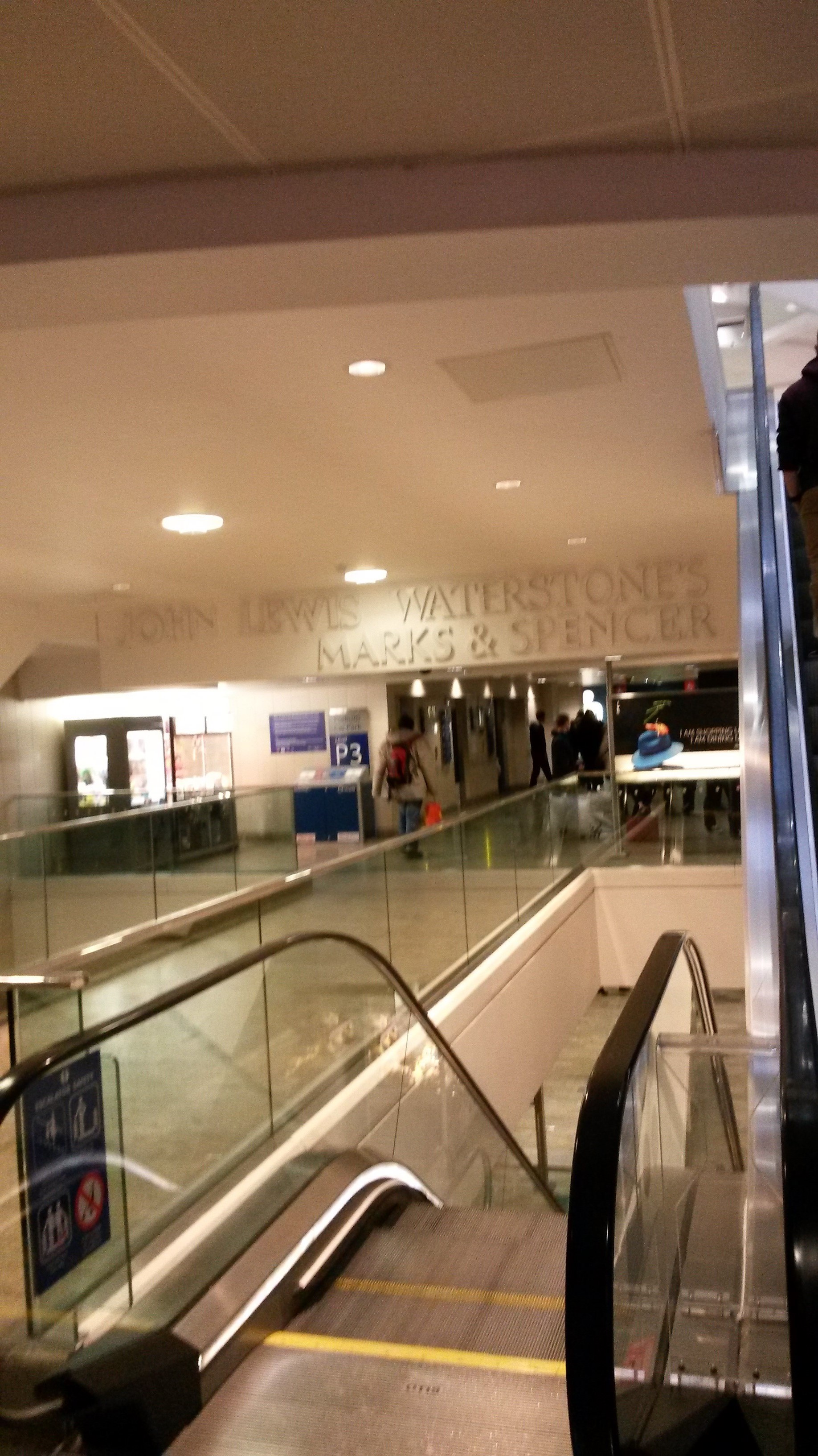
I love this sign in West Quay Southampton dating from when the centre opened in 2000 now containing 3 well out of date logos! (sorry it's a bit blurry!)